The network for creativity
Join 1.25M professional creatives like you
Connect with clients, get discovered, and run your business 100% commission-free
Creatives on Contra have earned over $150M and we are just getting started
Back to feedPost

I've been working on Cervia, a @Framer website for a single product.
A good single-product site combines the landing page and the store in one page, so the call to action is the purchase itself. Visitors learn what the product is, see why it’s better, and add it to the cart without leaving the page.
The challenge is making one page do both jobs. It has to look like a landing page, with room to explain the product and show it well, and still work like a store product page, with the price, colors and Add to cart always close at hand.
Every extra step between arriving and paying loses some buyers, so I kept the steps to a minimum.


Great work
Thanks! 🙌

Top!!
Thanks Celia!

Treating the purchase as the call to action is exactly how single-product sites should work. The Cervia page keeping the buy flow on one screen while still telling the product story is a clean solution.
💯 agreed
The network for creativity
Join 1.25M professional creatives like you
Connect with clients, get discovered, and run your business 100% commission-free
Creatives on Contra have earned over $150M and we are just getting started







Related posts


Startfrom 2.0 is live. It's our template library: finished websites designed at Apollo Studio, available as a Framer project, an Astro theme or a Next.js app.
Each template page shows what you get and runs the live demo in the page. Some templates are free.


Keeping content separate from layout would make the Astro and Next.js versions easier to customise. Do they share a content schema, or does each template have its own setup?


Proud to be an Official Framer Expert Agency for 2026!
Explore our work:
https://artonest.design/
https://www.framer.com/@artonest-design-studio/


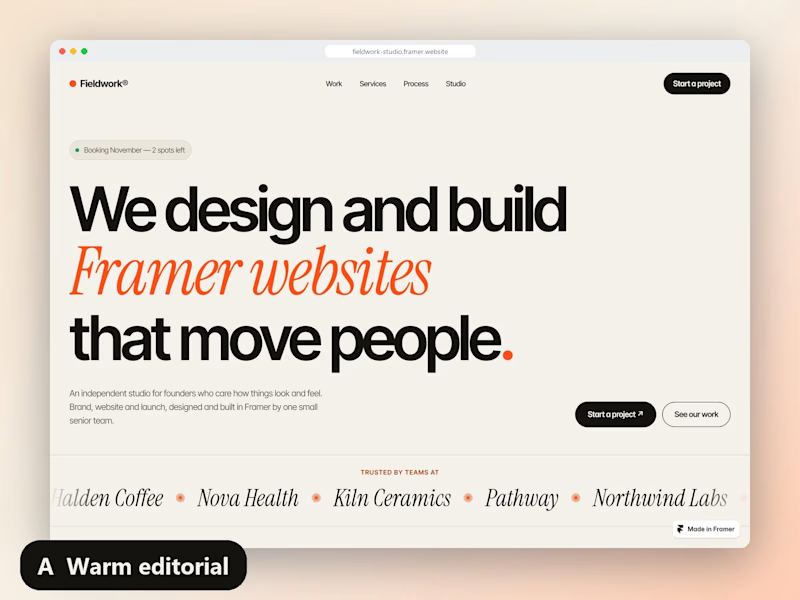
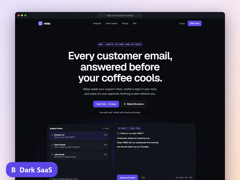
Founders: you get 3 seconds on a homepage. Which hero makes you book the call?
Both are live Framer sites I built this month (PageSpeed 97+ on desktop):
A: fieldwork-studio.framer.website
B: relay-ai-inbox.framer.website
Vote, then tell me why in the comments. I reply to every one.
6 voted
67%
3 voted
33%
9 votes
Closed
