The network for creativity
Join 1.25M professional creatives like you
Connect with clients, get discovered, and run your business 100% commission-free
Creatives on Contra have earned over $150M and we are just getting started
Back to feedPost

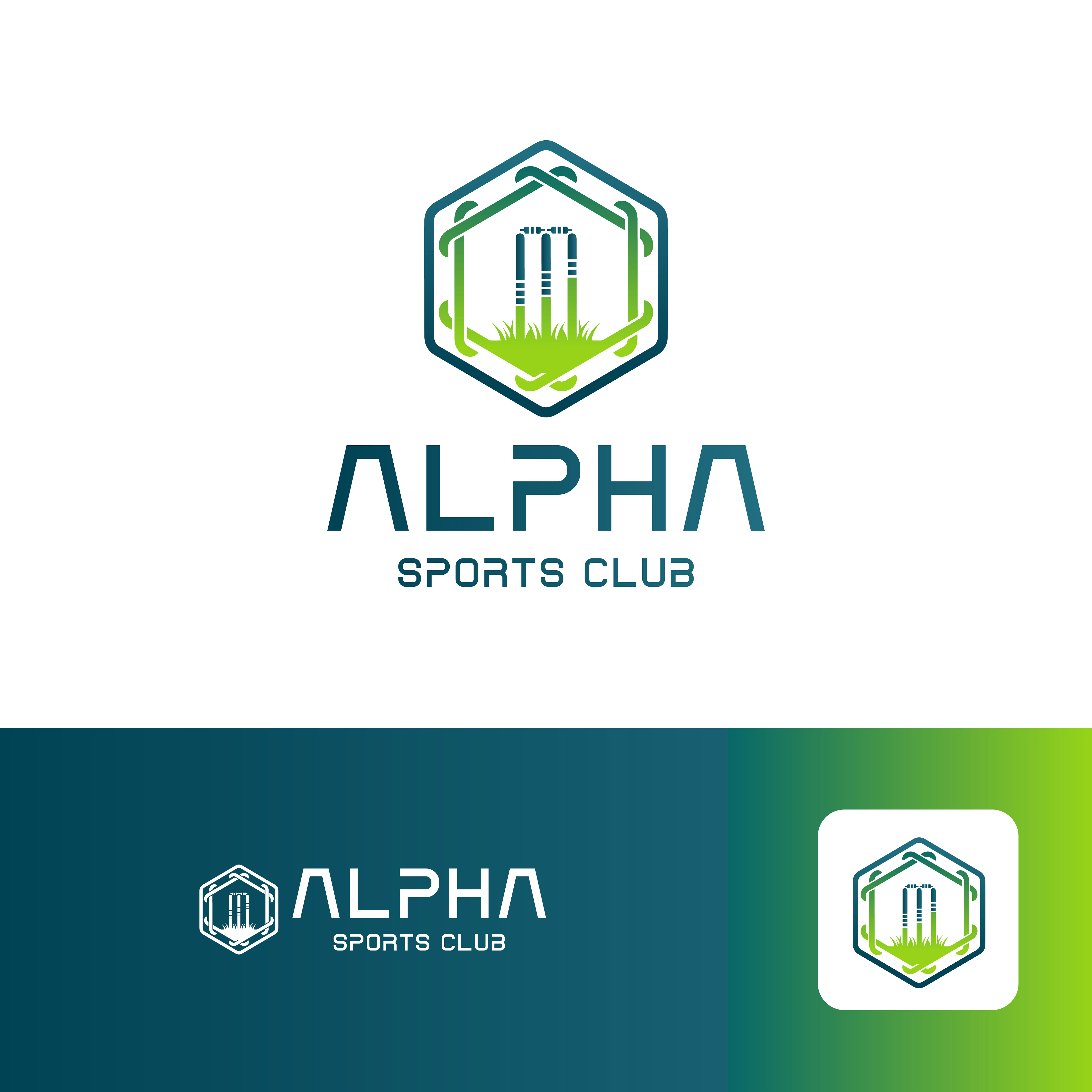
As cricket turf facilities continue to grow in popularity, having a distinct visual identity helps connect the venue with local players and teams. I recently worked on the branding for Alpha Sports Club, a modern cricket facility looking for a clean, professional, and energetic brand presence.
The goal of this project was to create a versatile design system that works across digital platforms, team apparel, and large-scale physical signage.
The Challenge & Creative Approach
A sports facility needs branding that is both dynamic and highly practical. Rather than creating a single, restrictive logo, I developed two distinct visual concepts to give the client flexibility:
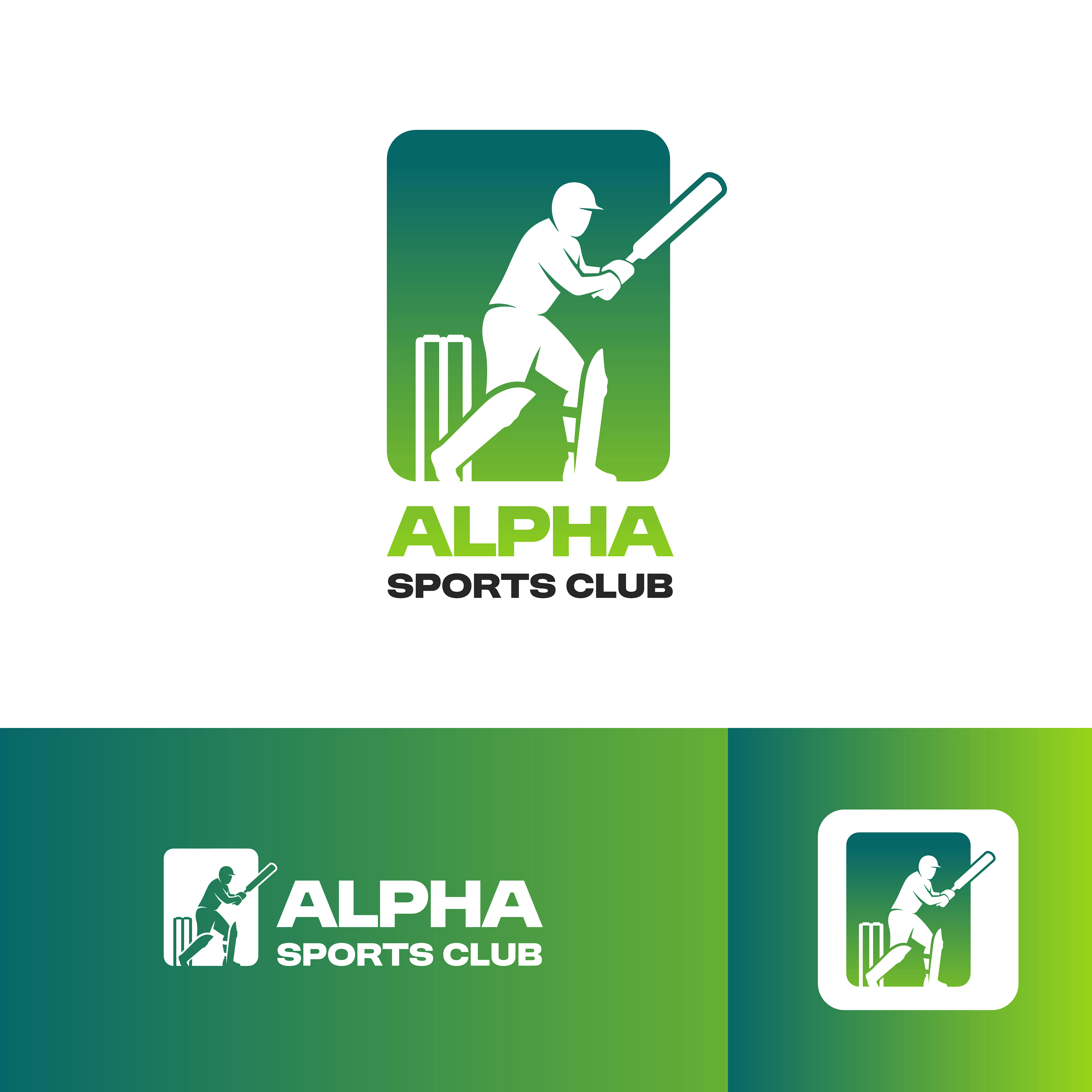
The Dynamic Action Mark: A silhouette of a batsman framed in an energetic badge. This direction is designed with athletic apparel, player jerseys, and social media icons in mind.
The Geometric Turf Emblem: A clean, modern hexagon incorporating cricket bats, wickets, and turf elements. This structured mark was created specifically for architectural signage, entrance banners, and business collateral.
For the color palette, I chose a gradient of fresh turf greens paired with deep teal and charcoal to represent energy, growth, and professionalism.



The network for creativity
Join 1.25M professional creatives like you
Connect with clients, get discovered, and run your business 100% commission-free
Creatives on Contra have earned over $150M and we are just getting started





Related posts

Winder is a bold brand identity built around a geometric W-inspired symbol, combining sharp angles and forward movement to represent progress, speed, and direction.
The identity uses a striking red and deep burgundy palette, supported by clean typography and a consistent visual system across brand guidelines, digital applications, and product mockups.
Progress in Motion.




Great logo it feels it really has an identity 🎉🎉



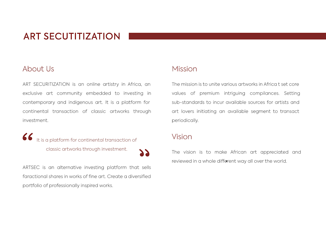
ARTSEC is an art investment platform focused on making African contemporary and indigenous art more accessible to collectors and investors.
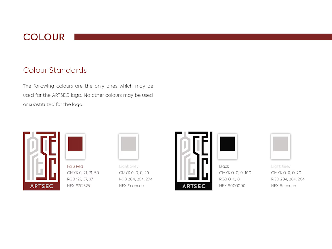
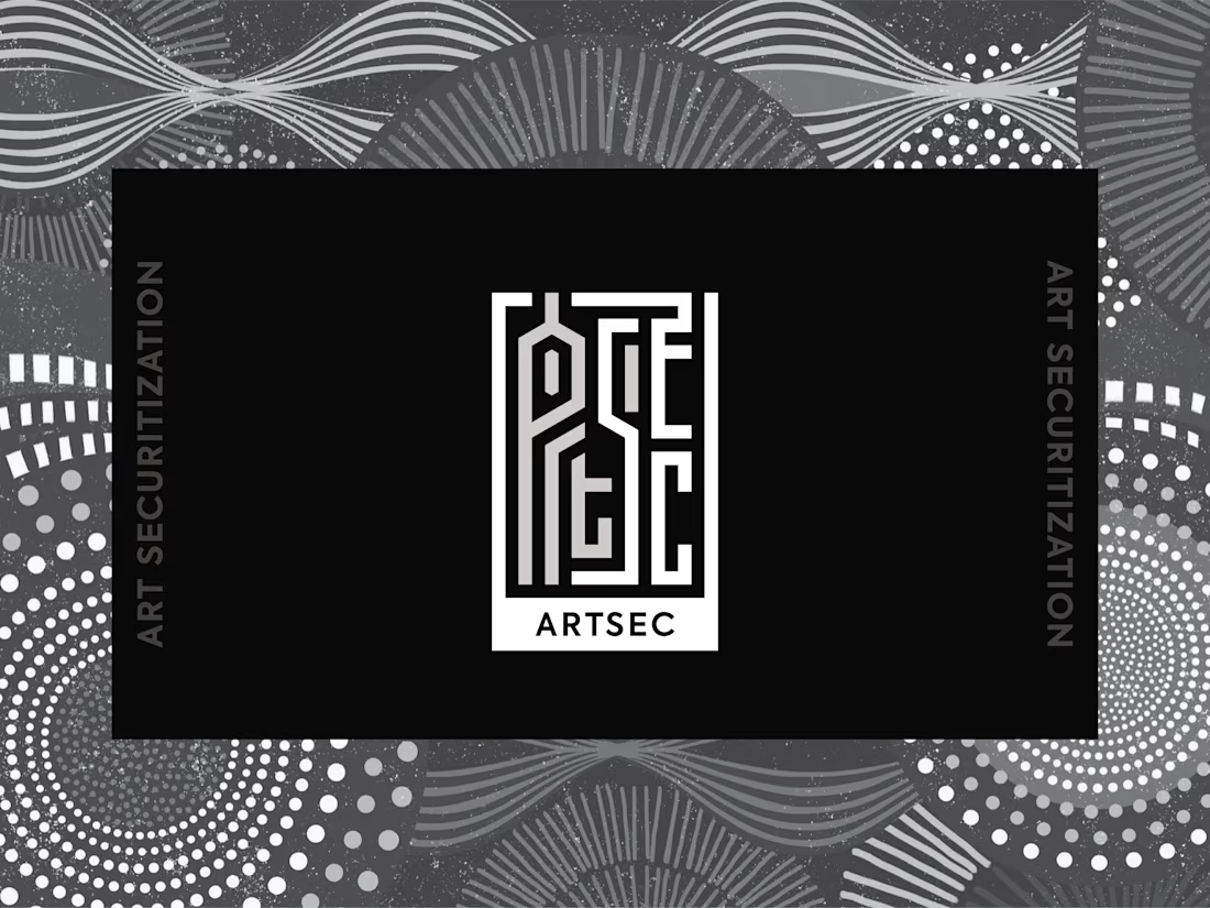
I developed a complete visual identity system for the brand, including the logo, colour palette, typography and usage guidelines.
The identity was designed to give ARTSEC a distinctive, consistent visual presence while reflecting its connection to African art and culture across print and digital applications.

Can't stop looking at this! 😍