The network for creativity
Join 1.25M professional creatives like you
Connect with clients, get discovered, and run your business 100% commission-free
Creatives on Contra have earned over $150M and we are just getting started
Back to feedPost
Taste Test

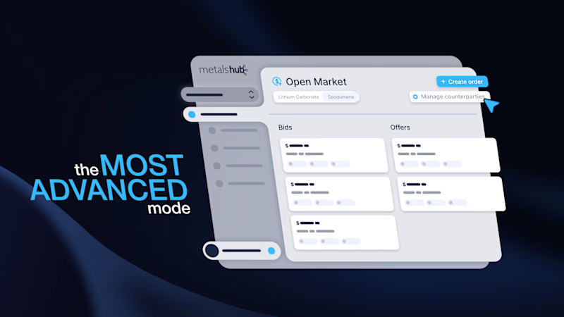
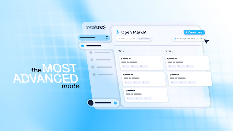
We’re launching a new project on Monday and would like to get the community’s input on which direction we should take.
The client is in the metals and mining industry, so we’re debating whether to go with a sleek, minimalist style or something lighthearted and unconventional.

5 votes
Ends in 10h

A black one - this is more contrast
Thanks a lot


the two directions for the metals brief are a fun split. which one is winning so far?


Mining clients usually skew conservative on their own branding, but the actual end users are often younger equipment operators watching this on a jobsite phone. Has anyone outside the client's leadership team seen either concept yet, or is this still purely internal?

A gets my vote. The darker background separates the interface more clearly, and the blue accents still give it some energy without making the mining brief feel too playful.
The network for creativity
Join 1.25M professional creatives like you
Connect with clients, get discovered, and run your business 100% commission-free
Creatives on Contra have earned over $150M and we are just getting started



Related posts

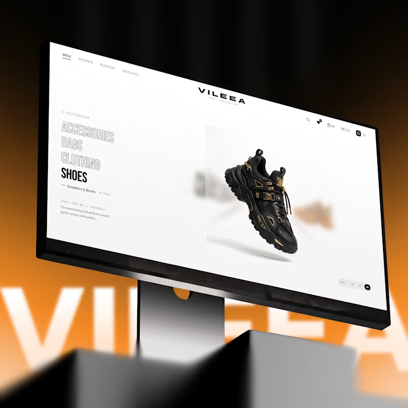
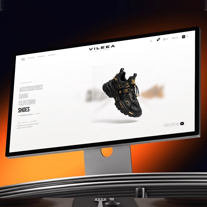
Help me decide the best visual direction for this 3D Product Hero Section:
Option A: Bold red accent with high visual impact
Option B: Subtle orange tone with smooth lighting focus
If you're building luxury e-commerce platforms, which UI aesthetic do you prefer?
Let’s hear your thoughts below! 👇


16 voted
52%
15 voted
48%
31 votes
Closed


Option A commands immediate attention for high-impact visual campaigns, but Option B feels much more aligned with luxury e commerce. A subtle, warmer tone creates a refined, high end look that keeps the product front and center without overwhelming the interface.


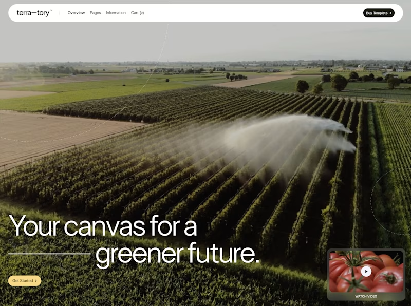
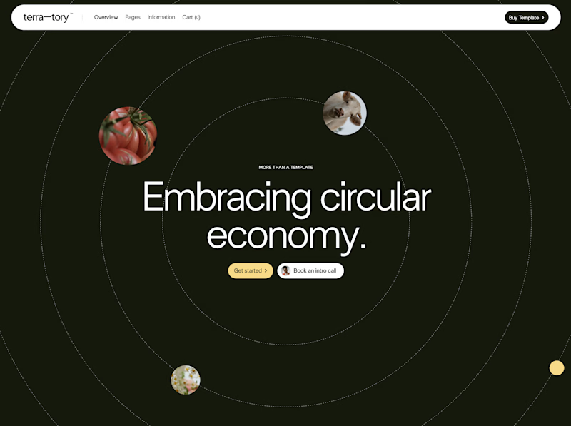
You only get to keep one. Which stays?
The circular layout has a bit of playfulness to it. The landscape gives you a much bigger sense of place.
I can see a case for both. Curious where you land.


93 voted
78%
27 voted
22%
120 votes
Closed
I'd keep the landscape one honestly, that sense of scale feels right for anything talking about sustainability at an industry level. Did the client push back on the crop at all, or were they on board with circular from the start?

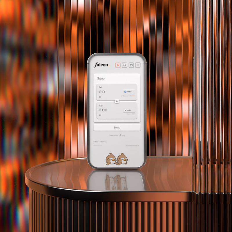
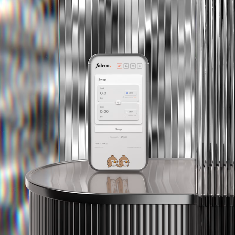

A for me. The warm copper gives the product some heat and makes it feel premium rather than clinical. B is cleaner but silver on silver almost hides the device, the copper actually frames it. Wild that this is no AI.