The network for creativity
Join 1.25M professional creatives like you
Connect with clients, get discovered, and run your business 100% commission-free
Creatives on Contra have earned over $150M and we are just getting started
Back to feedPost
I'm working on the brand identity of a learning & development brand and came up with this logo, then I did a cool animation 💫.


Nice one, Jose!

Thanks @Damilola Adelaja
You’re welcome

Super cool!
Thanks @Chantal Jemmott

That lime and black combo has serious energy for a learning & development brand, most brands in that space play it so safe. Did you consider a more literal symbol first, like a book or a graduation cap, or was an abstract mark always the direction?
Hey, thanks so much for your comment. We actually did consider the typical book symbol, that could also be reprsented as an arrow and what not. But we ended up settling with this one that presents direction, movement, energy because the hypothesis that we were going for is...


The animation makes the mark feel like it's mid-motion even as a still. What almost made the final cut before you landed on this version?


The bold black mark on the bright green pops a lot. Nice logo, Jose.

Simple. Straight. Cool.


Nice motion and color work!
The network for creativity
Join 1.25M professional creatives like you
Connect with clients, get discovered, and run your business 100% commission-free
Creatives on Contra have earned over $150M and we are just getting started

Challenges
View all


Related posts

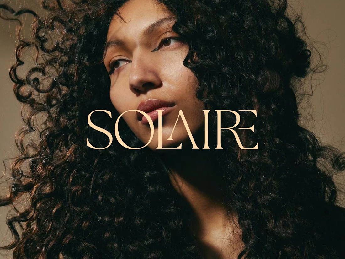
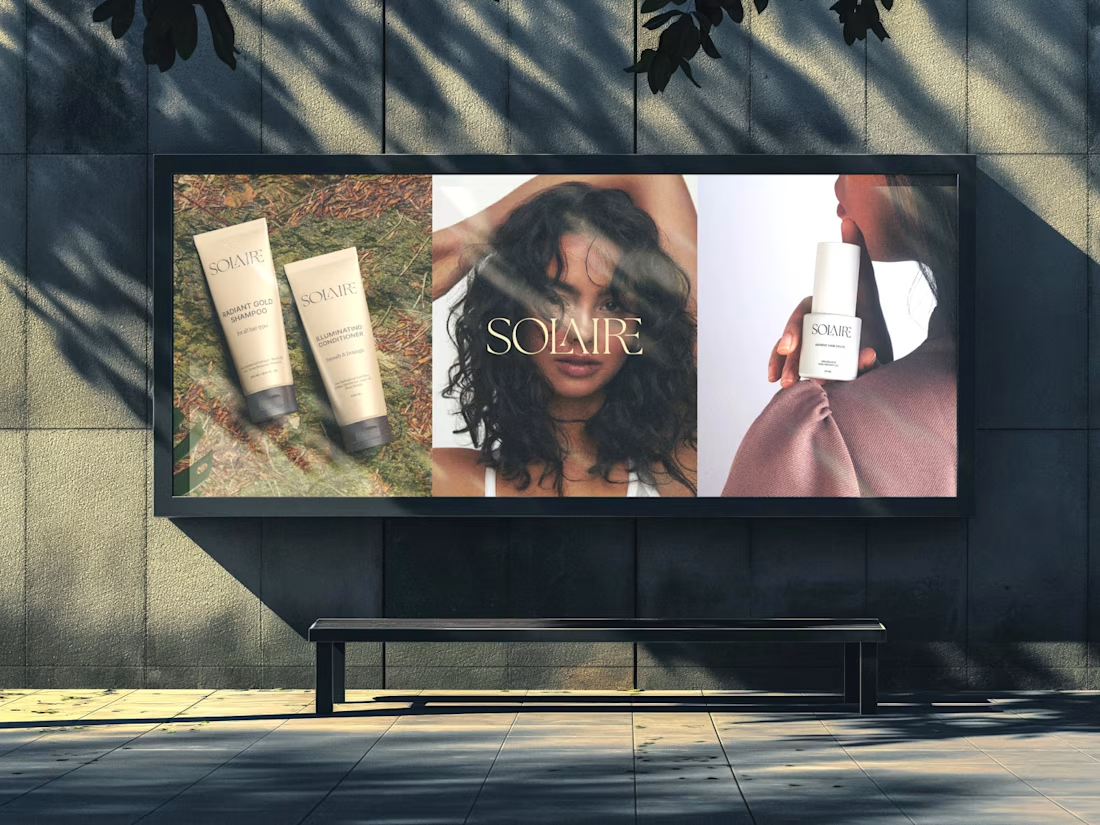
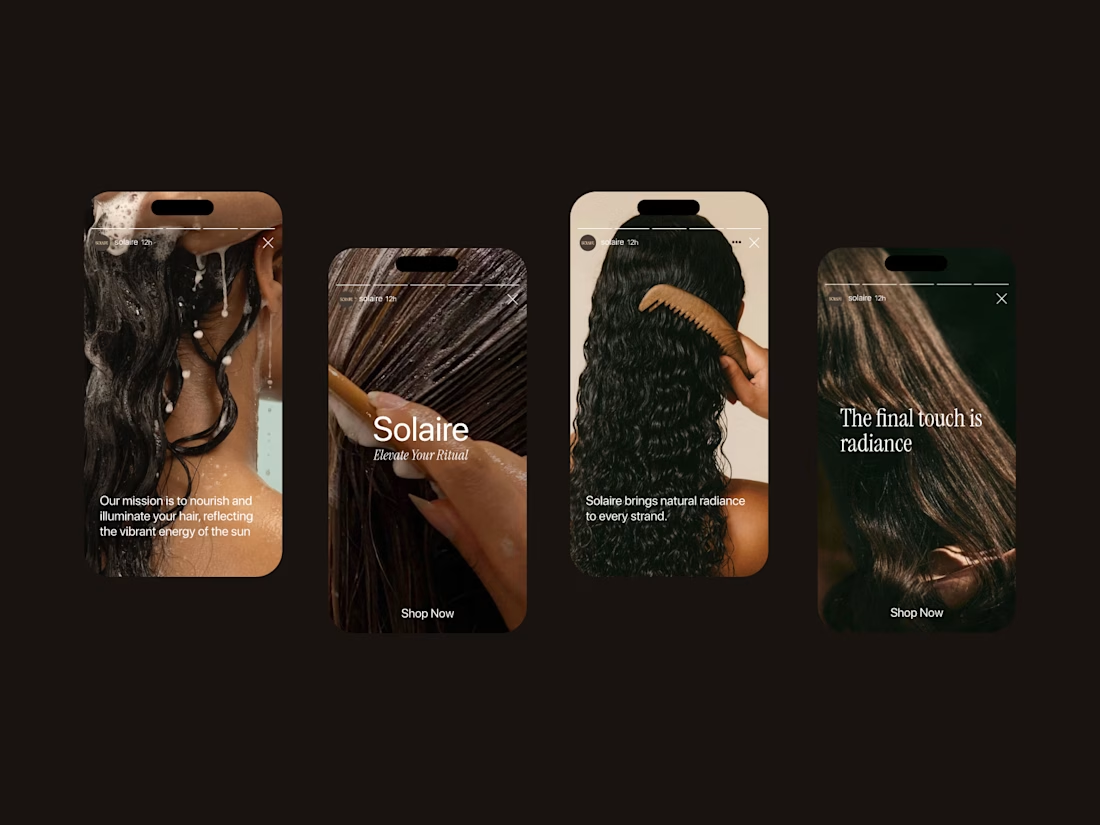
Solaire: a haircare brand identity rooted in warmth, texture, and light.
For this project, I wanted the brand to feel as dimensional as the hair it celebrates. The custom serif wordmark has elegant, ligature-style details where the letters overlap and intertwine, echoing the movement of a curl. The warm champagne tone against rich, golden-hour photography keeps everything feeling sun-kissed and confident rather than clinical.
The goal: a brand that feels luxurious but never precious, made for people who wear their texture proudly.
Brand identity • Logo design • Art direction

nice work


Working on apple watch experience. How else do I keep myself from getting bored when there’s interaction design involved? That’s honestly one of my top priorities.
Can’t wait to share the full case study for this project. For now, here’s a little sneak peek at some of the animated screens I’ve been working on for the fitness experience. ⌚️

This deserves only praise. wonderful execution

Factory × Slack - Product Integration Video
Created a product video showcasing Factory’s Slack integration, combining UI animation, motion design, and visual storytelling to clearly demonstrate how the integration works and fits into the user’s workflow.

