The network for creativity
Join 1.25M professional creatives like you
Connect with clients, get discovered, and run your business 100% commission-free
Creatives on Contra have earned over $150M and we are just getting started
Back to feedPost

Work in progress. What would you fix?
This is draft A of the ident for BLAQUE LINE, my anime drift series. A sword stroke splits the frame and the wordmark bleeds out in ink. 4.75 seconds, every frame drawn in code, and the wordmark is a blade-cut alphabet I drew for it.
Sound is off while I rebuild the tag.
Too slow before the cut? Does the seal stamp land too late? Tear it apart, I'm listening.
https://givemeprompts.com
The network for creativity
Join 1.25M professional creatives like you
Connect with clients, get discovered, and run your business 100% commission-free
Creatives on Contra have earned over $150M and we are just getting started











Related posts

How can branding make people feel part of a community?
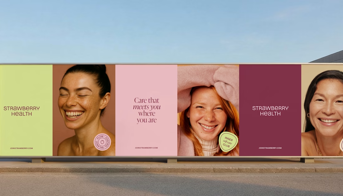
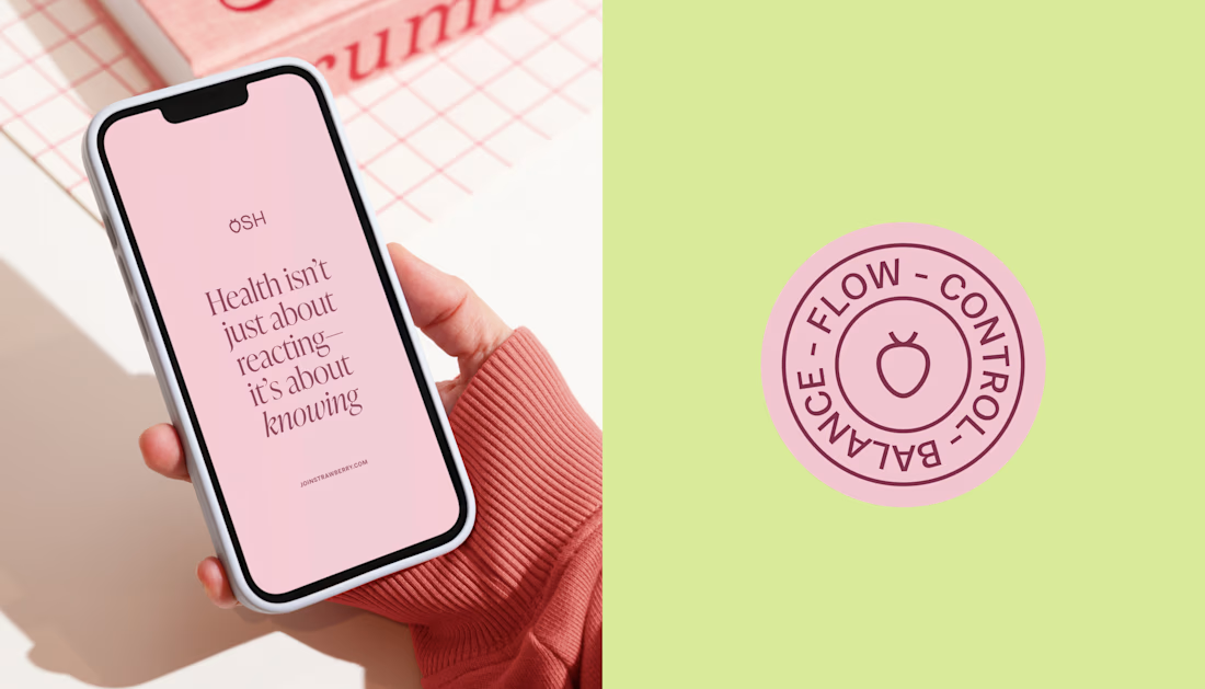
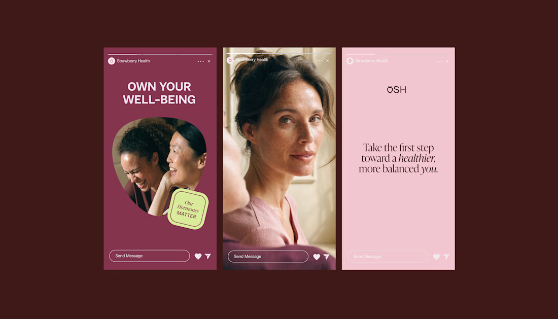
When working on Strawberry Health, we explored how visual identity could make women’s health feel more approachable and collective.
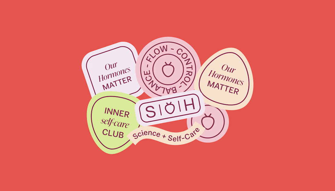
One of the ways was through supporting brand elements: stickers, badges and phrases that could live beyond the logo and become expressions of belonging.
These elements turned the identity into something people could interact with, share and make their own.
It’s a small detail, but I think it’s an important part of building brands around communities: the identity shouldn’t only identify the brand. It should give people something to identify with.

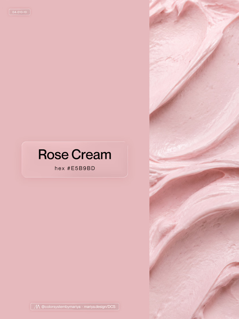
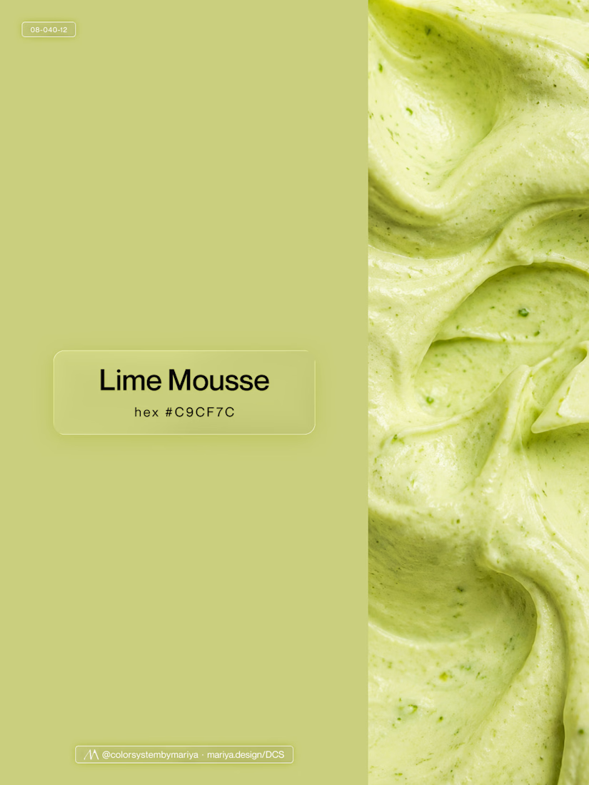
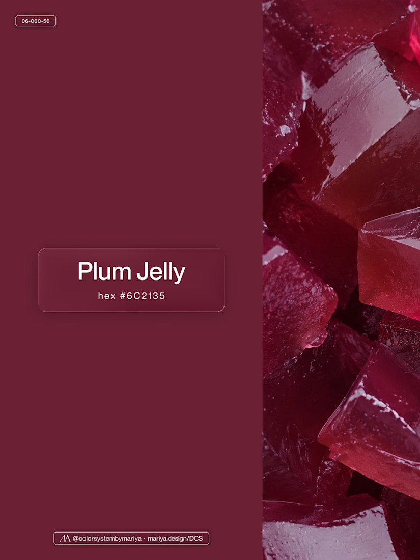
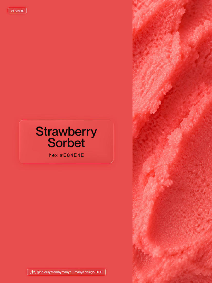
Love, love, love the colors. My mind goes: Rose Cream, Lime Mousse and Plum, hmmmm, which Plum... Plum Jelly. And of course, Strawberry Sorbet.
Let me match the vibe using my delicious swatches 😊


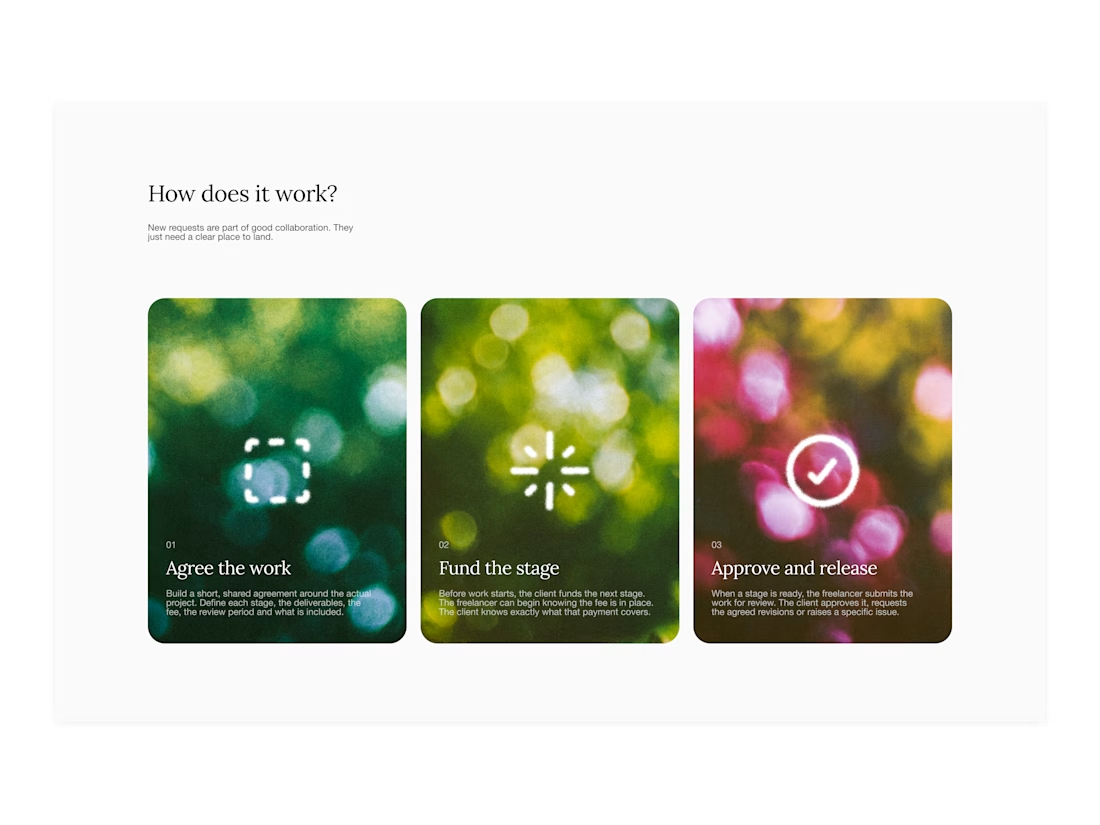

Your web sections always have such strong art direction. Great to see the brand carried right into the layout.

Public animation for Binance.
What do you think guys?


Stunning work! Love both the design and the way you presented it. ❤️✨