The network for creativity
Join 1.25M professional creatives like you
Connect with clients, get discovered, and run your business 100% commission-free
Creatives on Contra have earned over $150M and we are just getting started
Back to feedPost


The AI handles all routing automatically.
Thus, manual appointment creation is an edge case, something that happens when a specific customer request or exception requires human intervention.
When that happens, the system surfaces available technicians ranked by fit and shows how much distance and time the appointment adds to their route for that day. The manager picks from a ranked list rather than guessing.
The typography and color choices were made with one thing in mind: the platform needs to feel embedded in whatever system the client is already using rather than standing out as something foreign. We kept everything deliberately neutral.
Light and dark mode both follow the user's system preference automatically.
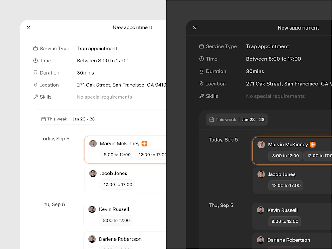


the ranked technician view makes the exception path feel really clear. did you test this with dispatchers first?
The network for creativity
Join 1.25M professional creatives like you
Connect with clients, get discovered, and run your business 100% commission-free
Creatives on Contra have earned over $150M and we are just getting started




Related posts

Which landing page looks more premium for a modern fintech app?
14 voted
78%
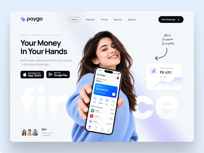
4 voted
22%
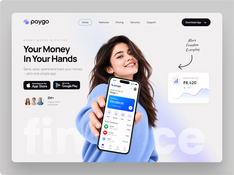
18 votes
Closed


A closer look at Sagebio.
Designed a clean, simple website experience for a complex health-tech product.
explore the live site: https://www.sagebio.com/
#WebDesign #UXDesign #ProductDesign #HealthTech #EiderDesign


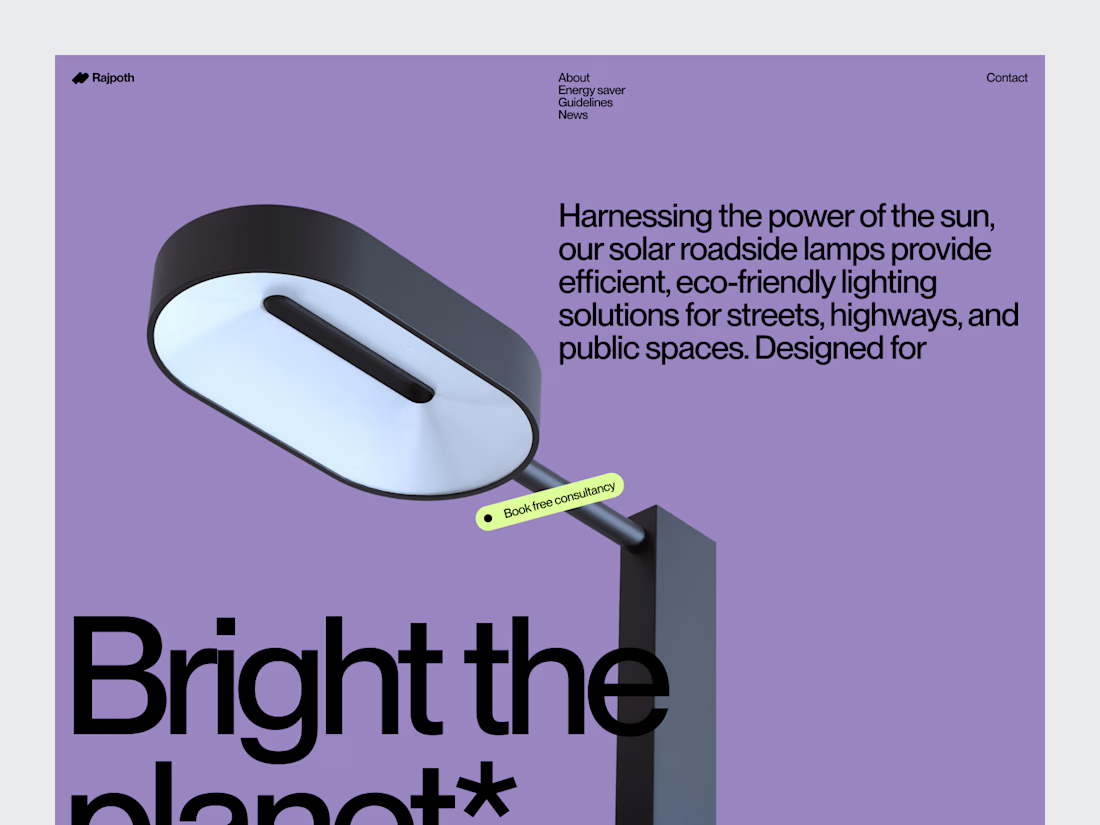
Solar Lamp Website Hero Section
A strong product website starts by giving the product room to speak.
For this solar lamp website concept, the hero section was designed around product visibility, clean messaging and a visual direction connected to sustainable lighting.
Strong product imagery creates the first impression, while typography and spacing keep the interface focused and easy to scan.
The result is a clean product landing page direction designed to introduce the solar lamp without overwhelming the visitor with information.
Focus: Product Website · Solar Lighting · UI/UX Design · Landing Page Design · Sustainable Web Design
Designed by WaxyWeb.
Have a product that needs a stronger digital presentation?

Excellent job!