The network for creativity
Join 1.25M professional creatives like you
Connect with clients, get discovered, and run your business 100% commission-free
Creatives on Contra have earned over $150M and we are just getting started
Back to feedPost

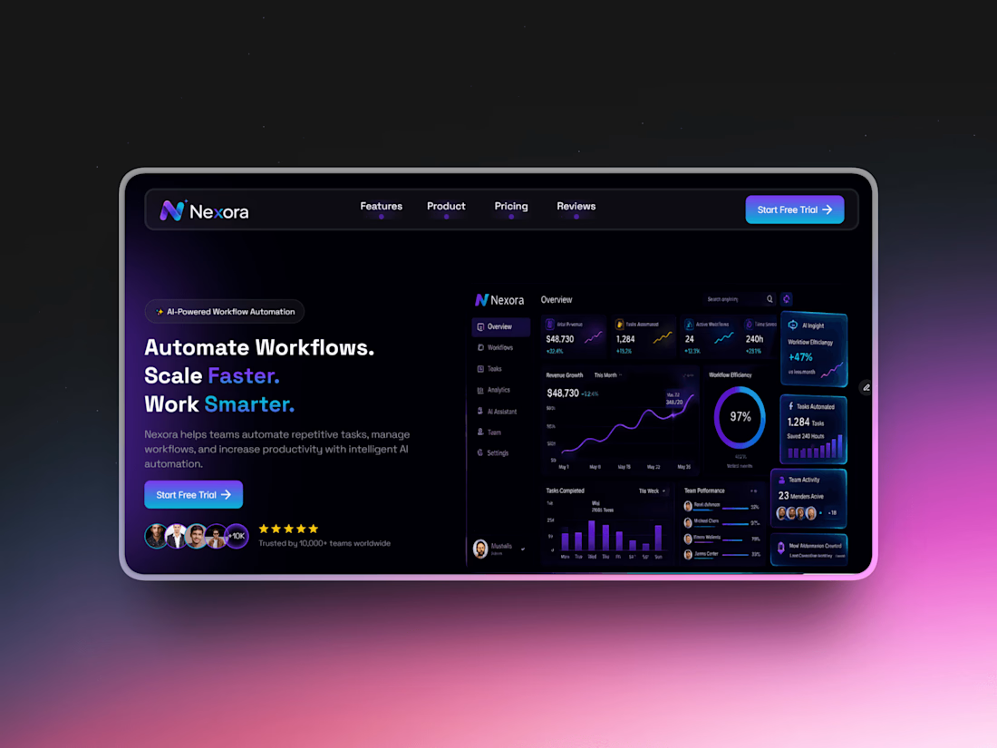
Nexora – AI SaaS Landing Page
A modern AI SaaS landing page designed and developed in Framer. Built with responsive layouts, smooth animations, interactive sections, and a conversion-focused user experience for startups and SaaS businesses.
✅ Fully Responsive Design
✅ Modern Dark UI
✅ Smooth Animations
✅ Interactive Components
✅ Pricing Section
✅ Testimonials
✅ FAQ Section
✅ Call-to-Action Sections
✅ Framer Development
Preview: https://nexora2.framer.website/
Remix: https://framer.link/jdySN7d

The network for creativity
Join 1.25M professional creatives like you
Connect with clients, get discovered, and run your business 100% commission-free
Creatives on Contra have earned over $150M and we are just getting started



Related posts

Smooth navigation for my luxury restaurant @Framer template – Bordo


nav feels so smooth


Here’s a little piece from my current project. As I watch the Swiss design concept become a part of my creative DNA, I find myself constantly gravitating towards this direction in web design.
What’s really interesting is that Volume 3 studio and I are experimenting here, mixing things that seem completely unmixable at first glance.
Since Volume 3 is a CGI and VFX studio, it was crucial to incorporate a 3D dimension into their brand communication. On top of that, a Terminal UI is exactly what keeps that technical vibe going.
So, the final mix is International (Swiss) style, a Terminal UI, and a 3D feel brought to life by neumorphism. Crazy, right???
It looks simple and clean, but behind the scenes, there’s a massive amount of work on the details. We focused on all those little things that push the UX/UI into the premium segment — the things you don't necessarily see right away, but you definitely feel when you're on the page.
The work is still ongoing, so I can't dive into reflecting on the whole process just yet, but I'm gonna keep revealing small parts here.


Swiss grids on the web never get old when they're this clean. What are you and Volume 3 mixing it with?

Design Agency Website
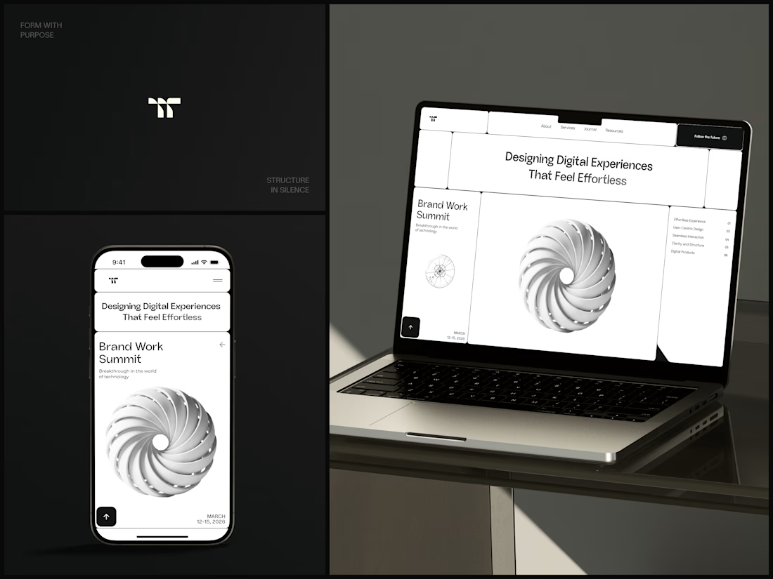
Only one cell on this homepage is black.
The rest of the page is a grid of rounded white cells: the headline, an event card, a white 3D spiral and a list of services. The black one, top right, holds the "Follow the future" button and stands out against all that white.
On the phone, the cells stack into a single column. The navigation folds into a menu icon, and the event card and spiral merge into one cell.
The headline reads "Designing Digital Experiences That Feel Effortless", so the grid has to look organized before anyone reads a word.
Designed by the Hue & Machine team.
#DesignAgency #WebDesign #AgencyWebsite #LandingPage #BentoGrid #MinimalDesign #UIDesign #ResponsiveDesign #MobileDesign #FigmaDesign


Looks cool