The network for creativity
Join 1.25M professional creatives like you
Connect with clients, get discovered, and run your business 100% commission-free
Creatives on Contra have earned over $150M and we are just getting started
Back to feedPost

A simple, strategic sales page for a membership built around better training.
I designed and built the landing page for a dog agility membership focused on helping handlers train with more clarity and consistency.
For this project, the client’s goal was to keep things simple and easy to navigate. Instead of a heavily designed or animated page, I focused on a clean layout, strong hierarchy, and plenty of space so the content could do the work.
I structured the page around the membership experience, highlighting:
💡 The training library and Clarity Blueprint
💡 Live coaching calls and monthly workshops
💡 Private community and bonus resources
💡 Member testimonials and social proof
💡 Clear pricing and FAQs to answer common questions
The page feels straightforward, focused, and easy to read, while still giving visitors everything they need to understand the membership and decide if it’s the right fit for them.
Sometimes, the best design choice is simply keeping things clear and intentional. ✨


The network for creativity
Join 1.25M professional creatives like you
Connect with clients, get discovered, and run your business 100% commission-free
Creatives on Contra have earned over $150M and we are just getting started

Challenges
View all


Related posts

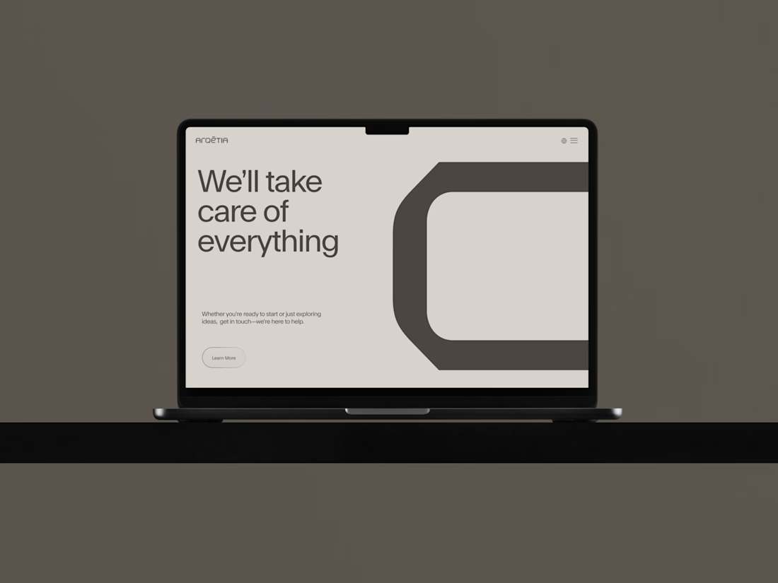
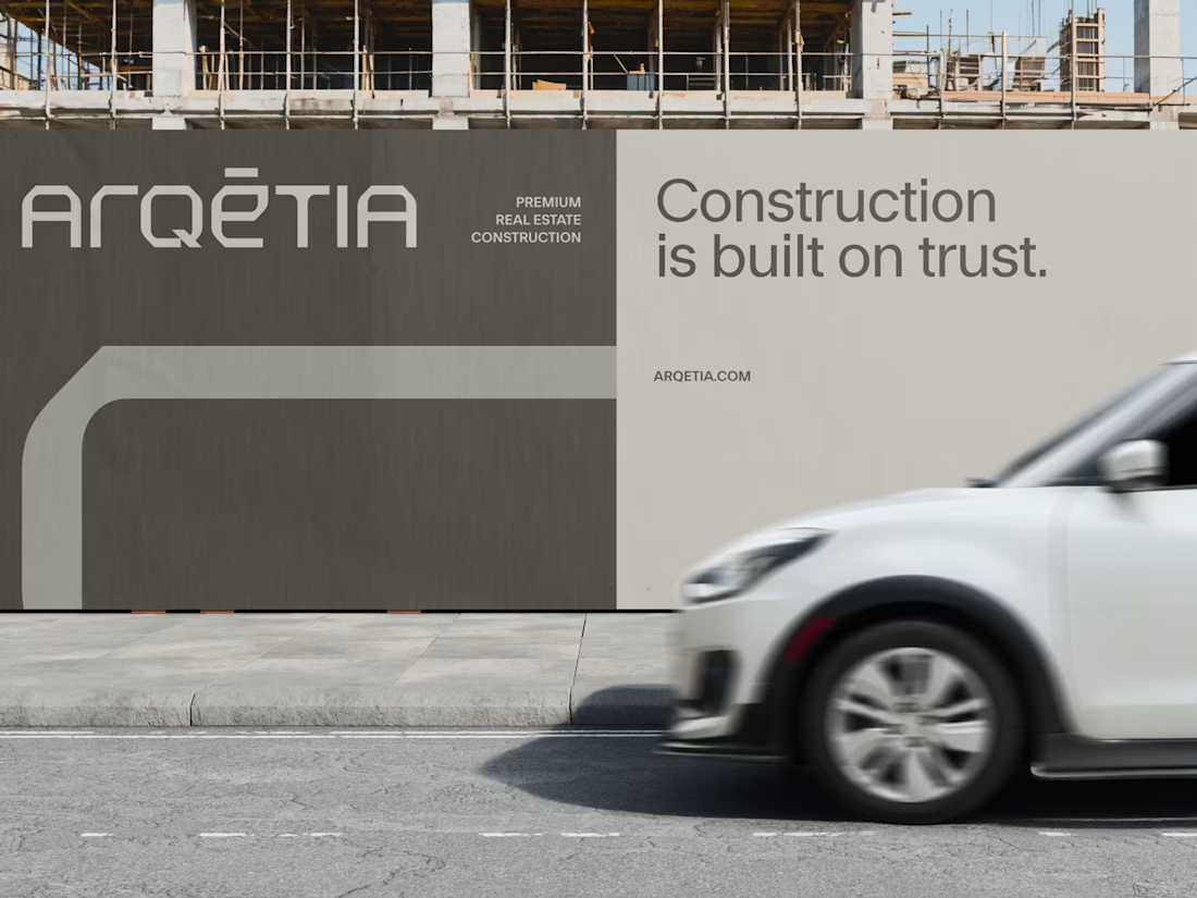
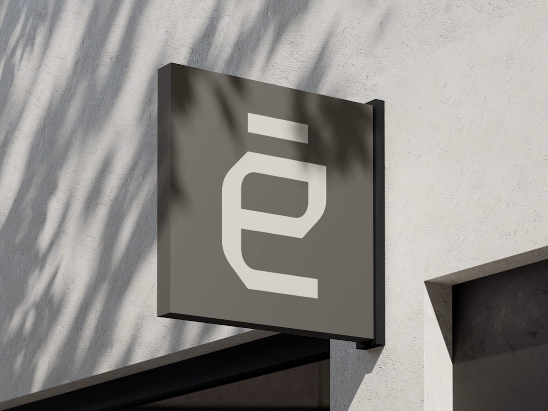
What if construction felt as clear as the space it creates?
For Arqētia, we built a visual identity around one of the industry's most important client needs: transparency. A direct response to the uncertainty often associated with construction, from unclear processes and budgets to timelines and decision-making.
The concept makes transparency tangible, translating it into a visual system that feels open, structured and precise.
check it out


Very clean identity work

Hi :) This is a journey through asteroids into the heart of a star. Built with Three.js, React Three Fiber, and custom GLSL shaders. Liquid images, interactive particle typography, and a core that opens under your cursor.


Man... this is cool. 😍

"Where the road ends, we begin."
Every line runs to one red point. The nav has a light switch: AMBIENT → FLASH.
Dot-matrix stays quiet until you fire it.
Which state would you open on?
Reply below.

The AMBIENT to FLASH switch is such a fun detail. I'd keep Ambient as default and let people discover Flash.