The network for creativity
Join 1.25M professional creatives like you
Connect with clients, get discovered, and run your business 100% commission-free
Creatives on Contra have earned over $150M and we are just getting started
Back to feedPost

A writer came to me with three books.
The stories were connected.
The characters were connected.
The audience was connected.
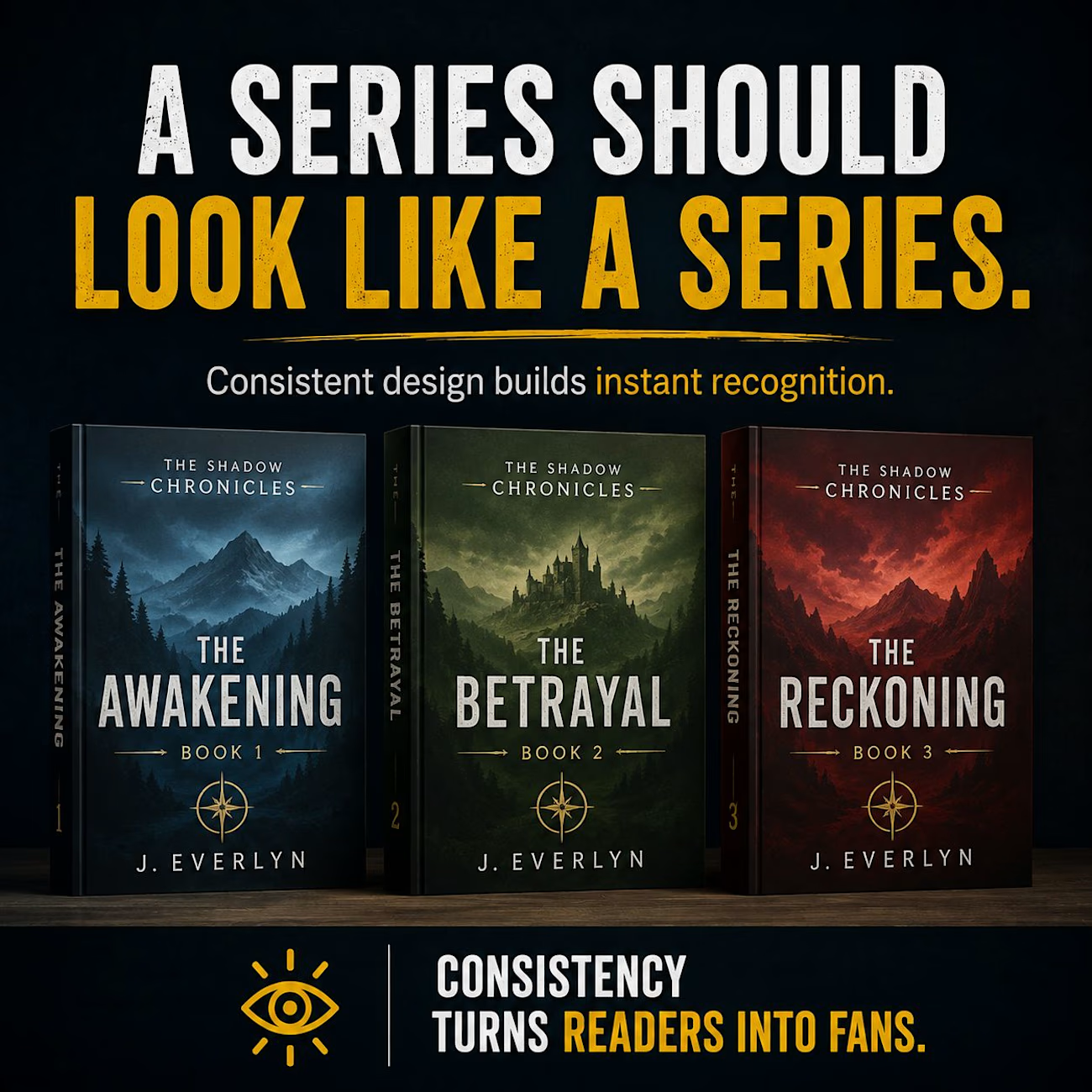
But when I looked at the covers, they looked like three completely different books.
Different colors.
Different typography.
Different visual styles.
Nothing told the reader:
“These books belong together.”
That is a problem when you're building a book series.
A reader who enjoyed Book 1 should be able to recognize Book 2 almost instantly.
That's why designing a series isn't about creating three beautiful covers independently.
It's about creating a visual identity for the entire series.
The title treatment can remain consistent.
The typography can follow the same system.
The placement of the author name can stay recognizable.
The color palette and composition can evolve while still feeling connected.
And the artwork can change according to each story without breaking the overall identity.
Think about walking into a bookstore and seeing five books from the same series.
You shouldn't need to read every title to know they belong together.
That's the power of consistency.
A strong series cover system doesn't make every book look identical.
It makes every book feel like part of the same world.
And for authors publishing multiple books, that's not just good design.
It's brand recognition.


The network for creativity
Join 1.25M professional creatives like you
Connect with clients, get discovered, and run your business 100% commission-free
Creatives on Contra have earned over $150M and we are just getting started
Trending
retrofuturism
Share your favorite designs from the past exploring the distant future. Or your own take on the aesthetic 🚀
halftone
Dots. Texture. Grain. Let's see your designs using the halftone technique.

Midjourney
Creatives are showing off what they're making with Midjourney.
colorgrade
Video editors sound off: How do you enhance the mood of your video in color grading?





Related posts

Exploring multiple interaction directions for one client section
A client wanted to compare different ways of presenting project imagery, so instead of relying on references, I built several working variations in one prototype.
We tested:
— Structured vs. more chaotic layouts
— Different image ratios
— Square vs. portrait-heavy compositions
The goal was simple: make the decision easier before moving into the final build.
Prototyping the interaction early gave us clearer feedback, faster alignment, and less room for interpretation.


So creative

Absolutely. For this Attend Homecare social media project, the caption should position you as a Social Media Manager who understands healthcare branding, content strategy, audience education, and compassionate storytelling, not just someone who designed graphics.
Social Media Management & Content Strategy for Attend Homecare 🏡💙
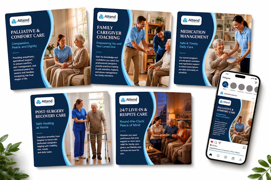
Created a professional social media content direction for Attend Homecare, focused on communicating compassionate, reliable, and personalized homecare services through clear and engaging visual storytelling.
The content strategy highlights key services including palliative & comfort care, family caregiver coaching, medication management, post-surgery recovery care, and 24/7 live-in & respite care.
For a healthcare-focused brand, the goal was to make every post feel trustworthy, warm, professional, and easy to understand while maintaining a consistent visual identity across the social media feed.
I developed content concepts designed to:
• Educate families about available homecare services
• Build trust with potential clients and caregivers
• Communicate complex services in a simple way
• Create a consistent and recognizable brand presence
• Encourage meaningful engagement from families and caregivers
• Present Attend Homecare as a compassionate and dependable care provider
The visual direction combines navy blue, light blue, clean typography, and authentic caregiving imagery to create a calm and professional healthcare aesthetic.
This project demonstrates my approach to social media management, content planning, healthcare content creation, visual storytelling, and brand consistency.
#SocialMediaManager #SocialMediaManagement #SocialMediaStrategy #ContentStrategy #ContentCreation #HealthcareMarketing #HealthcareSocialMedia #Homecare #HomeCareServices #SeniorCare #ElderlyCare #Caregiving #CaregiverSupport #HomeHealthcare #PalliativeCare #RespiteCare #PostSurgeryCare #FamilyCaregiver #HealthcareBranding #HealthcareContent #BrandStrategy #VisualStorytelling #InstagramMarketing #InstagramContent #SocialMediaContent #ContentMarketing #BrandContent #DigitalMarketing #SocialMediaDesign


Really strong approach. I like how the content focuses on educating families while keeping the brand warm and trustworthy especially important for healthcare brands where clarity and empathy matter.


Traer Mobile App Design.
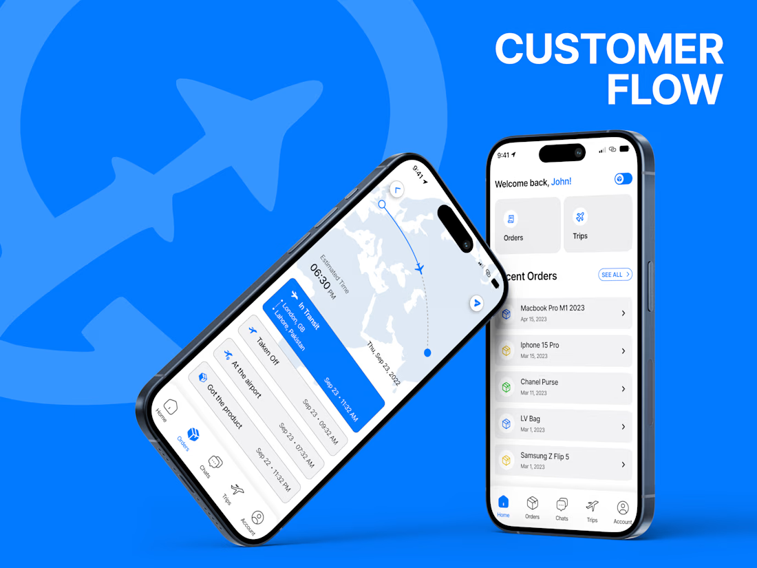
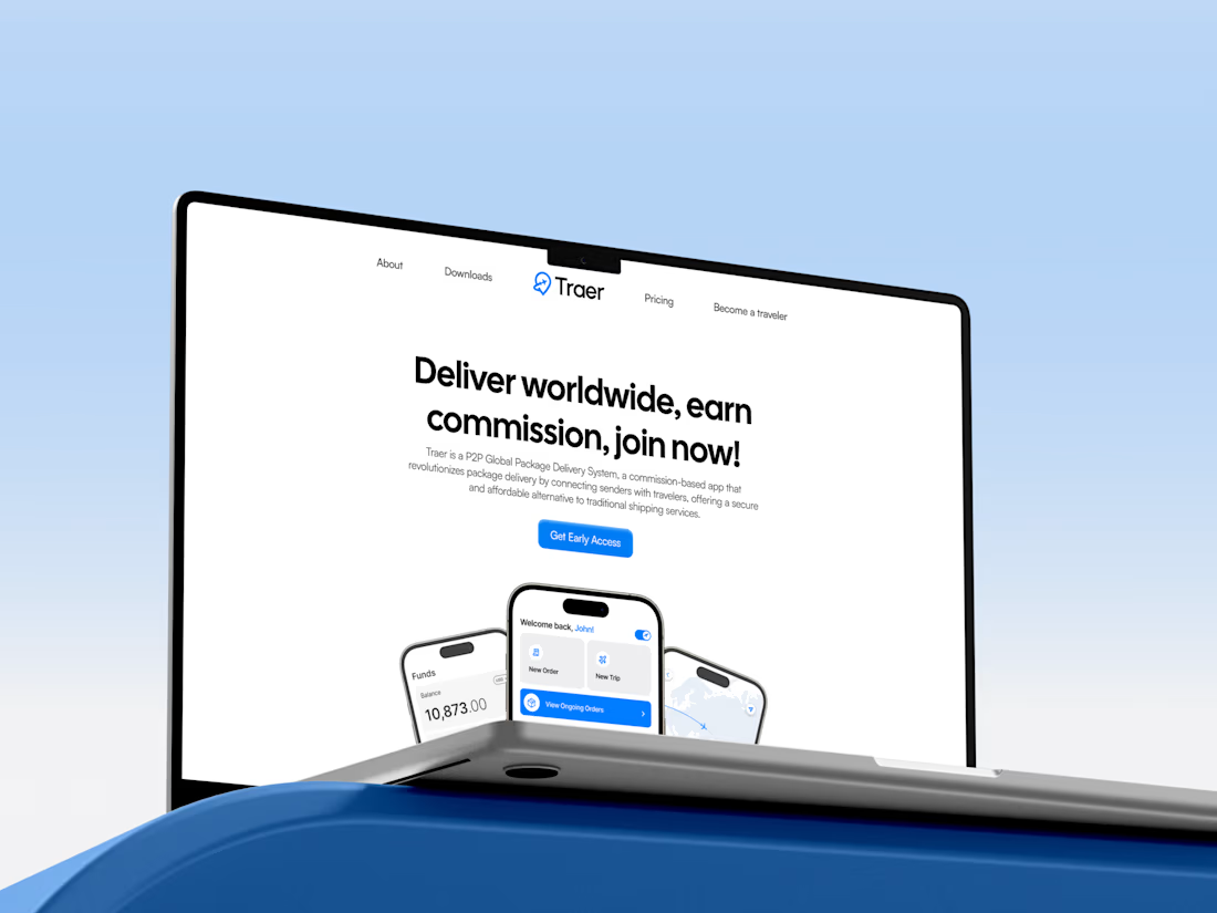
A clean and modern mobile app UI/UX design for Traer, a P2P global package delivery platform.
Designed the experience around package tracking, orders, trips, and delivery management, keeping everything simple and easy to navigate.
Also explored the visual identity, typography, colors, and responsive product experience to keep the app consistent across the brand.
Really enjoyed bringing this one together.




High-end design.