The network for creativity
Join 1.25M professional creatives like you
Connect with clients, get discovered, and run your business 100% commission-free
Creatives on Contra have earned over $150M and we are just getting started
Back to feedPost
Taste Test
Same brief. Same skincare brand concept. Two different AI tools.
Design 1 goes bold and playful, with a handwritten look and one hero bottle.
Design 2 goes soft and elegant, with a script headline, a full product line and clear benefits.

0 voted
0%
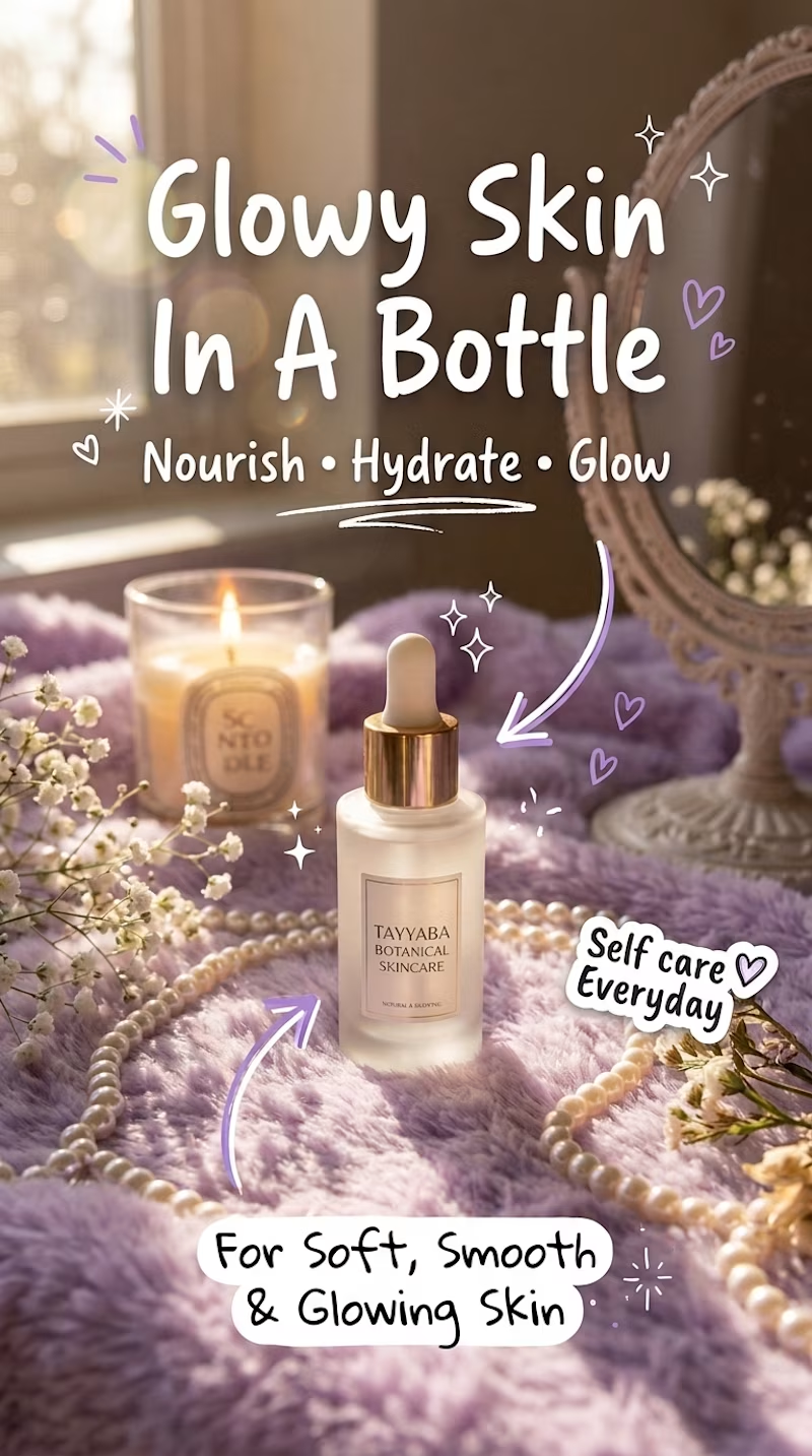
1 voted
100%
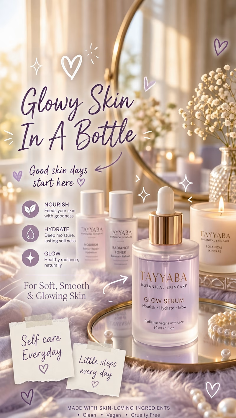
1 vote
Closed

Interesting that the bold one is the Google Flow build, it carries the handwritten look really confidently. For skincare I lean toward Design 2, the script headline with the full product line and clear benefits feels more shelf-ready. Did the two tools need very different...

Prompt is same for both of the AIs.

Great job 🎉🎉🔥🔥
The network for creativity
Join 1.25M professional creatives like you
Connect with clients, get discovered, and run your business 100% commission-free
Creatives on Contra have earned over $150M and we are just getting started



Related posts

Same company, two different concepts for an AI storytelling platform. Which one suits better?
31 voted
86%
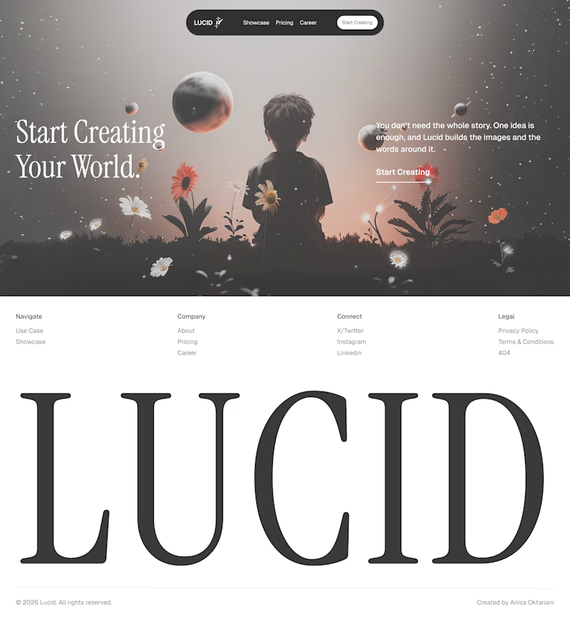
5 voted
14%
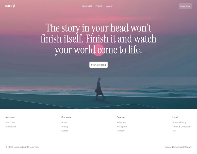
36 votes
Closed

Left!

Need a second pair of eyes 👀
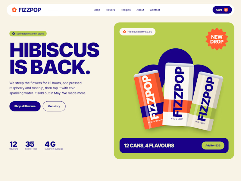
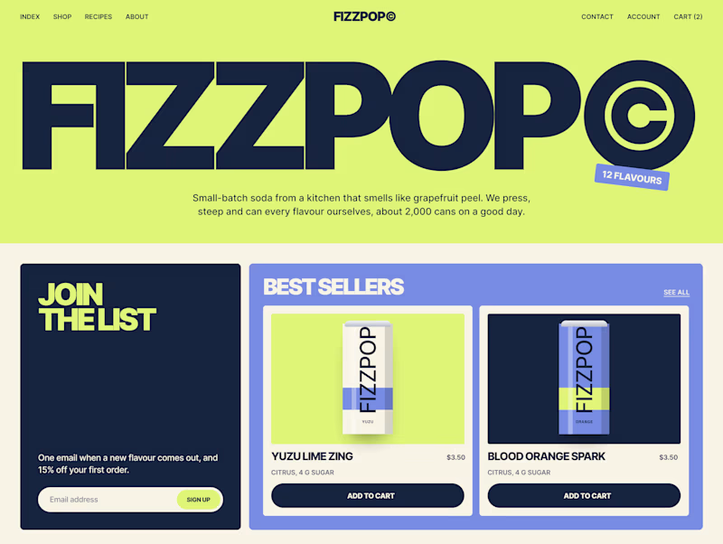
I'm designing the online store for FizzPop, a craft soda brand: all-natural sodas, sparkling waters and botanical tonics.
Flower Fizz(A): eggshell, tiger orange and deep ultramarine, with flower shapes and stacked colour swatches for the flavours
Corner Shop(B): lime, soft blues and navy, editorial layout with a giant wordmark and menu-style flavour tiles

38 voted
44%
48 voted
56%
86 votes
Closed


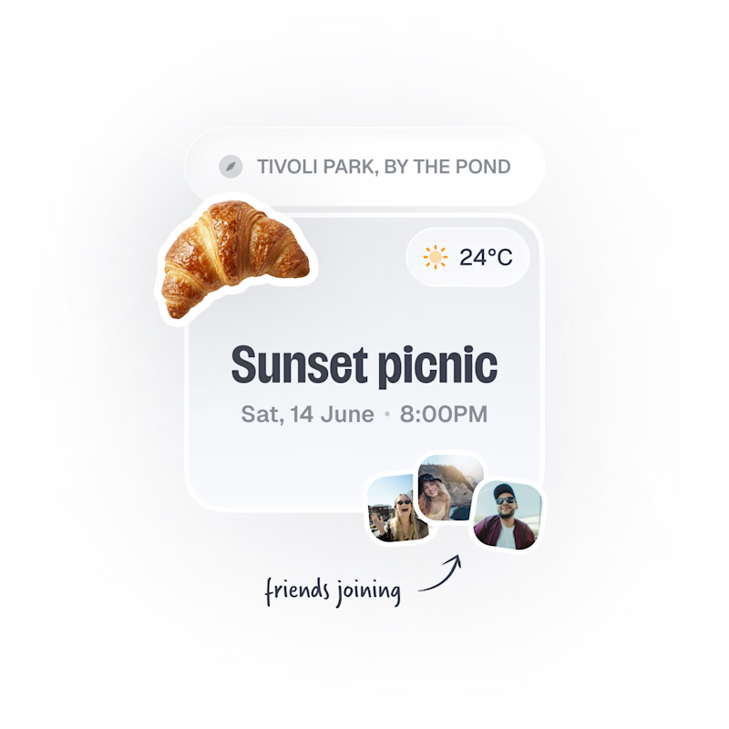
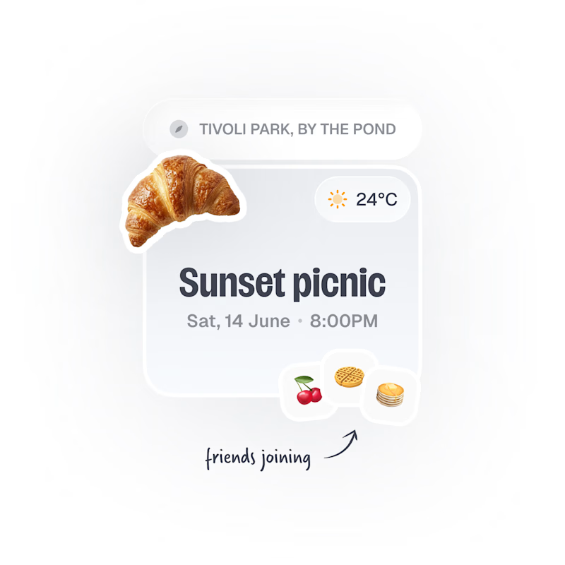
Upcoming card design for a Picnic App 🥞🧺🍎
Do we like the idea of images or predefined avatars more?:)
20 voted
83%
4 voted
17%
24 votes
Closed

Images, with the fruit avatars as the fallback for anyone without a photo. Faces are how you spot your friends at a glance, and the croissant already gives the card plenty of personality.