The network for creativity
Join 1.25M professional creatives like you
Connect with clients, get discovered, and run your business 100% commission-free
Creatives on Contra have earned over $150M and we are just getting started
Back to feedPost

Web & Mobile Design
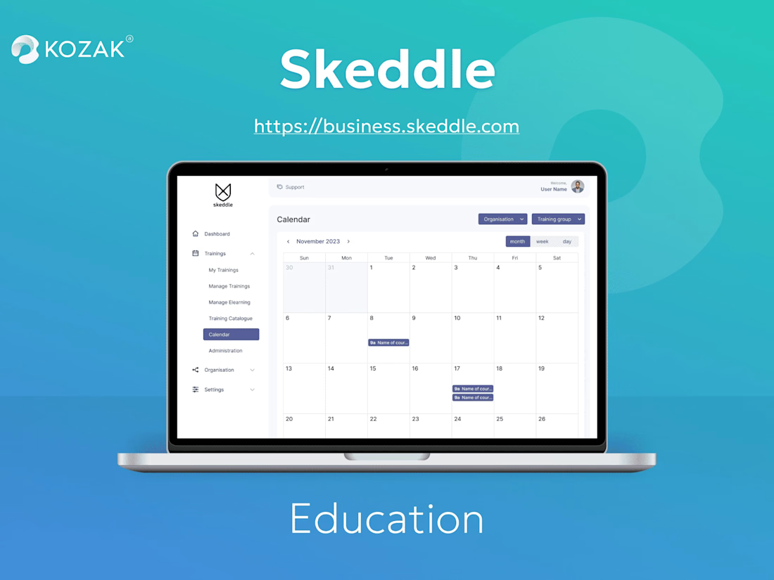
Angular , TypeScript , DevExpress , Website Redesign , Web Development , Design Analysis , Design Mockup , Figma , Git , REST API , Business AnalysisSkeddle is a central platform to manage trainings and qualification activities holistically


The network for creativity
Join 1.25M professional creatives like you
Connect with clients, get discovered, and run your business 100% commission-free
Creatives on Contra have earned over $150M and we are just getting started

Challenges
View all


Related posts

Ledger — AI CFO Platform
Ledger is an AI platform that acts as an always-on Chief Financial Officer for founders — connecting to accounts, learning cash rhythm, and surfacing risks before they become real problems. I designed the full landing page.
My role: UI/UX Design
Scope: Landing page
Financial tools for founders usually feel either cold (dashboards) or intimidating (accounting software).
For Ledger, we borrowed from old-world institutional finance instead — serif type, oil-painting textures, classical architecture — so an AI CFO feels like real authority, not another app.


This color pallet works so well with data and makes everything look premium. love it!

A fresh take on file sharing & storage.
Designing a modern, simple, and user-friendly platform where users can upload, store, organize, and share files effortlessly. From secure storage to seamless file sharing, every interaction is designed to feel fast, intuitive, and reliable.
More details coming soon. Stay tuned!
#WebDesign #UXDesign #UIDesign #FileSharing #CloudStorage #Artificial Intelligence #InteractionDesign #ModernUI #ProductDesign #Figma #GeeksInDesign

The gradient blob doing double duty as both brand texture and a visual metaphor for data flow is a nice touch. Curious how Securitan differentiates on the security side once the full site lands.

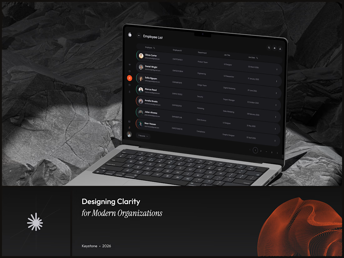
Keystone - HR Management Platform
Employee list screens are the homework assignment of SaaS design. A table is a table is a table. Nobody's winning an award for this view and that's exactly why it matters.
The restraint here is the point. No colored tags, no status badges fighting for attention, no dashboard widgets crammed into the sidebar. Just the data, breathing in a dark container with enough row spacing that your eyes don't blur at record five.
That split between a bold brand identity and a restrained product UI is one of the hardest things to get right in B2B SaaS.
#SaaS #DashboardDesign #DarkUI #B2BTech #ProductDesign


"A table is a table" is the harder argument to make internally than the design itself - most teams would've shipped colored status tags just to have something to show in a review.