The network for creativity
Join 1.25M professional creatives like you
Connect with clients, get discovered, and run your business 100% commission-free
Creatives on Contra have earned over $150M and we are just getting started
Back to feedPost

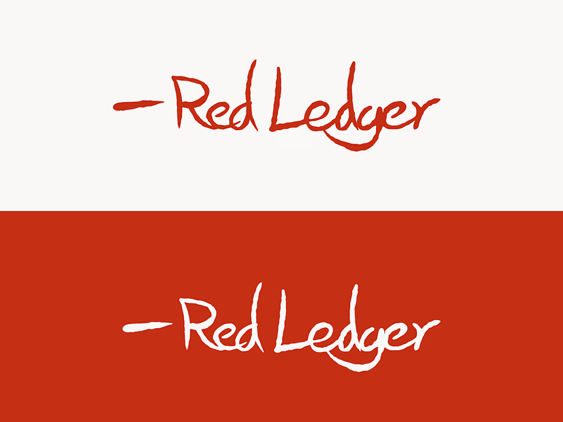
I’ve decided to officially offer my bookkeeping services under a new name: Red Ledger.
The logo is intentionally hand-drawn, loosely written, and a little rough around the edges. I wanted it to feel less like a polished financial institution and more like what the name suggests: a practical red ledger kept by a real person trying to keep the numbers organized.
That low-budget, approachable feeling is part of the identity. Bookkeeping doesn’t need to feel intimidating or overly corporate. It should feel clear, useful, and dependable.
Red Ledger provides remote QuickBooks Online bookkeeping support for U.S.-based small businesses and independent consultants. I’m currently accepting up to four clients at $600/week for ongoing support.
I’m excited to start building this side of my work, and I’d be happy to connect with anyone who could use help keeping their books organized.


The network for creativity
Join 1.25M professional creatives like you
Connect with clients, get discovered, and run your business 100% commission-free
Creatives on Contra have earned over $150M and we are just getting started





Related posts

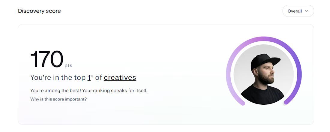
Top 1% on Contra. 🎉
A little milestone, but a reminder that showing up and doing good work consistently actually pays off.
If you're just starting out and wondering if it's worth it: it is. Keep going.
Thanks to all my clients and everyone here who's been so supportive.


That's Legendary bro congrats 🔥🔥🔥🔥


Your homepage should answer one question: what do you do? If a visitor can't answer that in five seconds, everything below the fold doesn't matter.


I just saw Bright Studios’ new website. You guys nailed it! Really like it.

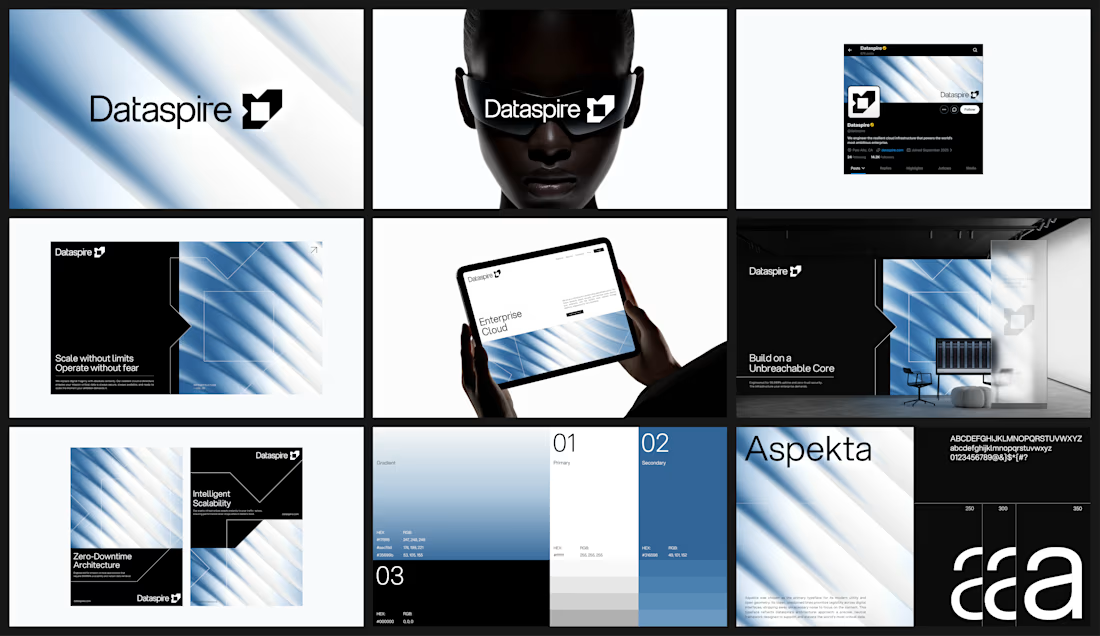


feels very sure of itself. i can picture this blown up on a conference stage