The network for creativity
Join 1.25M professional creatives like you
Connect with clients, get discovered, and run your business 100% commission-free
Creatives on Contra have earned over $150M and we are just getting started
Back to feedPost
An ecommerce website experience for a footwear brand, designed to combine comfort-led product storytelling, clear collection discovery, and a dedicated path for wholesale enquiries.
Project overview
Carbon Footwear is a footwear brand focused on premium-quality slippers for men, women, and children. The website needed to communicate more than a product catalogue. It had to introduce the brand with confidence, help shoppers explore the right collection quickly, explain the quality behind each pair, and support wholesale buyers looking for a reliable manufacturing or supply partner.
The resulting experience combines strong product imagery, warm editorial styling, clear category navigation, and practical calls to action. Every section contributes to one consistent message: Carbon Footwear delivers comfort, style, durability, and dependable quality for every step.
The homepage was structured as a complete brand journey. It begins with the emotional benefit of comfort, moves into product discovery, explains the materials and craftsmanship behind the footwear, shows the products in a lifestyle setting, and finishes with a focused wholesale partnership section.
Deliverables
Full ecommerce homepage design
Product and collection presentation system
Retail and wholesale user journeys
Content hierarchy and UX structure
Brand-led visual direction
Product benefit and craftsmanship sections
Conversion-focused calls to action
Responsive design direction
Project outcome
The finished design gives Carbon Footwear a polished digital presence that reflects the look and feel of its products. It creates a clear hierarchy across the homepage, gives each collection a distinctive place, and makes quality visible through close product details and structured proof points.
The website also presents the brand as commercially capable. Retail customers receive an attractive route into the collections, while wholesale partners receive a direct explanation of the business value and an obvious enquiry path.
The overall result is an ecommerce experience built around comfort, craft, and confident product discovery.


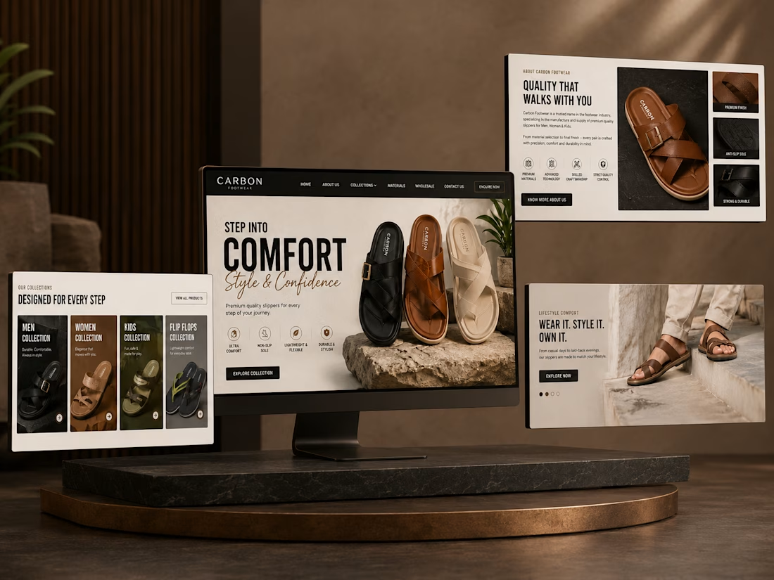
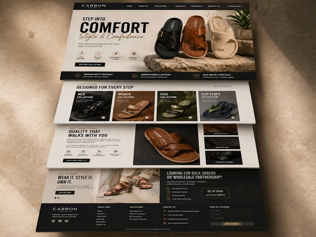

Ending the homepage sequence on the wholesale enquiry instead of burying it in a footer link is the sharper call — most brand sites treat B2B as an afterthought, and that ordering signals it's a real revenue channel, not a contact-form checkbox.

Exactly, that was intentional. Carbon Footwear serves both retail customers and wholesale partners, so I wanted the homepage to give B2B buyers a clear, dedicated path after the product and quality story had already established trust. I'm relieved someone could see the purpose
The network for creativity
Join 1.25M professional creatives like you
Connect with clients, get discovered, and run your business 100% commission-free
Creatives on Contra have earned over $150M and we are just getting started

Challenges
View all


Related posts

Logo and branding work for Doctus
I made sure that they look modern, fresh and more calming being a technical product
the goal was to have a calm, and natural language overall the design to stand out from all the technical companies
website is still WIP
#branding #saas #logo #design #fundraise #doctus #figma #uiux

Most real estate brands look like they were designed not to offend anyone. Arcova was designed to be impossible to ignore.
Electric lime. Forest green. A house mark that owns a building facade as confidently as it owns a tote bag. "Build where others only look." "What we build today is what stands tomorrow."


Pet shopping, with a little more personality. 🐾
Introducing WIGGLE CLUB — my latest pet-commerce website concept.
Bold typography, cobalt blue, acid-yellow accents and editorial photography bring the brand to life across the shopping experience.
The design includes:
✦ Detailed desktop and mobile layouts
✦ Reusable Figma components and Auto Layout
✦ A connected design system
✦ Product discovery, wishlist and checkout prototype flows
From the homepage to the smallest shopping detail, the goal was a playful brand experience with clear, practical navigation.
What catches your eye first—the typography, photography or layout?
#WebDesign #Figma #UIUXDesign #EcommerceDesign #DesignSystem


awesome