The network for creativity
Join 1.25M professional creatives like you
Connect with clients, get discovered, and run your business 100% commission-free
Creatives on Contra have earned over $150M and we are just getting started
Back to feedPost

My new Framer template is live.
Praxa. Built for legal AI platforms, B2B SaaS, and consulting firms that sell to enterprise buyers.
Most AI templates default to dark mode, glowing gradients, and startup energy. Praxa is the opposite. Light mode, clean, enterprise-grade from the first scroll.
Features, use cases, blog, security, careers. Everything a serious product company needs to show up credibly online.
Link: https://praxa.framer.website


The network for creativity
Join 1.25M professional creatives like you
Connect with clients, get discovered, and run your business 100% commission-free
Creatives on Contra have earned over $150M and we are just getting started
Related posts

Here's an embossed signature at the bottom of a portfolio template made in Framer.

that's satisfying 🍷

What if a Landing page could feel less like a Landing page and more like opening a door to another world?
I'm exploring this idea with Elsewhere, a visual discovery concept built around extraordinary landscapes, hidden places, and inspiration worth getting lost in.👀
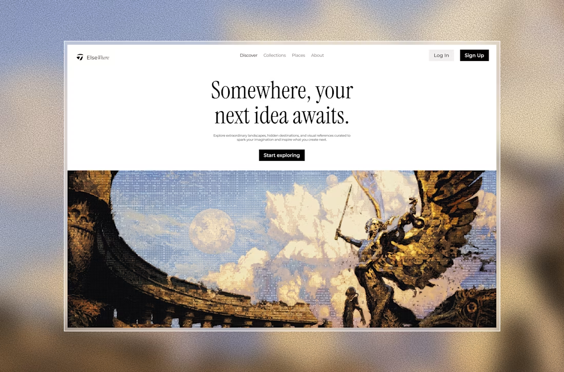

Would be a gread concept

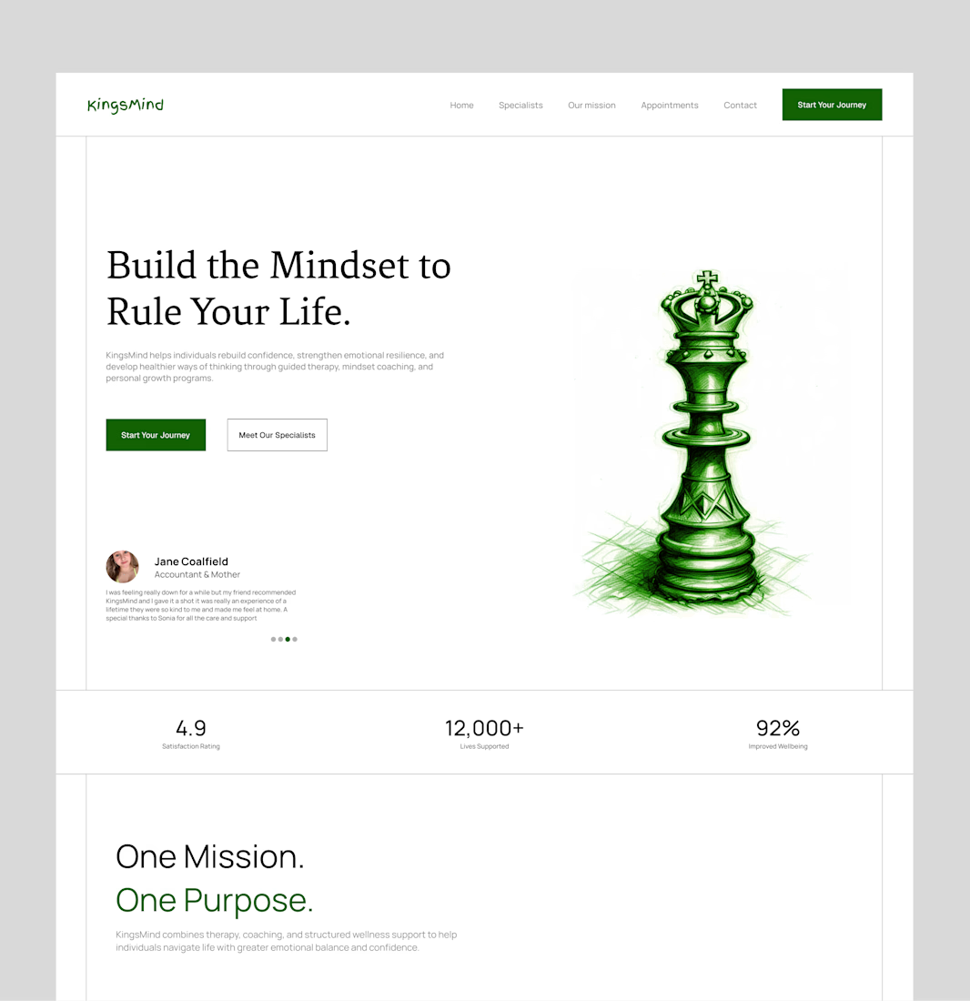
Bringing an old hero section design back to the spotlight. ✨
A hero section is often the first thing people see when they visit a website, so it needs to do more than just look good. It should capture attention, communicate the brand's message, and guide visitors toward the next step.
For this concept, I focused on creating a clean layout, strong visual hierarchy, and a balanced composition that makes the content feel clear and engaging without overwhelming the viewer.
Looking back at older projects is always a good reminder of how much thought goes into the little details that make a design work.
What do you think of this one? 👀
#WebDesign #UIUXDesign #HeroSection #LandingPageDesign #Framer #WebDesigner #UIDesign #DesignInspiration #Contra #PortfolioWork


this is amazing design