The network for creativity
Join 1.25M professional creatives like you
Connect with clients, get discovered, and run your business 100% commission-free
Creatives on Contra have earned over $150M and we are just getting started
Back to feedPost

Bringing an old hero section design back to the spotlight. ✨
A hero section is often the first thing people see when they visit a website, so it needs to do more than just look good. It should capture attention, communicate the brand's message, and guide visitors toward the next step.
For this concept, I focused on creating a clean layout, strong visual hierarchy, and a balanced composition that makes the content feel clear and engaging without overwhelming the viewer.
Looking back at older projects is always a good reminder of how much thought goes into the little details that make a design work.
What do you think of this one? 👀
#WebDesign #UIUXDesign #HeroSection #LandingPageDesign #Framer #WebDesigner #UIDesign #DesignInspiration #Contra #PortfolioWork
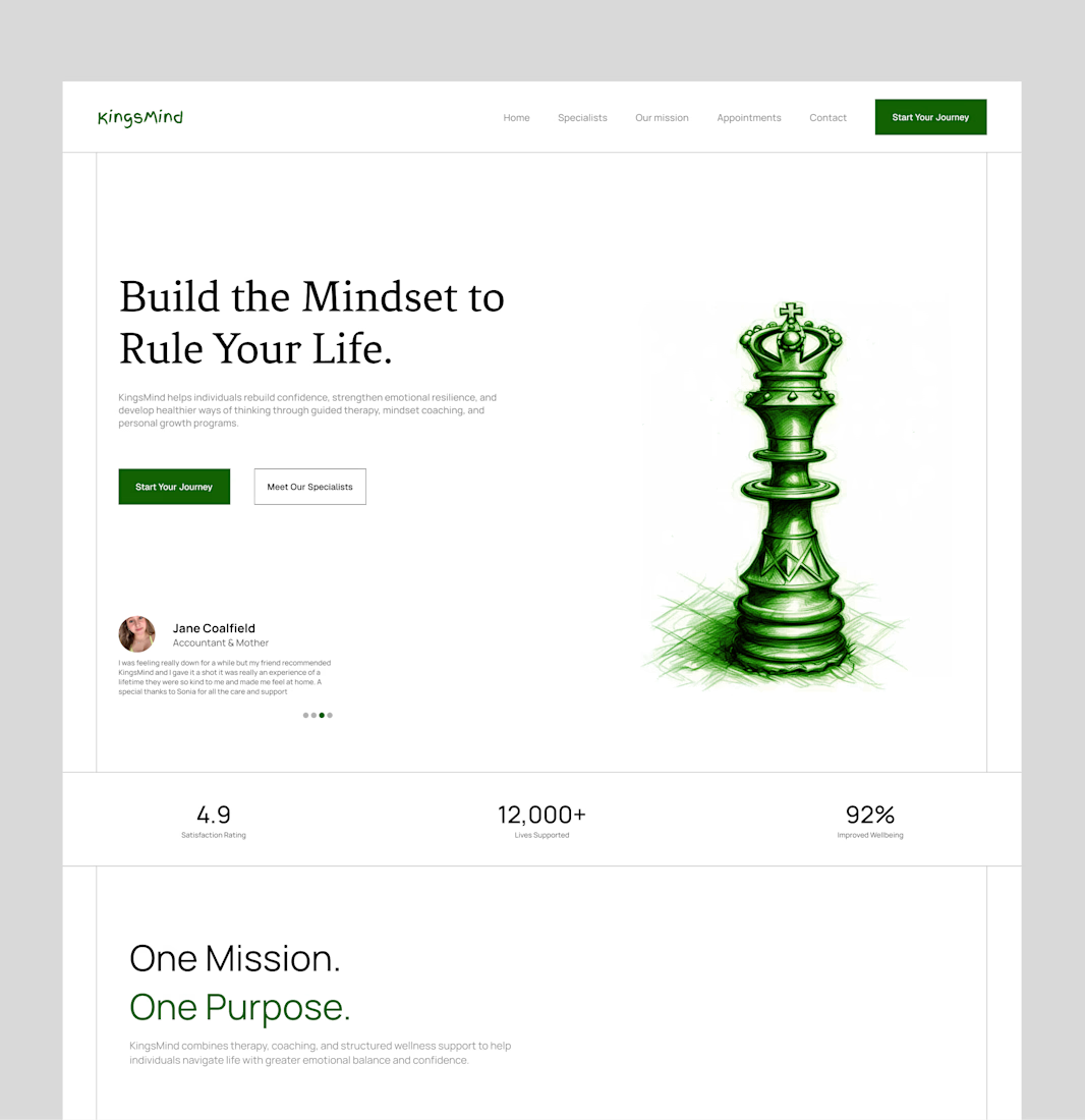

The green chess king and the serif headline give KingsMind a calm, serious feel, and the 4.9, 12,000+ and 92% strip right under the hero is well placed. My challenge: Build the Mindset to Rule Your Life with a king piece reads as power and control, while the page is about...

this is amazing design
The network for creativity
Join 1.25M professional creatives like you
Connect with clients, get discovered, and run your business 100% commission-free
Creatives on Contra have earned over $150M and we are just getting started



Related posts


New project: a film-first website for Portugal Media Productions, an award-winning film and photography team whose work includes David Beckham for Haig Club. Built in Framer on our Nova Quinn template, with headlines over full-screen footage, a moving client logo strip, and a site the team now edits on their own.
The full case study is on my profile.


Build with Framer?



Nice work

The full landing page design is complete.
I designed this website for a web design and development agency, with founders and growing businesses in mind.
Clear services, selected work, straightforward pricing and answers to common questions. Each section helps visitors understand the offer and take the next step.
Visually, I kept it consistent with teal accents, structured grids and corner details throughout.
Good to see all the sections come together.

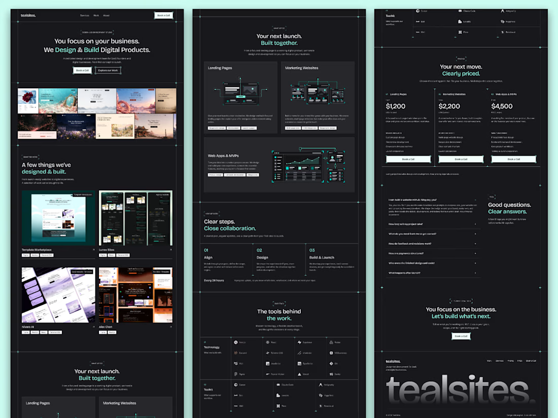

Love how you’ve focused on clarity and consistency! The clear services and pricing make it easier for visitors to understand the offer and take the next step. 👏✨

