The network for creativity
Join 1.25M professional creatives like you
Connect with clients, get discovered, and run your business 100% commission-free
Creatives on Contra have earned over $150M and we are just getting started
Back to feedPost
Taste Test
For a conceptual teddy bear brand which art direction would you go for? content videos or adspots and why?

3 voted
30%
7 voted
70%
10 votes
Closed

The #fusercocreate hackathon entry this came out of:
https://contra.com/community/kqszRsgW-optimize-video-model-selection-with-fuser
contra.com
Optimize Video Model Selection with Fuser Studio’s Model Arena
Connect with next-gen talent and tools to get work underway. Hire more independents. Start more projects. Get more creative.

i a mock brand for the fuser hackathon, didn't make mock user avatars too 😉 .
Really if i took this further it would be a mix of the fridge drawing being a portal narrative device


I went with Stylized Realism - Feels more modern and alive!
The network for creativity
Join 1.25M professional creatives like you
Connect with clients, get discovered, and run your business 100% commission-free
Creatives on Contra have earned over $150M and we are just getting started








Related posts

FOCUS — Creative Portfolio & Digital Art Website 🌸✨
A visually expressive website concept for a creative portfolio, built around digital art, bold imagery, and visual storytelling
The design combines vibrant pink tones, soft gradients, experimental typography, and immersive photography to create a distinctive editorial experience
Special attention was given to:
• Bold editorial hero composition
• Vibrant pink and dark color palette
• Experimental typography and visual details
• Immersive photography and digital artwork
• Creative project gallery and navigation
• Responsive mobile experience
• Clean layouts with a strong visual identity
The result is an expressive digital experience that puts creativity, emotion, and visual storytelling at the center of every screen 💗
Looking to create a standout portfolio or website for a creative brand? Let’s connect 🚀







An existing brand identity showcased across a new campaign. This was one of my favourite projects ever!

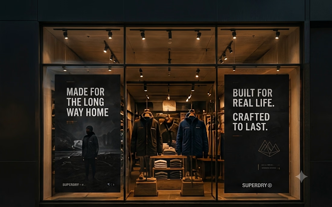
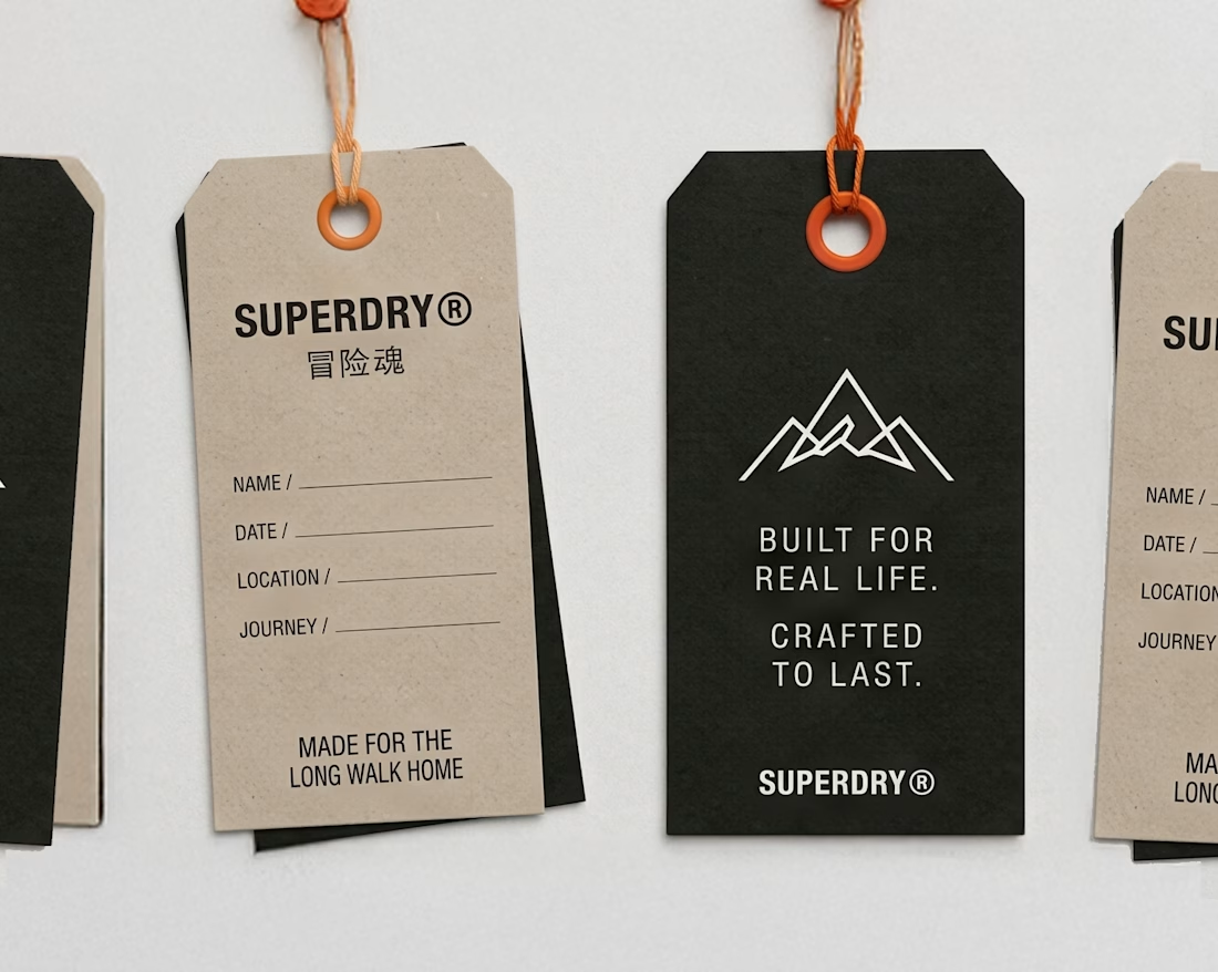
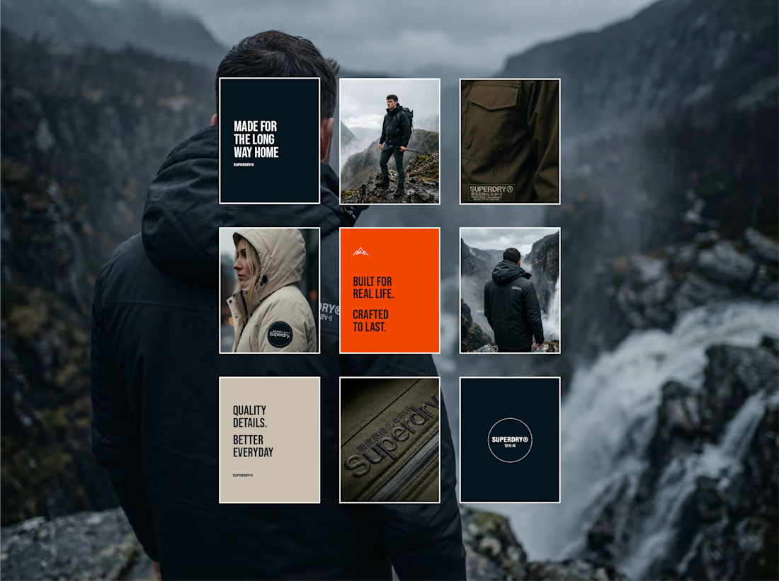

Taking an existing identity and stretching it across a whole new campaign is such a good test of a system. This looks like one of those projects where everything just clicked.

The brief was simple. Show a new personalized news feature.
The obvious solution was to show a few clicks in the UI as you choose your topics. Clear, but not very interesting.
So I pulled that moment out of the interface first and turned it into a cloud of topics. You get the idea before you even see the product, then the video drops you back into the real UI and shows where it lives.
I really like these tiny decisions. The feature stays the same, but it feels easier to get and a lot more fun to watch.


Pulling the topic cloud outside the UI makes the feature instantly clearer.