The network for creativity
Join 1.25M professional creatives like you
Connect with clients, get discovered, and run your business 100% commission-free
Creatives on Contra have earned over $150M and we are just getting started
Back to feedPost


amazing
The network for creativity
Join 1.25M professional creatives like you
Connect with clients, get discovered, and run your business 100% commission-free
Creatives on Contra have earned over $150M and we are just getting started

Challenges
View all


Related posts


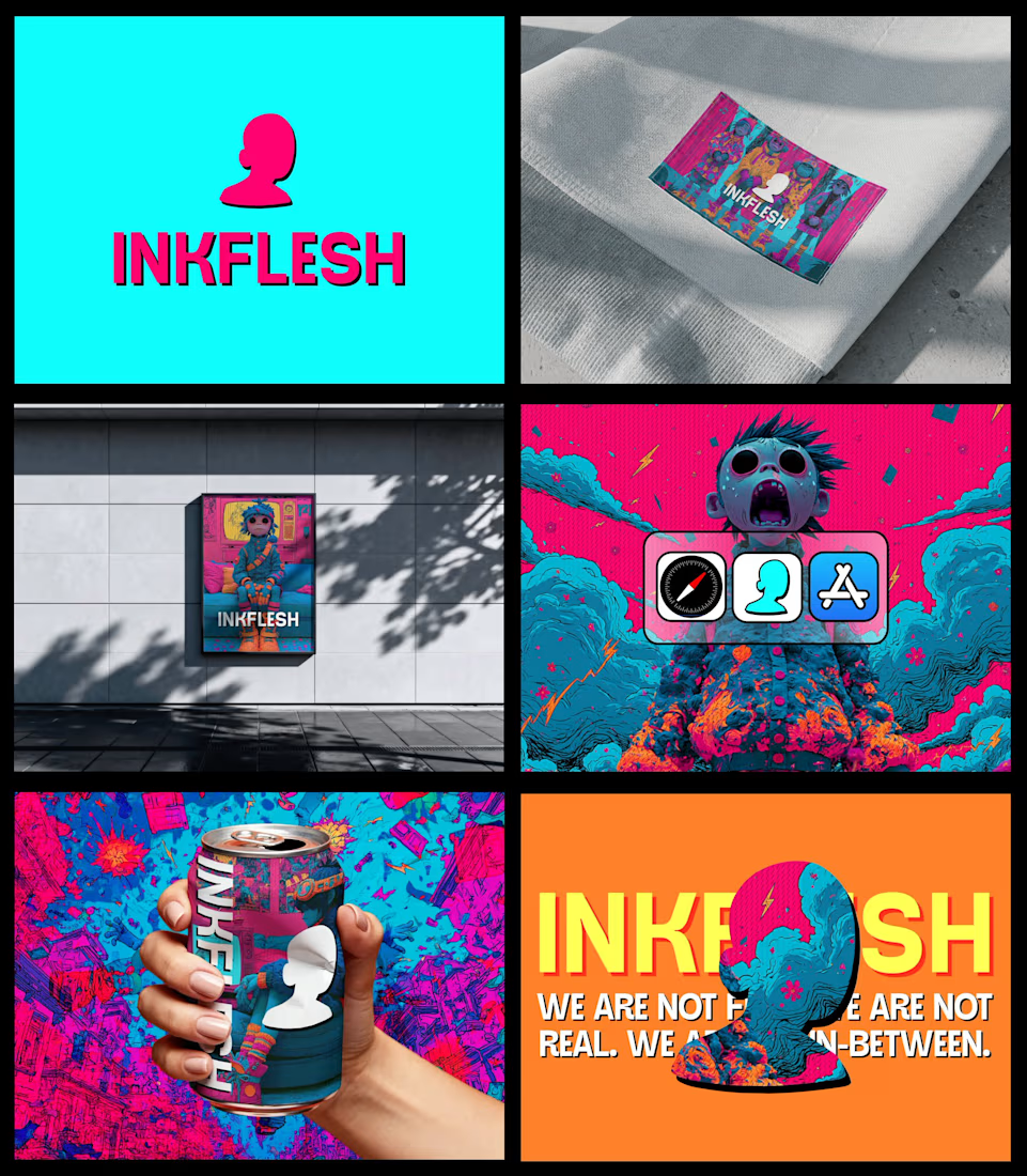
In my INKFLESH identity work, the wordmark runs off the can's curve and gets partly hidden behind artwork on posters. That crop asks the rest of the identity to carry more recognition. The mark has a job when the name is only partly there.

Hover animation made with Rive. Smooth, playful, and interactive.


3D Motion Design - A vs B Poll - Minimal White vs Premium Detailed Copper coins with F logo flowing in spiral. Which feels more premium? Rendered in Blender 4.2, 4:3 (1600x1200), 98% photoreal.
2 voted
13%
13 voted
87%
15 votes
Closed