The network for creativity
Join 1.25M professional creatives like you
Connect with clients, get discovered, and run your business 100% commission-free
Creatives on Contra have earned over $150M and we are just getting started
Back to feedPost
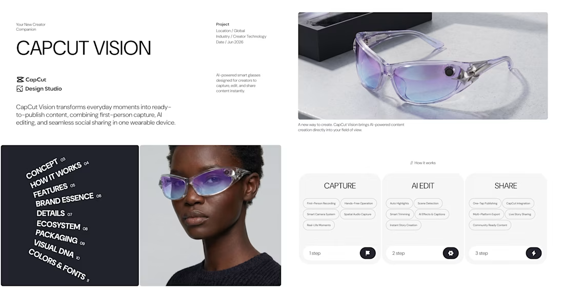
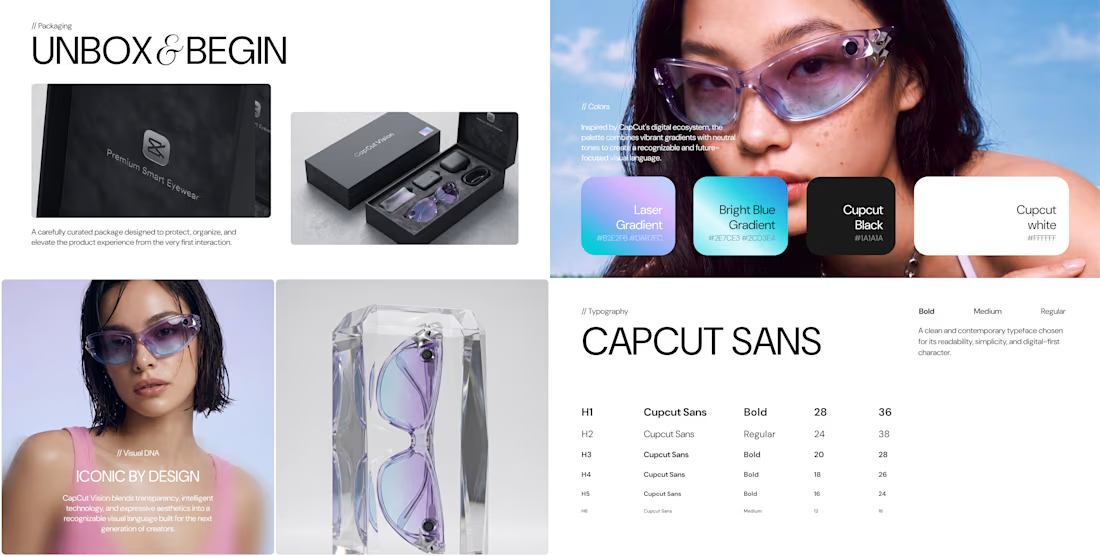
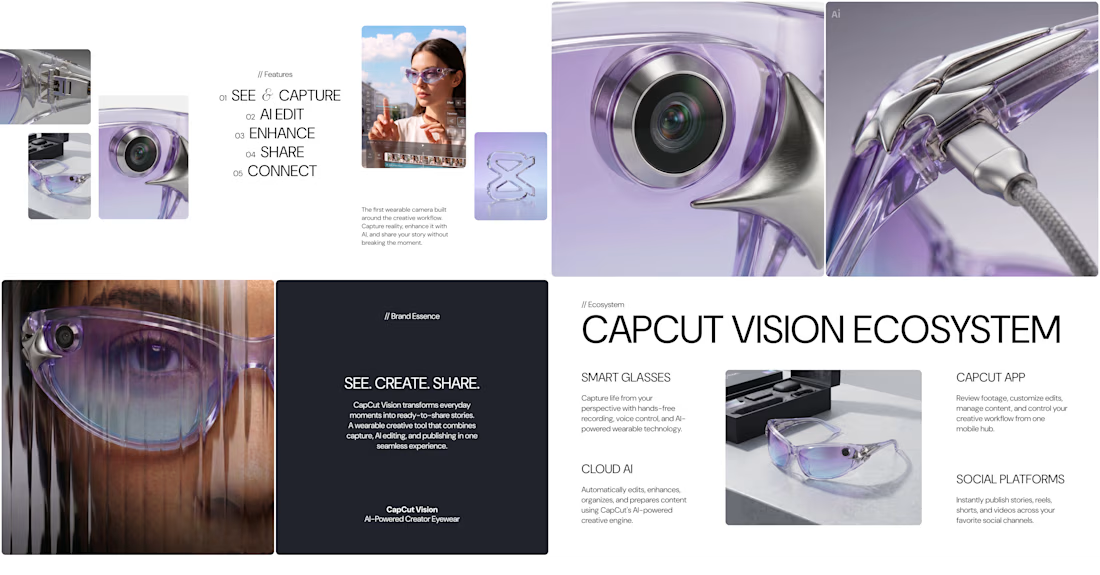
For the #CapCutDesignStudio Challenge, I created 𝗖𝗮𝗽𝗖𝘂𝘁 𝗩𝗶𝘀𝗶𝗼𝗻 — a concept that reimagines CapCut as a wearable technology company 💎
[𝗗𝗶𝗿𝗲𝗰𝘁𝗶𝗼𝗻 𝗔] 𝗖𝗮𝗽𝗖𝘂𝘁 𝗮𝘀 𝗮 𝗗𝗶𝗳𝗳𝗲𝗿𝗲𝗻𝘁 𝗜𝗻𝗱𝘂𝘀𝘁𝗿𝘆
CapCut Vision transforms CapCut from a video editing platform into an AI-powered smart eyewear ecosystem designed for the next generation of creators. CupCut Vision allows creators to capture moments, transform them through AI, and instantly share them with the world.
I was inspired by CapCut's mission to make creativity accessible to everyone, and I imagined a future where capturing, editing, and sharing content happen as one seamless experience.
[𝗣𝗿𝗼𝗷𝗲𝗰𝘁 𝗢𝘃𝗲𝗿𝘃𝗶𝗲𝘄]
For this submission, I developed:
• Brand Concept
• Visual Identity System
• Product Design Language
• Smart Glasses Design
• Packaging Experience
• Creator Ecosystem
• Presentation Deck
[𝗪𝗼𝗿𝗸𝗳𝗹𝗼𝘄]
To demonstrate my workflow, I also included:
• Recording of the entire creation process
• Brand Concept Presentation
• Complete Design Studio chat history
[𝗠𝘆 𝗘𝘅𝗽𝗲𝗿𝗶𝗲𝗻𝗰𝗲] ❤️
One thing I genuinely enjoyed while working on this project was how intuitive CapCut Design Studio felt ❤️
I realized that great results don't necessarily come from writing perfect prompts. Most of my process involved combining references, exploring visual directions, refining ideas, and iterating creatively. Design Studio made it easy to move from inspiration to concept development and final presentation within a single workspace 🔥🔥🔥
[𝗗𝗲𝘀𝗶𝗴𝗻 𝗦𝘁𝘂𝗱𝗶𝗼 𝗙𝗲𝗮𝘁𝘂𝗿𝗲𝘀 𝗨𝘀𝗲𝗱]
Throughout the project, I used Design Studio for inspiration gathering, visual exploration, product ideation, branding, packaging concepts, and ecosystem development.
Thank you to the CapCut team for creating a platform that encourages experimentation, creativity, and exploration 🫶
[𝗟𝗶𝗻𝗸𝘀]
CupCut Design Studio Chat History: https://www.capcut.com/ai-design?shareId=7647947968217202695
Brand Concept Presentation: https://www.figma.com/proto/reTVCLZxw73WBxxaJOePS0/CAPCUT-VISION?node-id=1-285&viewport=701%2C169%2C0.02&t=Z6lxfa2Fi8czJOxo-1&scaling=contain&content-scaling=fixed&page-id=0%3A1
Video explainer (the same as attached): https://docs.google.com/videos/d/1SSDBHyguM5hNoItyjONVOOouXbL54xgNCdo3w-8jDv8/edit?usp=sharing
If you like this concept and the work behind it, I’d be incredibly grateful for your support. Every like, comment, share, or vote means a lot. Thank you! 🙌



Amazing concept! 💜 I really like how you reimagined CapCut as a wearable tech brand
My favorite part is the AI ecosystem around the glasses. Curious, which part of the project was created first, the eyewear design or the ecosystem idea behind it? 👀


Thank you so much! 💜 The ecosystem actually came first. I wanted to imagine CapCut as a complete creative companion
Everything else, the visual identity, packaging, and brand language, was built around that core vision, thank you so much for your support 🫶🫶🫶🫶

Wow, so cooool Alex, as usual, one of the best works, the most impressive that you really dont need to be able to prompt well, you just need to combine the pictures, this is new stage of AI 🔥🔥🔥
Thank you sooooo much Roman ❤️✨🫶

Wow, that so stylish, Alex! I always enjoy what you create it looks really cool. I’d love to get one of these AI glasses and take pictures of everything around me. And thanks for sharing the chat story 🤓💎
Kaaaaate thank you so much ૮꒰˵• ﻌ •˵꒱ა

Excellent
Thaaank you so much Kiran 𐔌՞ ܸ.ˬ.ܸ ՞𐦯
Welcome 😊
𝗟𝗶𝗻𝗸𝘀 𝘁𝗼 𝘀𝗼𝗰𝗶𝗮𝗹 𝗺𝗲𝗱𝗶𝗮 𝗽𝗼𝘀𝘁𝘀:
Linkedin 1 :

This is such a smart take on the challenge. The idea of turning CapCut into an AI-powered wearable ecosystem feels surprisingly natural. Great concept and excellent execution🔥 🔥 🔥 🔥
Thank you so much, Michael, your support means a lot to me

Wow, this is a completely new take on the Capcut, and I love it. Now I even wish they existed in real life. Great work, one of the best 👏
Thank you, thank you, thank you Diana ❤️✨🫶💃


Thaaanks Ilya for your support

so cool!
Thaaank you :)

the color palette you chose along with the font's simplicity is such a magnetic combination. very sleek, chic, has that sort of true cyber-y2k feeling about it instead of manufacturing it through nostalgic imagery.
Thank you so much Nicolette 🫶

The spacing consistency throughout the layout makes the design feel very polished.
Thank you so much Abu Bookor 🙌 😍

Your submission is like mine but nicer, well done.
Thank you so much Sebastian, I've checked your submission , great idea 🔥

Looks nice and clean
Thank you Sharon 😍

Great work
Thaaaank you so much 😍
You are always welcome

ooooh I like your vision!
Thaaank you so much Silvia 😍 🎉

Congrats on winning the challenge, Oleksandra! It was well deserved! 👌
The network for creativity
Join 1.25M professional creatives like you
Connect with clients, get discovered, and run your business 100% commission-free
Creatives on Contra have earned over $150M and we are just getting started








Related posts

Post
Luxury Sound — Premium Headphones Landing Page 🎧✨
A premium landing page concept for a luxury audio brand, built around a bold headphone design and a refined visual experience
The design combines warm neutral tones, glowing details, oversized product visuals, and minimal typography to create a futuristic yet elegant feel
Special attention was given to:
• Product-first composition
• Premium visual direction
• Feature highlights
• Lifestyle imagery
• Clear CTA placement
• Responsive mobile experience
The result is a clean, immersive product experience that makes the headphones feel like more than tech — they become part of the lifestyle 🔥


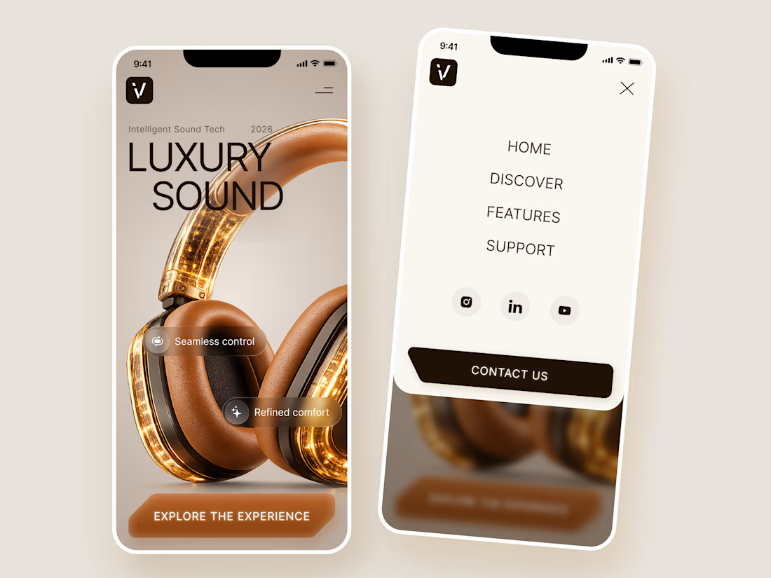
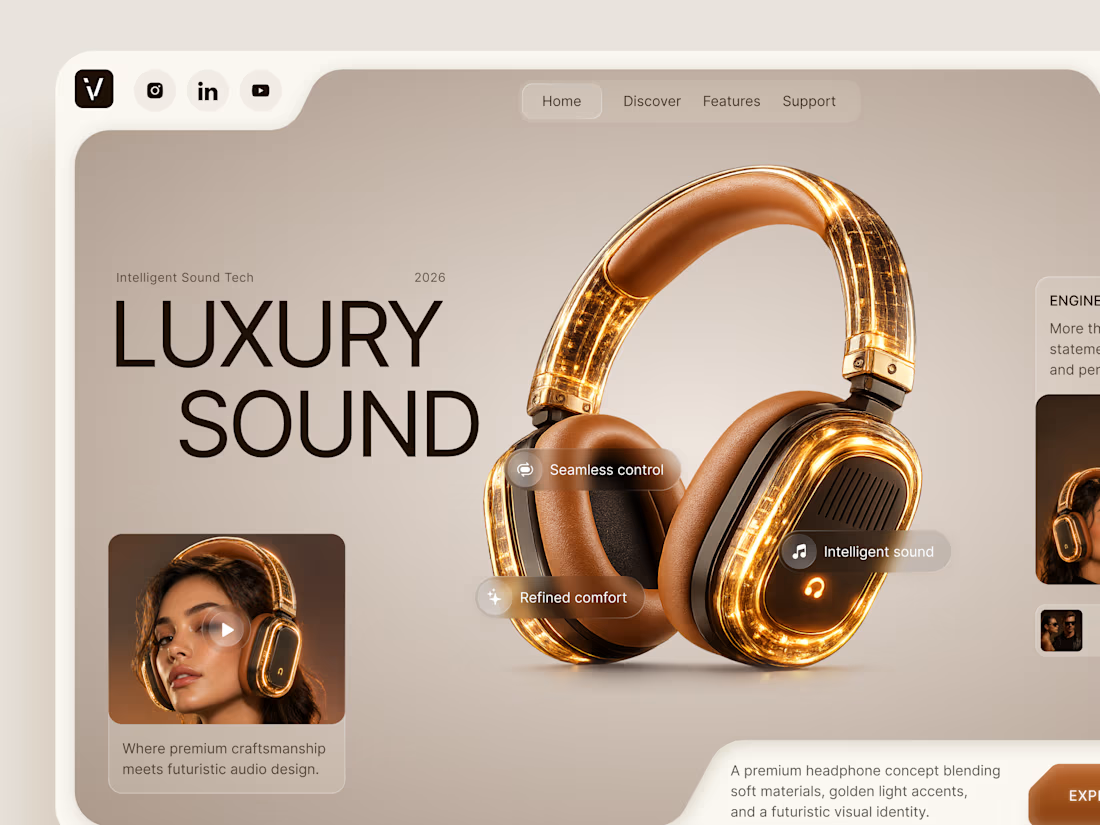
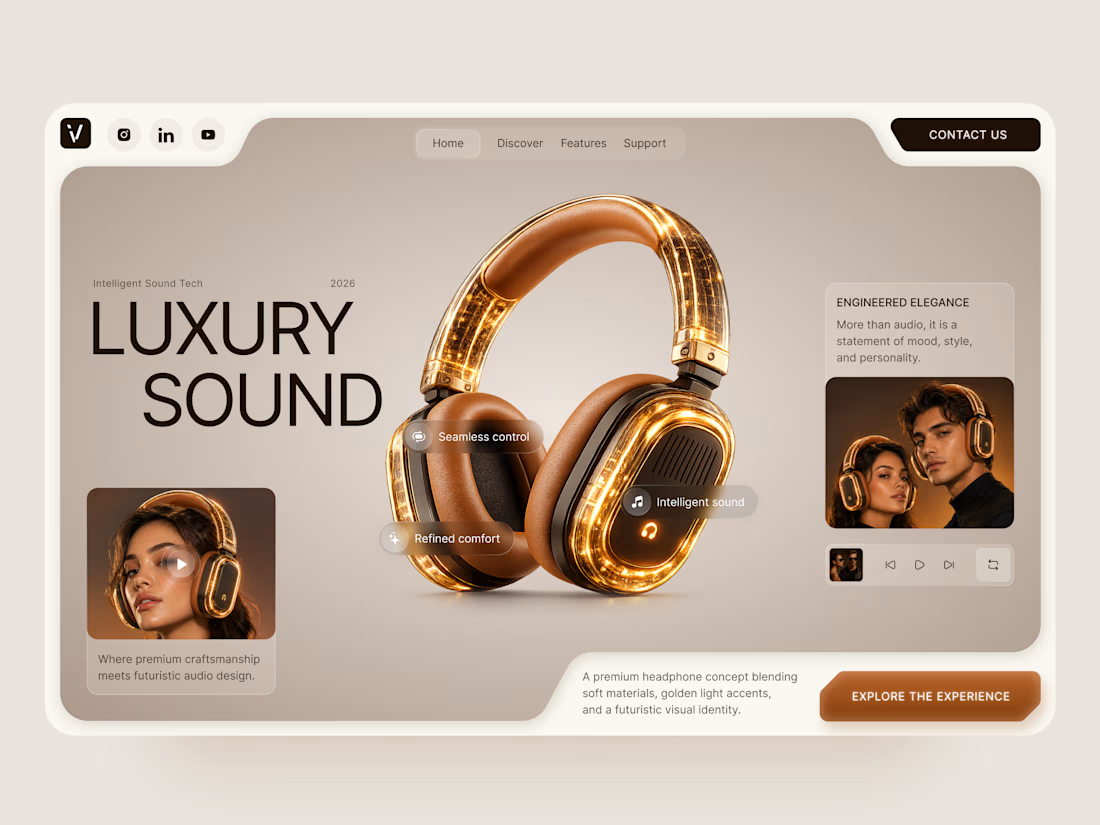

The amber glow on the headphones against that warm beige is lovely. How does the mobile menu handle the product image?

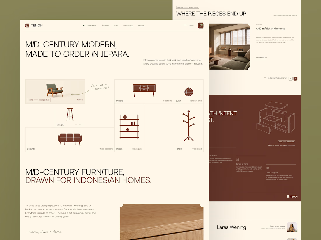
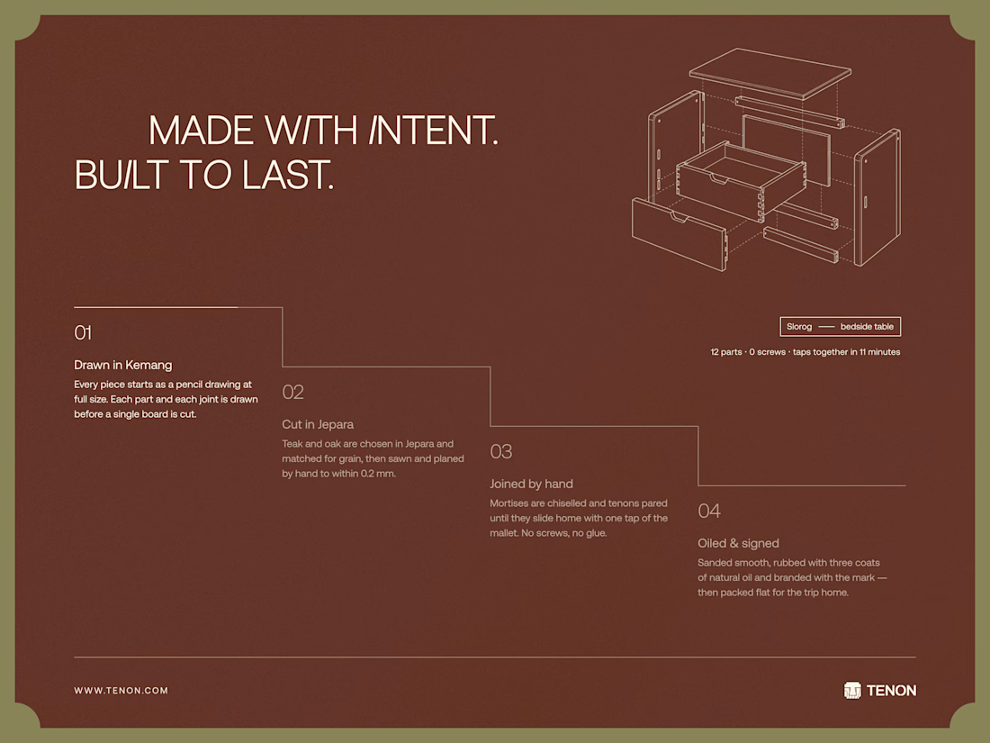
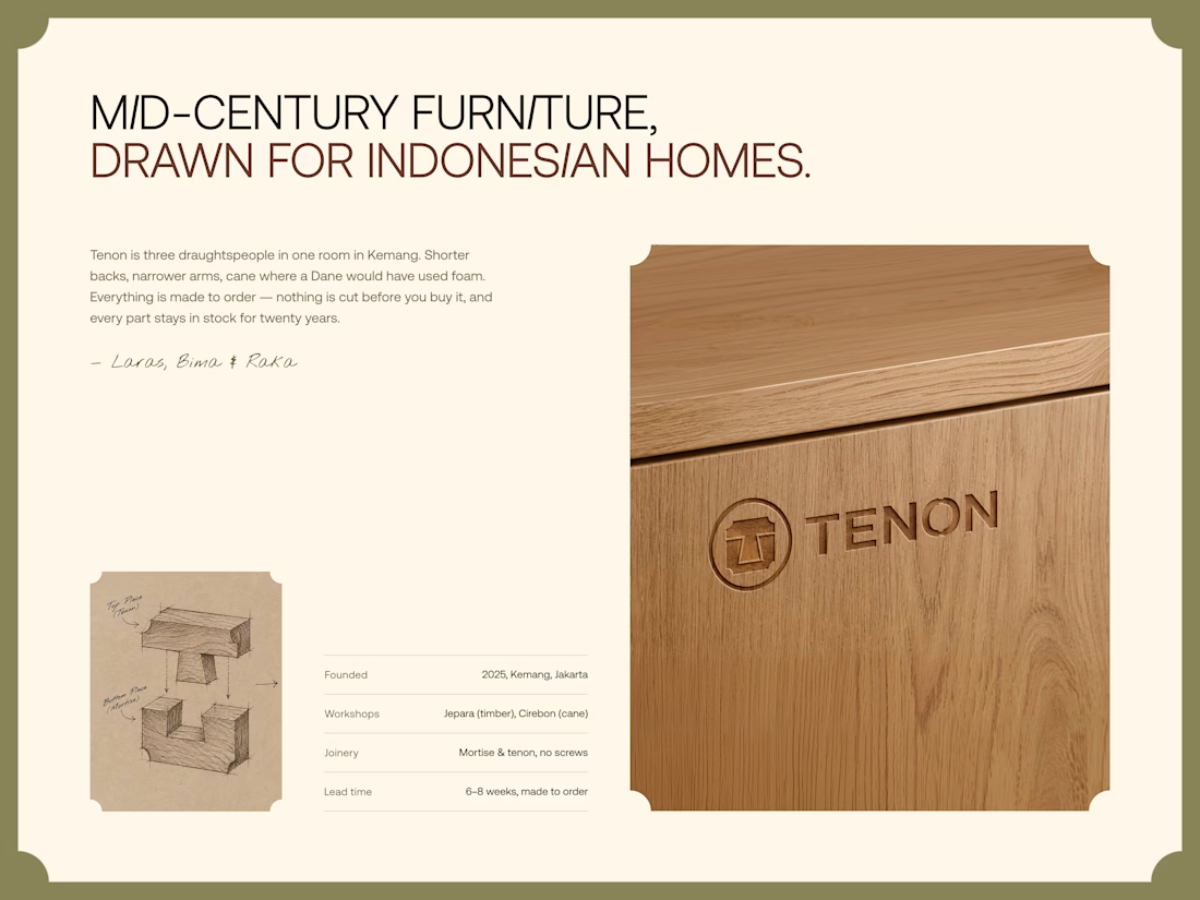
Tenon is Furniture Website Design
Exploring a digital experience for an Indonesian furniture brand inspired by mid-century modern design.
The website brings together product discovery, storytelling, and visual direction to make the digital experience feel as considered as the furniture itself.
Made to order. Made to last.
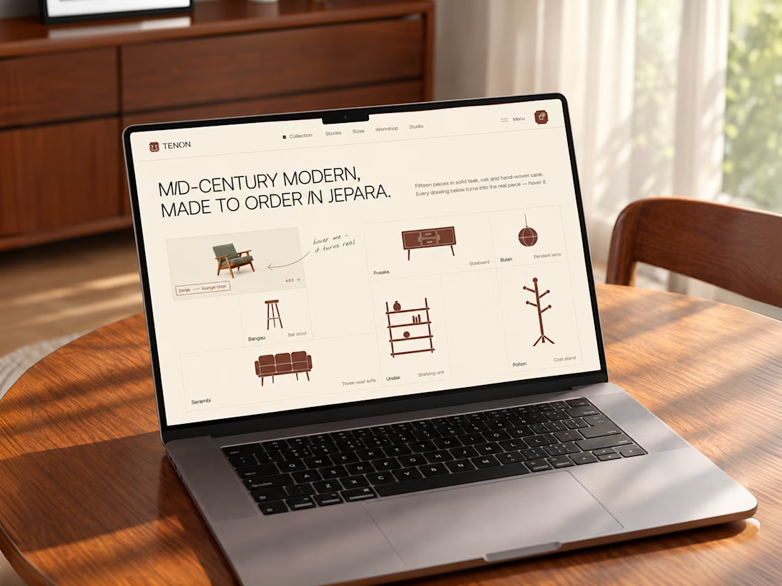

Love the color choice used

The best part of this website might be the page nobody is supposed to see.
About 4 months ago, we launched the new website for STORY Design Amsterdam.
STORY is all about giving homes personality, so we wanted the website to have some too.
Including their 404 page.
Naturally, I put the owner's dog on it.
If you end up on the wrong page, you might as well enjoy it.
But the fun details only work if the website itself does too.
Before the launch, most of their website traffic came through Instagram.
Today, around 60% comes from Google.
And now we've taken the next step by adding a little shop, so people can buy their kitchen handles directly from the site.
Next up: a great about us page; photoshoots are already planned.
I don't design websites that often.
But when I do, I don't want to create something that could belong to any business.
It should feel like their business. Do you think I achieved that?


Great work, Bram