The network for creativity
Join 1.25M professional creatives like you
Connect with clients, get discovered, and run your business 100% commission-free
Creatives on Contra have earned over $150M and we are just getting started
Back to feedPost
Taste Test
I’m currently building out the hero section for a conceptual wilderness retreat brand called Timber & Trail, and I’m torn between two navigation styles. The goal is to evoke a sense of calm and modern luxury, allowing the photography and typography ("Find Your Wild Silence") to take center stage.
Take a look at the two variations:
Design A: A clean, classic layout featuring a distinct white navigation bar separating the branding and links from the main hero image. It’s safe, accessible, and familiar.
Design B: A more experimental approach where the navigation is integrated directly into the hero section with a stylized, rounded cut-out tab housing the logo. It feels a bit more editorial and immersive.
I want to know which direction you think works best for a high-end booking experience.
2 voted
40%
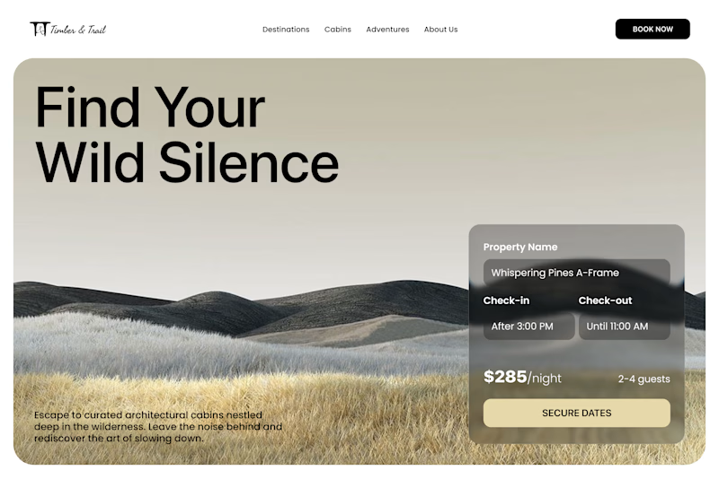
3 voted
60%
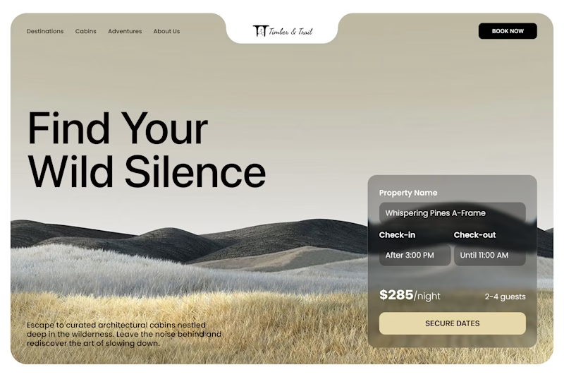
5 votes
Closed

Design B. The integrated tab feels high end and memorable. Design A is clean but B delivers the true luxury atmosphere you're aiming for.

Thanks!

Weldone, Mohammad
Thank You!!

Clean, modern, and purposeful. The overall visual direction is excellent.
Thank You!!
The network for creativity
Join 1.25M professional creatives like you
Connect with clients, get discovered, and run your business 100% commission-free
Creatives on Contra have earned over $150M and we are just getting started







Related posts

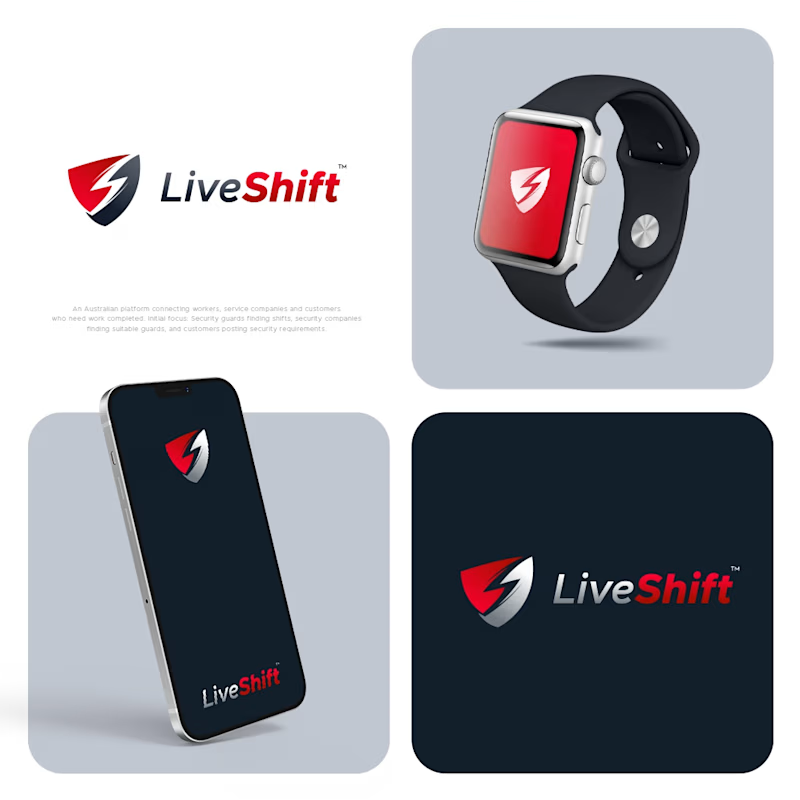
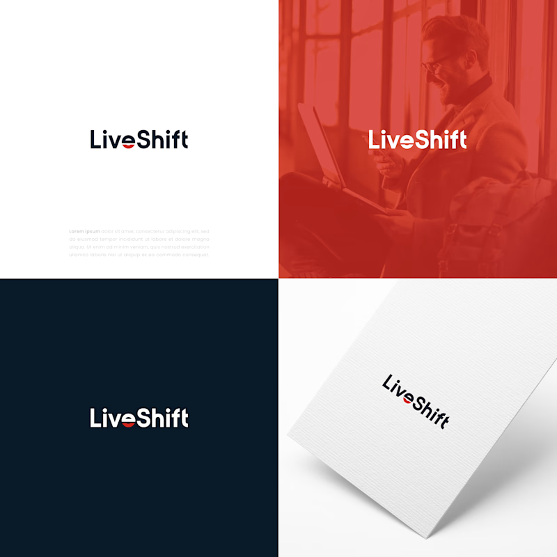
I designed four concepts for this logo. The client likes one of them, while another is my personal choice. I would love to hear your opinion. Which one do you think works better?
3 voted
60%
2 voted
40%
5 votes
Closed

Which one is the best?
6 voted
60%
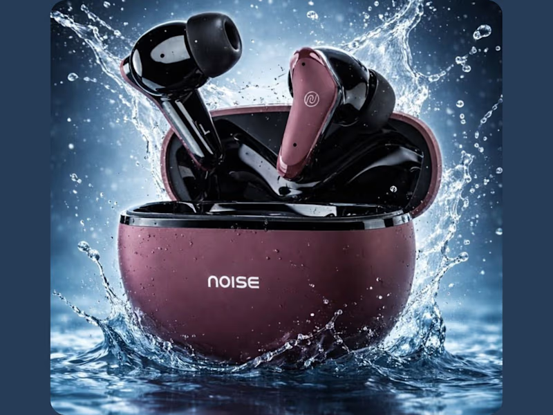
4 voted
40%
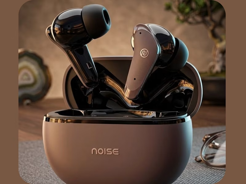
10 votes
Closed

Both looks unique.

I made two versions of a logo intro animation for my brand, Pixelblue, and can't decide which one's stronger.
To get an idea of the brand → Pixelblue Brand guidelines
Quick context: Pixelblue is a motion design studio focused on SaaS product demos, explainer videos, and social motion content. We've been doing this for 10+ years, mostly white-label, for agencies and marketing teams worldwide.
Would love your eyes on this: which version hits harder for you, and why? Pacing, reveal, timing, anything that stands out.
Drop your pick below (A or B) - genuinely curious what lands better from a fresh perspective.

7 voted
27%
19 voted
73%
26 votes
Closed

Going with B! Great work