The network for creativity
Join 1.25M professional creatives like you
Connect with clients, get discovered, and run your business 100% commission-free
Creatives on Contra have earned over $150M and we are just getting started
Back to feedPost

amazing concept!!

"The Museum of Us"
I began this project challenge with a simple question:
What if stock isn't just a collection of assets? What if it's the memory of our species?
That single thought reshaped every creative decision that followed.
Instead of telling a story about AI, I chose to tell...
The network for creativity
Join 1.25M professional creatives like you
Connect with clients, get discovered, and run your business 100% commission-free
Creatives on Contra have earned over $150M and we are just getting started







Related posts


Contra Verified project: After Effects and Premiere Pro MOGRT templates for an AI data center.
Logo animation, animated map, lower thirds and stats auto-resize as you type, so the team can edit videos without a motion designer.


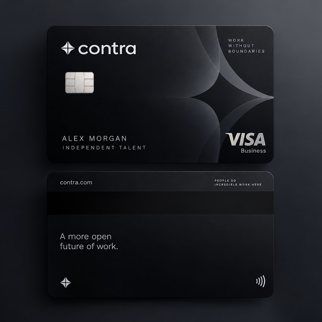
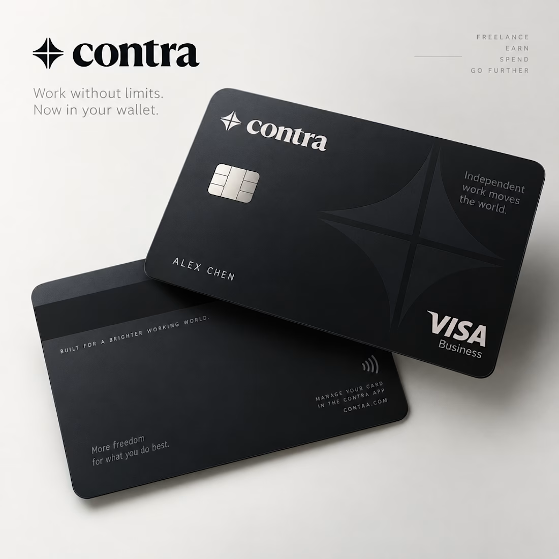
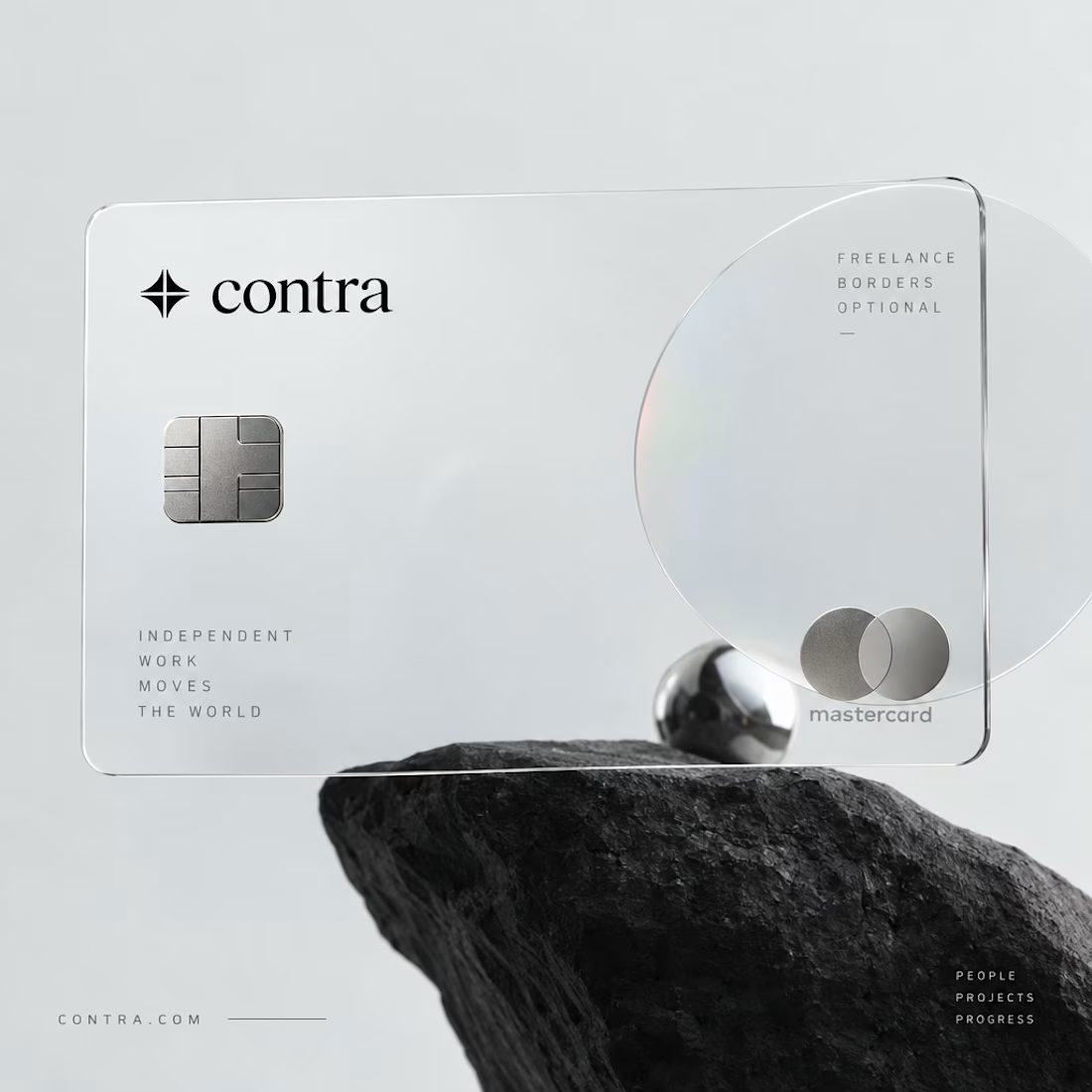


I’d definitely go with black. 🖤 It feels sharper, more premium, and timeless. The transparent concept is creative, but the black version has a stronger visual identity.

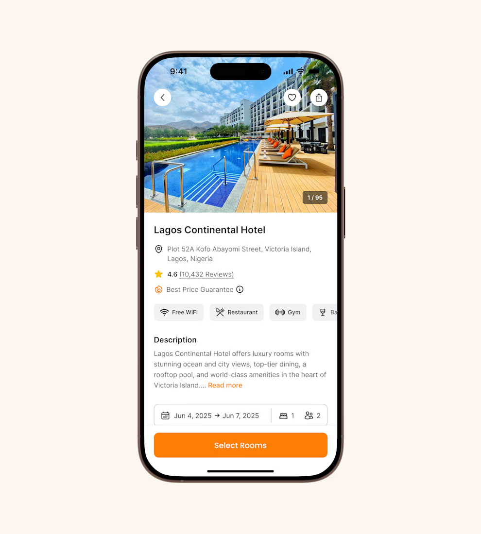
Hotel details screen for a booking app I’ve been designing.
Focused on clear information hierarchy, visual comfort, and helping users make quick booking decisions.
Excited to start sharing my work here 🚀


It's basic design but it's great❤️


