The network for creativity
Join 1.25M professional creatives like you
Connect with clients, get discovered, and run your business 100% commission-free
Creatives on Contra have earned over $150M and we are just getting started
Back to feedPost

Looks good

thanks


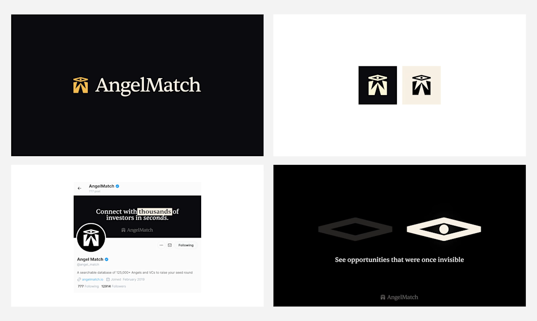
the black and gold logo pops
Thanks, really like this one!

Calling it permissionless design is a great way to frame speculative work. Was this unsolicited concept work, or is AngelMatch an actual client who's seen the wing mark and the dark UI treatment yet?
Permissionless design is such an intriguing way to frame a project. What does that phrase actually mean for how you worked on AngelMatch, compared to a more typical client process?

Very cool logo! 🙌
thank you!
The network for creativity
Join 1.25M professional creatives like you
Connect with clients, get discovered, and run your business 100% commission-free
Creatives on Contra have earned over $150M and we are just getting started
Related posts

Inspired by, I'm sharing one of my own concepts that wasn't chosen for the final design, but that I absolutely love.
This idea is so good! We all have concepts hiding in our drafts that never get to see the light of day. I think they deserve their moment, too. ✨
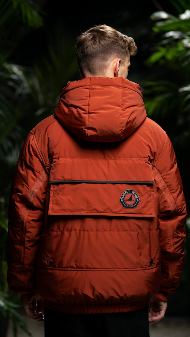
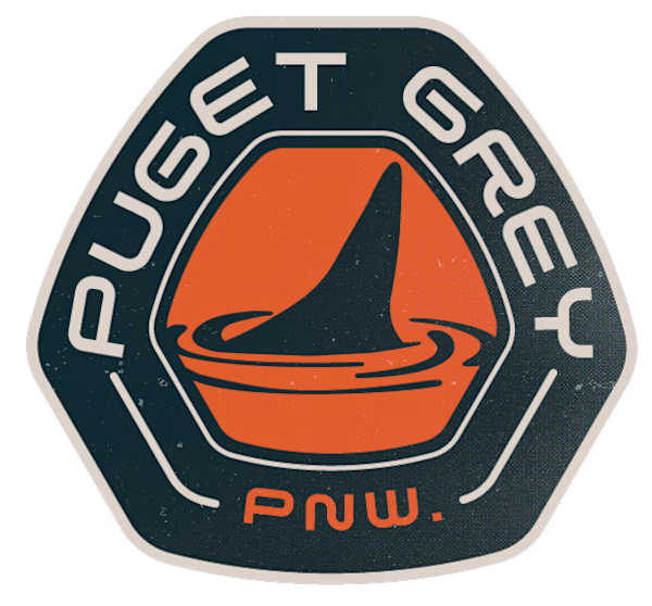
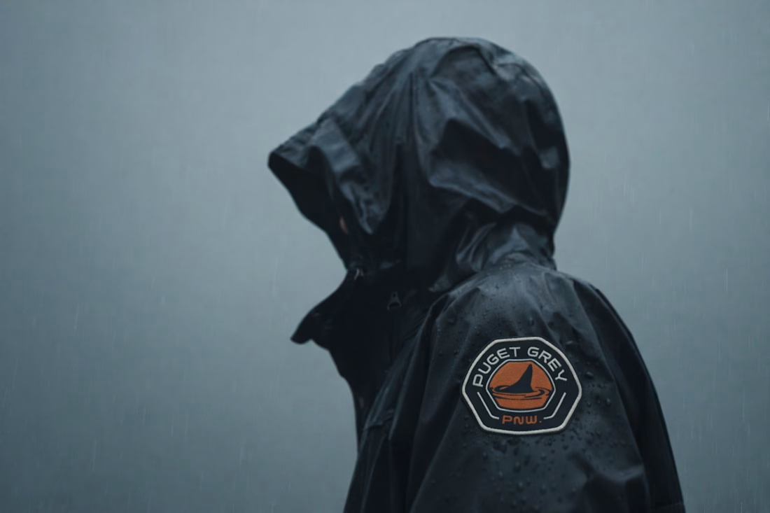

How many concepts die in your drafts folder? 💀
In the spirit of Inktober, a digital sketch that never saw the light.
This was a lettering-inspired brandmark...


A little more about the inspiration behind Tindara.
I wanted the identity to have a connection to Tindari, Sicily. The Madonna di Tindari statue was the starting point for the symbol, while Sicilian decorative patterns inspired the graphics around it.
For the colors, I chose mustard yellow, deep green, and burgundy, balanced with cream. I wanted to bring some of that warmth and richness into the packaging, while keeping the different elements comfortable together.
For me, these references are what give the project its character and sense of place.



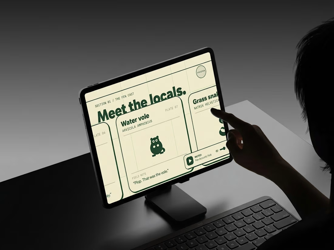
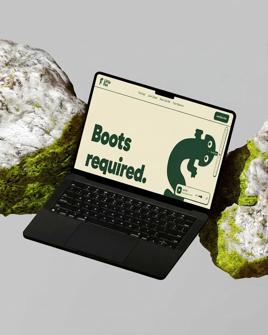
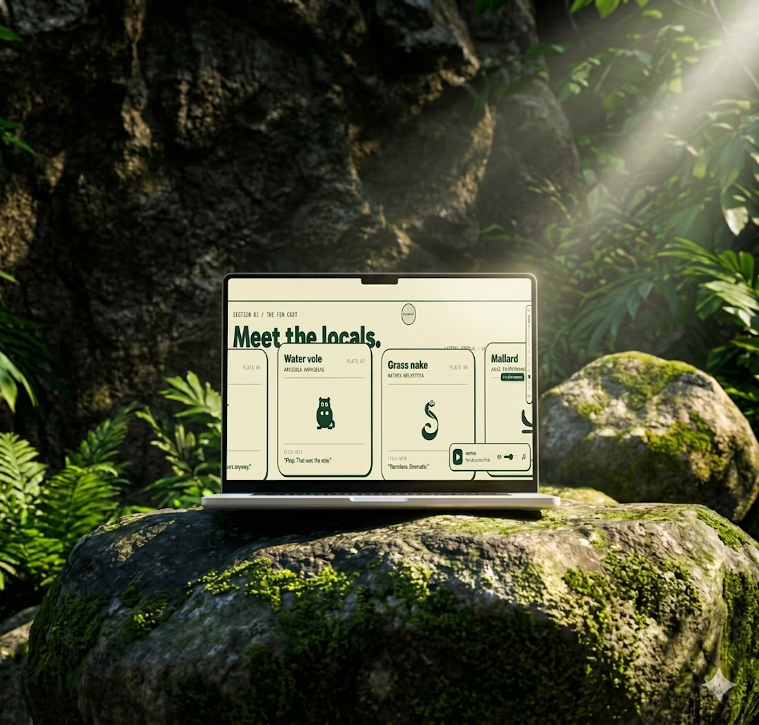
Most websites open with “Welcome.”
This one opens with “Boots required.”
Little Fen’s site is a field guide: locals with Latin names and a heron soundtrack.
Go meet the vole.