The network for creativity
Join 1.25M professional creatives like you
Connect with clients, get discovered, and run your business 100% commission-free
Creatives on Contra have earned over $150M and we are just getting started
Back to feedPost
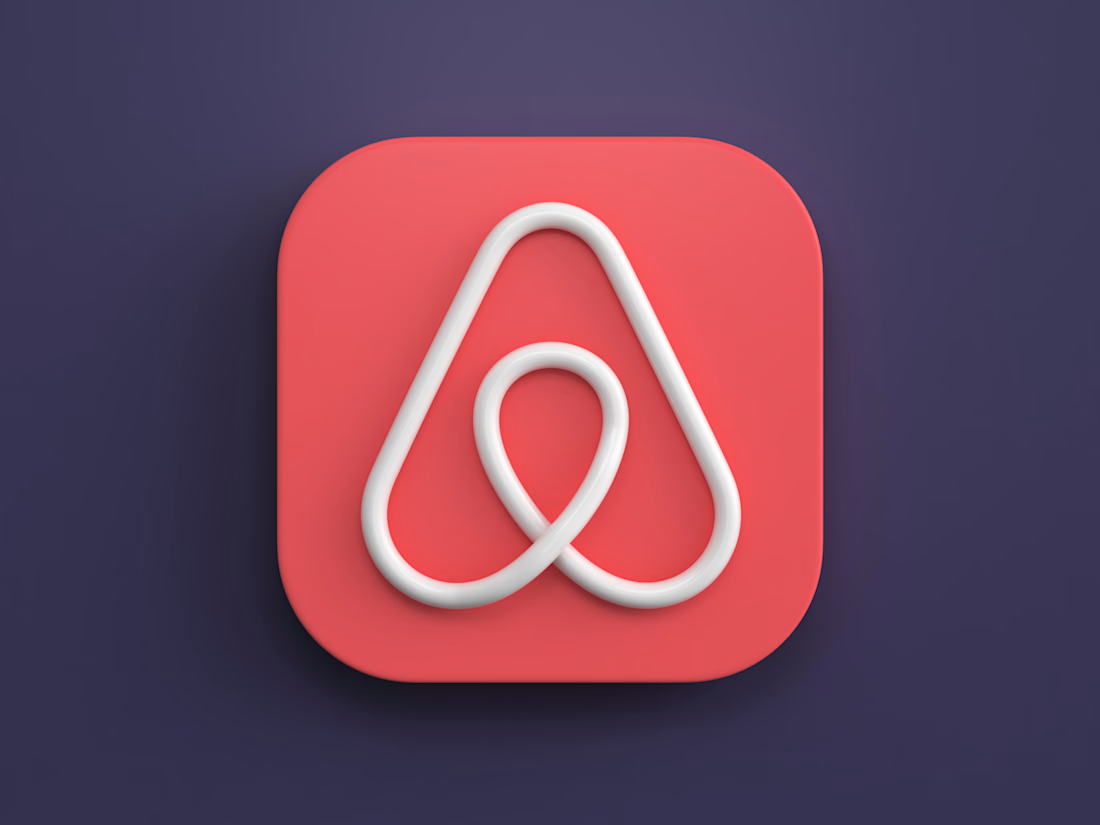
Airbnb 3d icon I created a while back.


This still feels fresh.

The soft bevels and controlled shadowing give the mark a convincing physical presence without muddying the silhouette. The coral-on-indigo palette also makes the icon pop beautifully.

Wow

That coral against the deep indigo does a lot of work, makes the mark feel like it's floating rather than sitting flat. Was this just you practicing lighting and materials, or was there a rebrand pitch behind it?

The soft bevel keeps it feeling like a real object instead of a flat mark rendered in 3D, that balance is harder to get right than people think.


Impressive work..

The network for creativity
Join 1.25M professional creatives like you
Connect with clients, get discovered, and run your business 100% commission-free
Creatives on Contra have earned over $150M and we are just getting started

Challenges
View all


Related posts

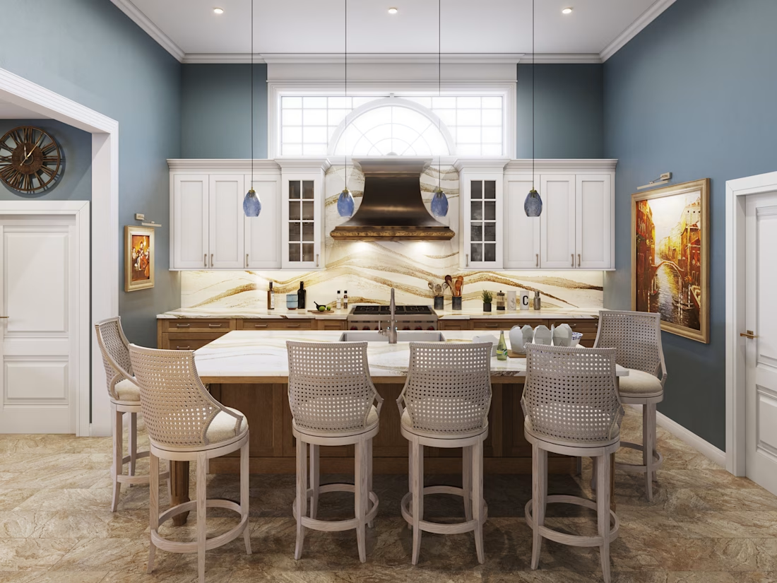
New kitchen render set is live 🏡
This one was fun - a transitional kitchen with a waterfall island, brass hood, and full stone backsplash. The brief was simple but the pressure wasn't: the client needed to fall in love with a space that didn't exist yet.
That's the real job in architectural visualization. Not "make it pretty" - make it believable enough that nobody hesitates before construction starts.
Full case study is in my portfolio. Which angle sells the space best to you - the wide island shot or the tighter cooking-wall view?


So great 🔥

I see the winner, so guys...meet the entire case study 🙌 Let me know what do you think about it! Thank you


what a stunning result, well done!

Created this animation for Lounge.


So smooth