The network for creativity
Join 1.25M professional creatives like you
Connect with clients, get discovered, and run your business 100% commission-free
Creatives on Contra have earned over $150M and we are just getting started
Back to feedPost

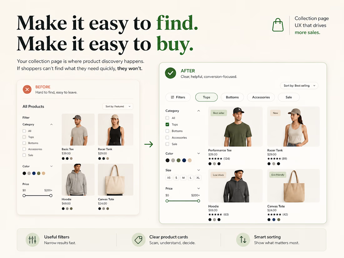
A Shopify collection page should help customers narrow down choices, not make them scan harder.
A common mistake is treating collection pages like simple product grids.
But when a store has more than a few products, shoppers need help answering:
• Which product is right for me?
• What’s the difference between these options?
• Can I filter by what actually matters?
• Can I compare key details without opening every product page?
Good collection-page UX usually comes down to a few things:
• Useful filters
• Clear product titles and pricing
• Relevant badges or attributes
• Logical sorting
• Product cards that show enough information to make the next click easier
The goal is not to show more products.
It is to help customers reach the right product faster.

The network for creativity
Join 1.25M professional creatives like you
Connect with clients, get discovered, and run your business 100% commission-free
Creatives on Contra have earned over $150M and we are just getting started





Related posts

Credit card landing page design for a fintech startup — an interactive 3D claw machine that turns the offer into the hero instead of another floating card at 15 degrees.
Every card brand ships the same hero: a card hovering over a gradient. Clawd sells one card, not a marketplace, and the entire pitch is "stop comparing — we already did the comparing". So the landing page had to make a single-product offer read as a win rather than a shortage of options, and pull early-access sign-ups from people who are deliberate about money: the ones who actually track spending and read the APR line.
The metaphor does the positioning work. A claw machine that never misses, plus "we already picked the best one", means the visual is the argument and the headline doesn't have to explain itself.
I built the scene in Blender as an interactive element rather than a still render — the claw follows the cursor, the card tilts in the grip, and the pile underneath reacts, so a visitor plays with the product's core idea for a few seconds instead of scrolling past it.
Hero plus full page structure, desktop and mobile designed separately, the Blender scene with web-ready exports, interaction notes, and a developer-ready Figma file.


nice work


Professional work


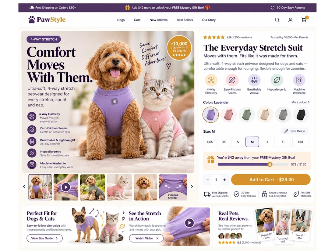
Your product page shouldn’t make customers work this hard to buy.
For pet apparel, one of the biggest conversion killers isn’t always the product.
It’s uncertainty about fit.
So I designed this Shopify product page concept around one goal: remove hesitation before the Add to Cart.
Instead of a basic product page, I built the buying experience around:
🐾 Dog + cat sizing support
📏 Easy-access interactive size guide
🧵 4-way stretch & product benefit callouts
🎥 Stretch demonstration video
⭐ Pet-specific reviews & UGC
🎁 Free gift progress tracker to increase AOV
🎨 Color + size selection above the fold
🛒 Clear, high-visibility Add to Cart
📱 Mobile-first sticky purchase experience
📩 Back-in-stock flow for unavailable sizes
The idea is simple:
Don’t just show the product. Answer the questions stopping someone from buying it.
“Will it fit my dog?”
“Will it stretch?”
“Which size should I choose?”
“Can I trust the quality?”
“What are other pet owners saying?”
Good eCommerce design should answer those questions before the customer has to ask them.
That’s how I approach Shopify design: UI/UX + CRO + buyer psychology, not just making pages look good.
What’s the #1 thing that makes you hesitate before buying clothing online—for yourself or your pet? 👇