The network for creativity
Join 1.25M professional creatives like you
Connect with clients, get discovered, and run your business 100% commission-free
Creatives on Contra have earned over $150M and we are just getting started
Back to feedPost

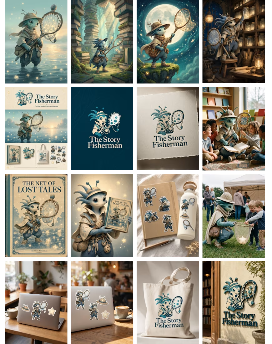
Bramble — The Story Fisherman
What if forgotten stories didn't disappear, they simply waited to be found?
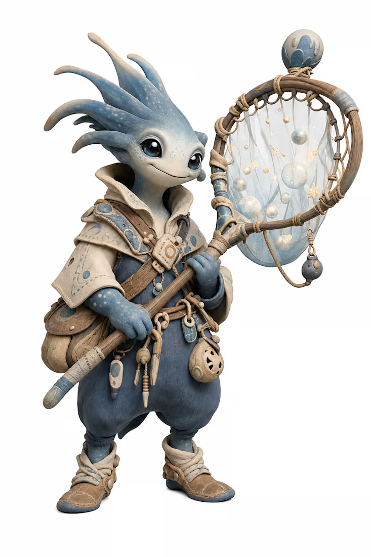
Meet Bramble, one of the last Story Fishermen. Every forgotten tale drifts into the Endless Story Sea, where stories slowly fade into silence. Gentle, endlessly curious, and quietly patient, Bramble spends every night rescuing these lost stories with his handcrafted story net, believing every story deserves another chance to be discovered.
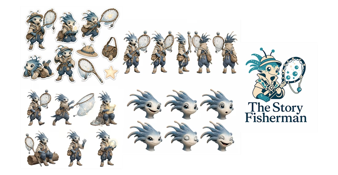
This project was created entirely in Recraft Studio, exploring Bramble as a complete mascot system through a custom wordmark, character turnaround, expression and pose sheets, stickers, branded applications, and consistency across multiple touchpoints. Every visual element was designed to reinforce one cohesive fictional world where no story is ever truly forgotten.
Because every story deserves another chance to be told.

Love how cohesive the world feels. The story net, the Endless Story Sea, and the mascot’s quiet personality all connect beautifully. Good luck
The network for creativity
Join 1.25M professional creatives like you
Connect with clients, get discovered, and run your business 100% commission-free
Creatives on Contra have earned over $150M and we are just getting started





Related posts

KpiClock — animated hero with Unicorn Studio
Static hero backgrounds are easy to scroll past. So for KpiClock's marketing site, I built a living one — a soft, flowing gradient that moves on its own behind the headline, made with Unicorn Studio.
It's lightweight, runs smoothly right in the browser, and gives the whole hero a calm, premium feel without pulling attention away from the message or the CTA. Subtle motion, big difference.


Excellent work idea


Ram Mascot Logo Design





Looks really good