The network for creativity
Join 1.25M professional creatives like you
Connect with clients, get discovered, and run your business 100% commission-free
Creatives on Contra have earned over $150M and we are just getting started
Back to feedPost

This is a show icon for my Counterpoint X page that Grok helped me to create.


The network for creativity
Join 1.25M professional creatives like you
Connect with clients, get discovered, and run your business 100% commission-free
Creatives on Contra have earned over $150M and we are just getting started





Related posts


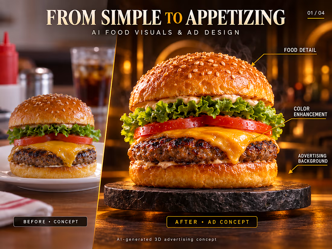
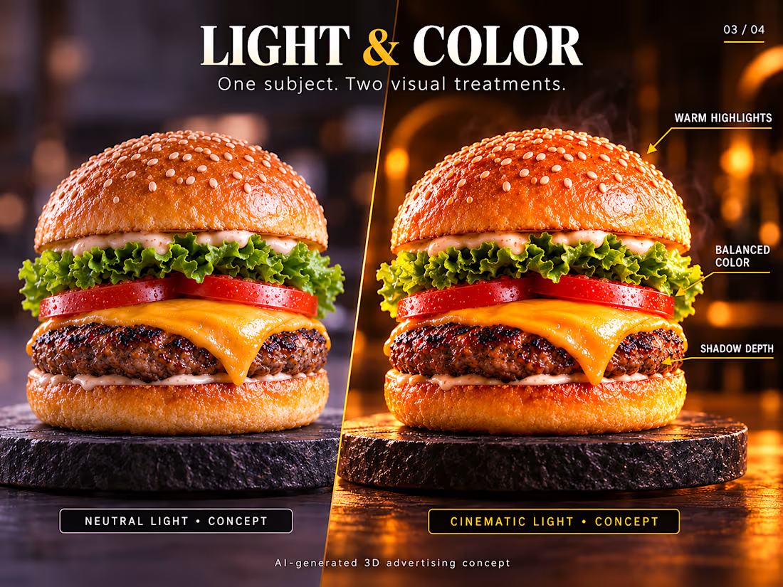
Premium AI Food Advertising Visuals 🍔
A cinematic food advertising concept focused on realistic texture, professional lighting, rich color, and high-impact product presentation. From a simple food image to a polished commercial visual, I developed the lighting, composition, color balance, and overall advertising direction to create a premium, appetizing result.
Created for food brands, restaurants, social media campaigns, and commercial advertising.
Available for custom AI product visuals, food advertising, image enhancement, and creative visual design.


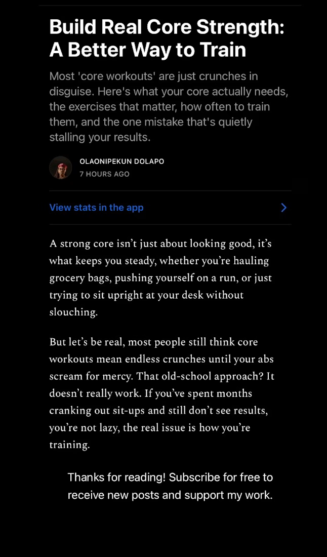
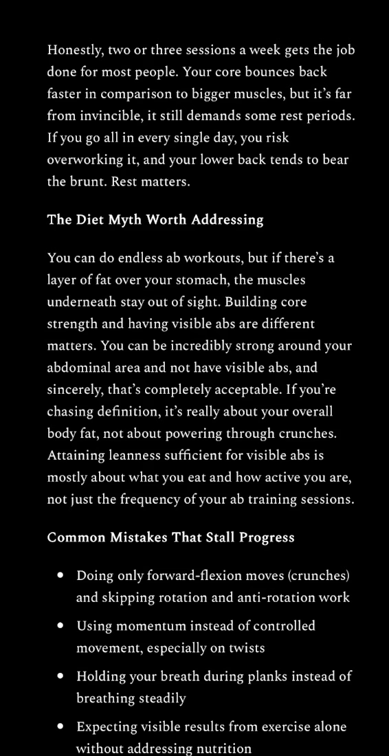
Core Strength Blog Post — SEO Content Sample
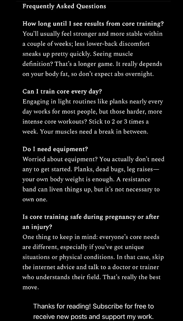
An SEO-style blog article written to correct a common fitness misconception: that core training means endless crunches. The piece breaks down what the core actually involves, the five exercises that matter most, training frequency, and a diet-myth section addressing visible abs vs. core strength — closing with an FAQ section built for search visibility. Written in a conversational, personality-driven voice rather than generic listicle tone.
Great piece! Love how it breaks down core training myths in a clear and engaging way. 👏