The network for creativity
Join 1.25M professional creatives like you
Connect with clients, get discovered, and run your business 100% commission-free
Creatives on Contra have earned over $150M and we are just getting started
Back to feedPost
Findays: a website template for personal finance apps.
One hero that shows the product, with a clear path to sign-up and pricing.


The brief. A personal finance platform that has to explain income, expenses, bills, savings and payments in one place without looking like a spreadsheet.
Three design decisions.
1. One green accent on a pale mint ground, so the brand reads calm instead of cold like a bank.
2. The...

Quick question if you don't mind - I'm new on Contra (UGC + 3D product animation niche). My PTS is low right now. What was the 1 thing that helped you the most to increase your score from 0 to 100+?
Would love to learn from your journey!

Mint green keeps a finance product from feeling stiff. Showing the chart inside the hero sells it quickly.
The network for creativity
Join 1.25M professional creatives like you
Connect with clients, get discovered, and run your business 100% commission-free
Creatives on Contra have earned over $150M and we are just getting started











Related posts

tiiny.host Landing Page
Description:
A clean, friendly landing page for tiiny.host, the easiest way to put a file online and share it with a link.
The goal was to make the product feel as simple as it actually is. The upload box sits right in the hero, so visitors can drag in a file and get a live link without scrolling or signing up first.
What I focused on:
1. Upload-first hero with a clear “Upload a File” action and file type tabs (Docs, Images, Code, Samples)
2. Hand-drawn illustrations and script accents to keep the tone light and approachable
3. Social proof up top: 500K+ users and logos like Salesforce, Nestlé, and Square
4. Soft sky gradient and plenty of breathing room so nothing feels technical or intimidating


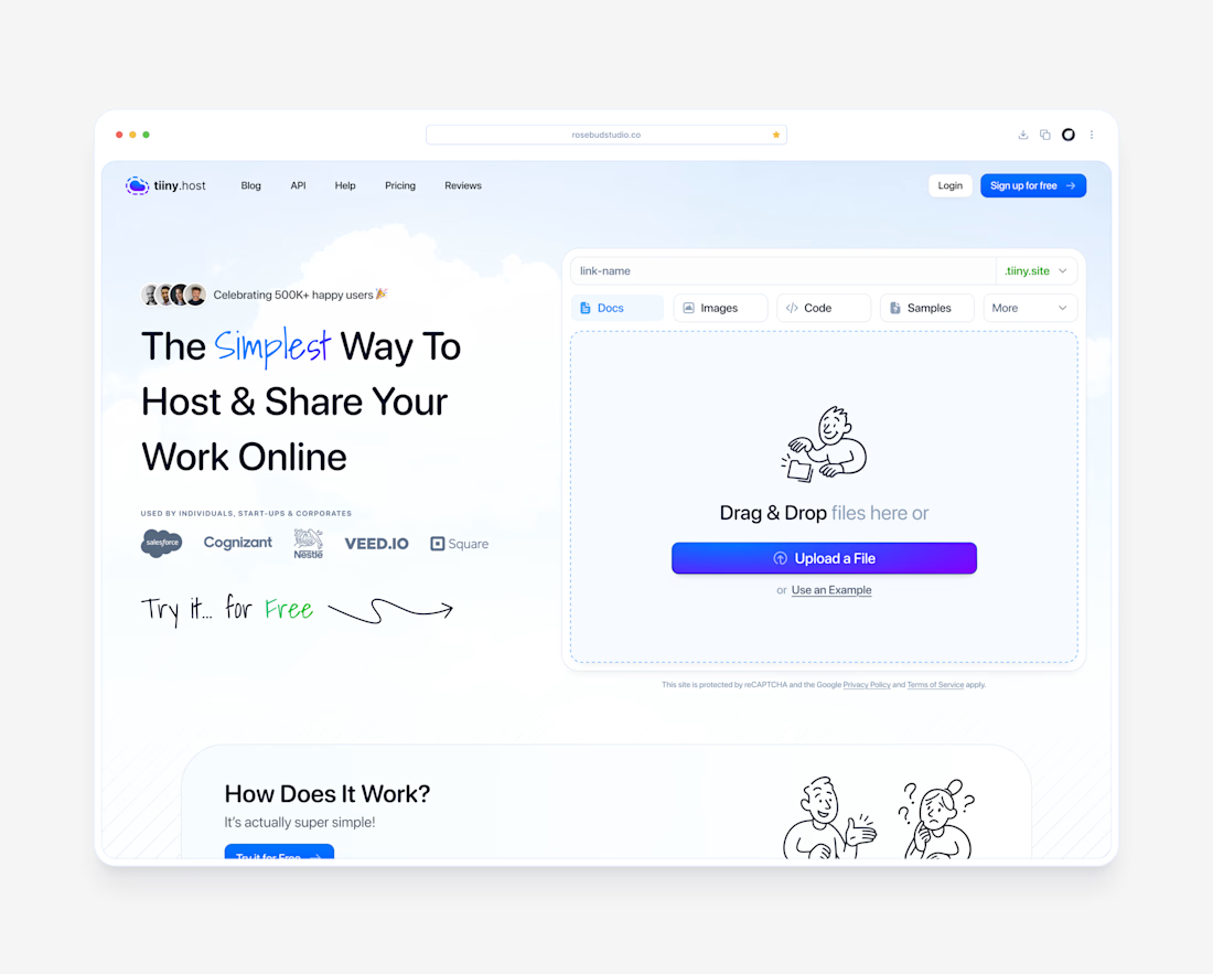

The hand-drawn illustrations with the script accents are what make this landing page special, Dante. They keep a file-hosting tool feeling light and approachable instead of technical, which is exactly the tone the upload-first hero needed.

The only glow on the Kestra page is the reflective strip on the jacket. It comes from the image itself, so the Framer layers on top stay flat: grey, white and mono text, no glow effects on buttons or headings. That keeps the page easy to edit, because nothing in the UI depends on one lighting setup. If you swap the photo, the glow goes with it. Would you add a glow effect in Framer or keep it in the image?


wow, nothing but top notch

Built this in Framer as a concept project. Goal was to make it feel run by ex-journalists. Choices: editorial serif (Libre Baskerville), a dark photo with one color accent, and copy that positions against blast-style PR.
Where I’m unsure: text legibility over the photo and whether the two CTAs compete. What would you change?
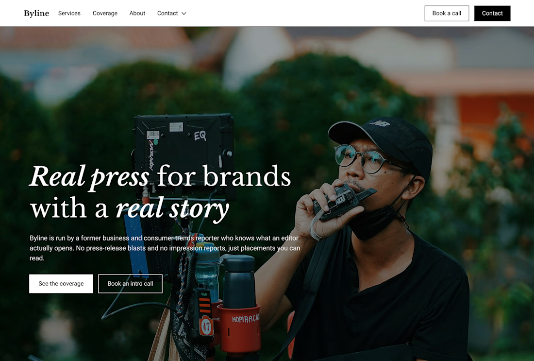

That's great design it feels professional I like how the background mixed with interface ❤️❤️
Great job Cheree🎉🎉