The network for creativity
Join 1.25M professional creatives like you
Connect with clients, get discovered, and run your business 100% commission-free
Creatives on Contra have earned over $150M and we are just getting started
Back to feedPost

The network for creativity
Join 1.25M professional creatives like you
Connect with clients, get discovered, and run your business 100% commission-free
Creatives on Contra have earned over $150M and we are just getting started











Related posts

The team is cooking
Motion design for the logo we are making for Nation e-commerce


Wou

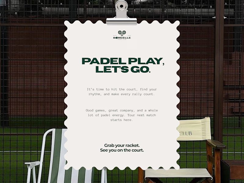
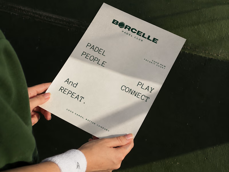
From the court to the little details, every touchpoint is an opportunity to bring the brand to life.
Good games, better company. 💚
What do you think of this direction?
11 voted
69%
5 voted
31%
16 votes
Closed
Amaizing

WIP 🚧:
an architecture site for a studio that only builds where the weather decides.
The brief I set myself: make it feel like a set of drawing sheets. Every section is numbered, ruled and labelled like a title block, and every project carries real data: altitude, build window, snow load.
The hero is a small code component. A datum line follows the cursor and reads the altitude live off the scale.
Built in Framer. Still polishing motion and mobile.
#framer #webdesign #architecture

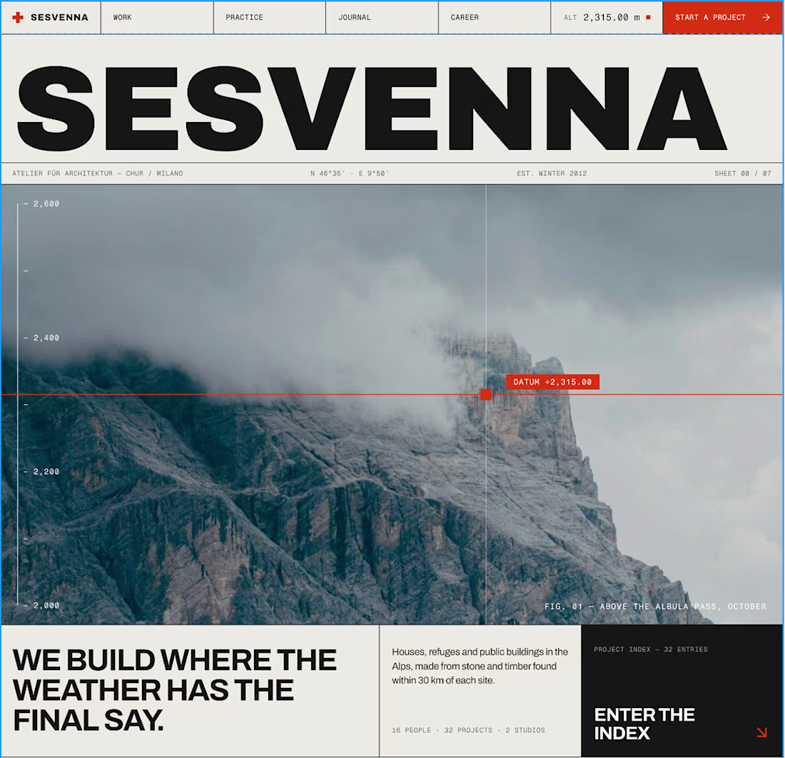

The drawing-sheets brief is such a charming concept for this site, Bright. That datum line reading altitude live off the scale in the hero is the perfect detail to anchor the whole thing.