The network for creativity
Join 1.25M professional creatives like you
Connect with clients, get discovered, and run your business 100% commission-free
Creatives on Contra have earned over $150M and we are just getting started
Back to feedPost

WIP 🚧:
an architecture site for a studio that only builds where the weather decides.
The brief I set myself: make it feel like a set of drawing sheets. Every section is numbered, ruled and labelled like a title block, and every project carries real data: altitude, build window, snow load.
The hero is a small code component. A datum line follows the cursor and reads the altitude live off the scale.
Built in Framer. Still polishing motion and mobile.
#framer #webdesign #architecture


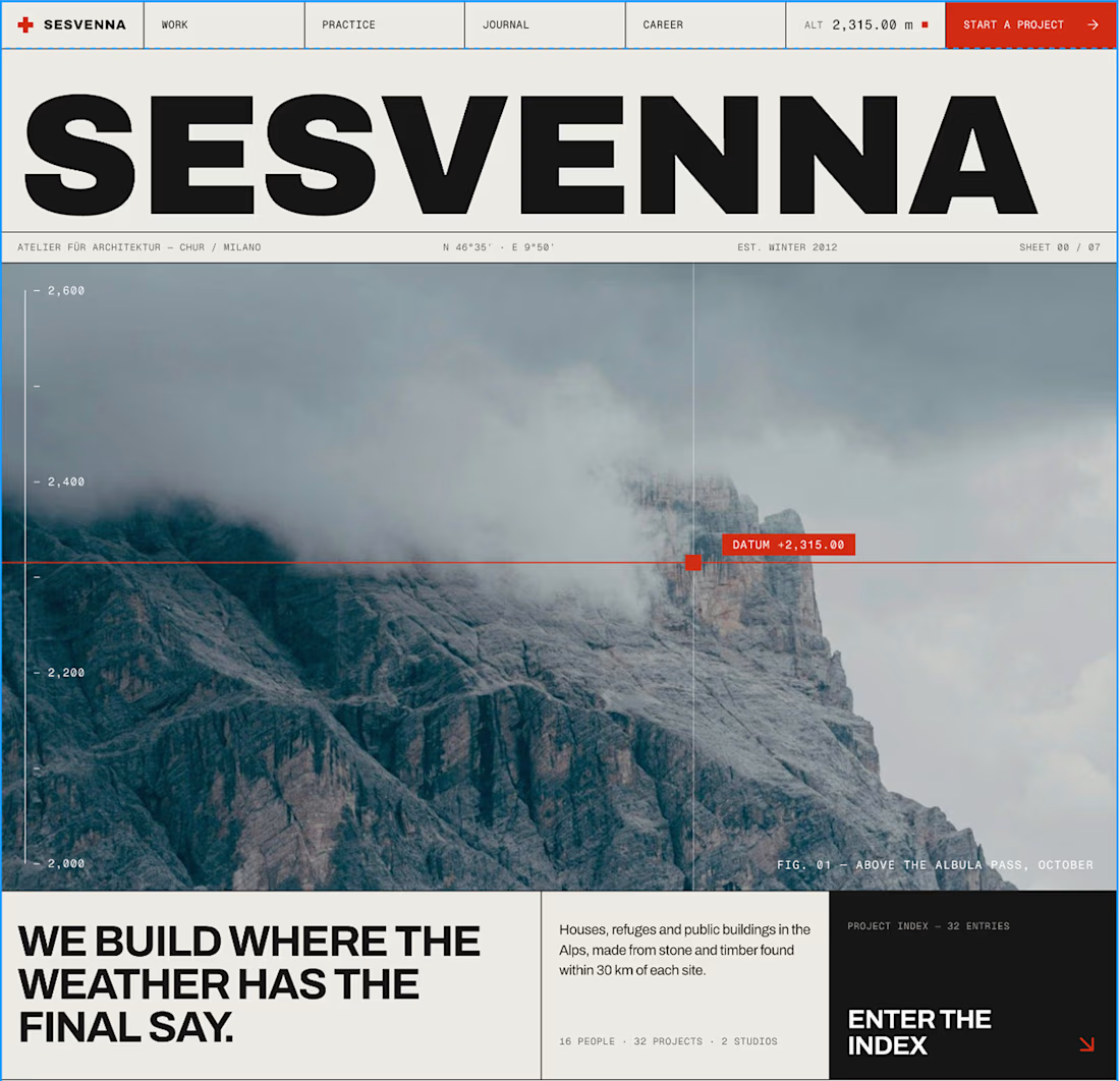

The drawing-sheets brief is such a charming concept for this site, Bright. That datum line reading altitude live off the scale in the hero is the perfect detail to anchor the whole thing.
thank you 😃
The network for creativity
Join 1.25M professional creatives like you
Connect with clients, get discovered, and run your business 100% commission-free
Creatives on Contra have earned over $150M and we are just getting started



Related posts


Here’s a little piece from my current project. As I watch the Swiss design concept become a part of my creative DNA, I find myself constantly gravitating towards this direction in web design.
What’s really interesting is that Volume 3 studio and I are experimenting here, mixing things that seem completely unmixable at first glance.
Since Volume 3 is a CGI and VFX studio, it was crucial to incorporate a 3D dimension into their brand communication. On top of that, a Terminal UI is exactly what keeps that technical vibe going.
So, the final mix is International (Swiss) style, a Terminal UI, and a 3D feel brought to life by neumorphism. Crazy, right???
It looks simple and clean, but behind the scenes, there’s a massive amount of work on the details. We focused on all those little things that push the UX/UI into the premium segment — the things you don't necessarily see right away, but you definitely feel when you're on the page.
The work is still ongoing, so I can't dive into reflecting on the whole process just yet, but I'm gonna keep revealing small parts here.


Swiss grids on the web never get old when they're this clean. What are you and Volume 3 mixing it with?

Some details from my latest redesigns project
🔗 codex.io


The dark screens look sharp, and the product data stays easy to read. The redesign feels focused on the people using it, not just on a new look.

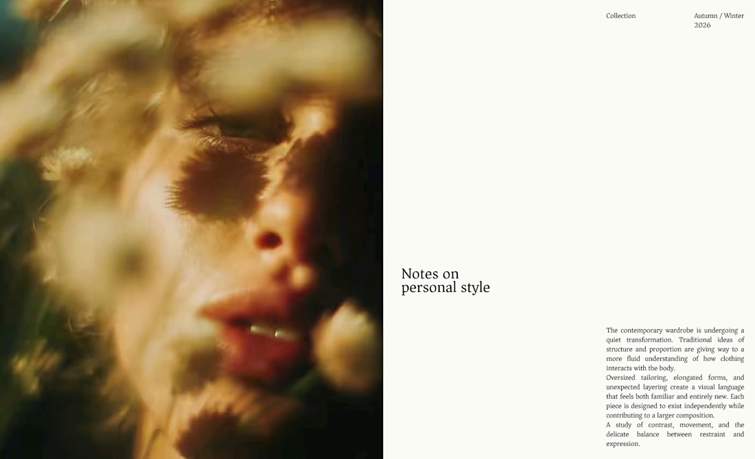
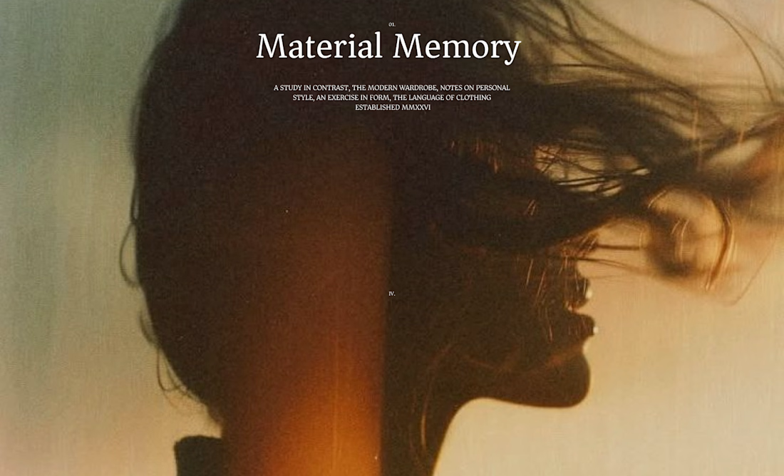
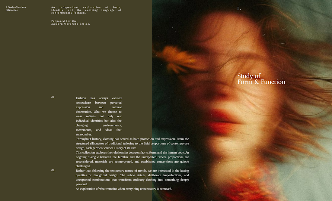
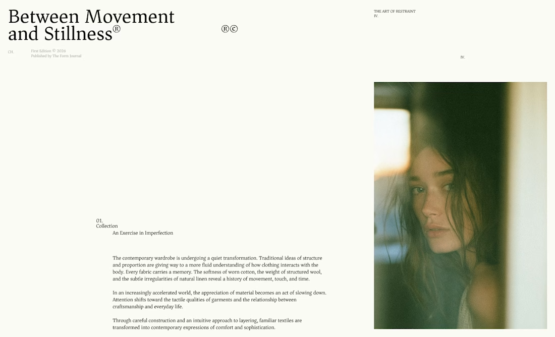
I designed these editorial-inspired layouts as part of an exploration for a fictional photography and fashion magazine
↳ Master typography & layout - The foundation of timeless web design. Join 350+ designers inside my 13-hour online course https://typomonday.com/course

Really nice exploration 👍