The network for creativity
Join 1.25M professional creatives like you
Connect with clients, get discovered, and run your business 100% commission-free
Creatives on Contra have earned over $150M and we are just getting started
Back to feedPost
The first version of Kopvié was red. Here's why it ended up blue.
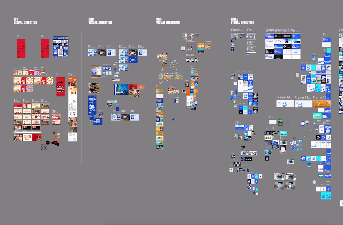
We ran three full visual directions before the final one. Not mood boards. Complete systems: color palette, mascot rendering, typography, mockups, social templates.
Direction 1 was built around red, cream, and lavender. Bold retro type, comic-style character, strong food photography layered in. It had personality. But the editorial tone read closer to a street food brand than a coffee shop with digital ambition. The character felt like decoration on top of the identity, not the identity itself.
Direction 2 shifted to deep cobalt blue. Same character, flatter rendering, street-poster energy. The contrast was sharp and the layout system was tight. But the blue ran cold. Coffee brands live on warmth, even when they're modern, and this one didn't quite get there.
Direction 3 went warmer: amber, teal, dark neutrals. We developed multiple mascot poses here, the most character work of any direction. It had texture and depth. But the color system spread too wide. Three tones fighting for dominance meant nothing owned the shelf.
The final direction collapsed the question. One blue. One white. One smiley. The mascot stopped being a character that appeared on things and became the face of the whole system, a UI element, a pattern, an icon. "Kopvié" with the accent mark did the rest: instantly distinctive, no other coffee brand owns that shape.
What changed between direction 1 and the final wasn't the concept. It was the commitment. The idea was always the character. The exploration was figuring out what the character needed to carry.
Visual exploration isn't where you find the idea. It's where you prove you can actually execute it.
Full Behance case
https://lnkd.in/gREhsqkp
The network for creativity
Join 1.25M professional creatives like you
Connect with clients, get discovered, and run your business 100% commission-free
Creatives on Contra have earned over $150M and we are just getting started
Related posts
The moodboard was the hardest part of this whole project.
54 Mirrors had to stand out, but still read as wellness. Those two pull against each other and that's basically the entire brief.
It's a weird artifact, this board. It holds the bold, loud character of the studio, and at the same time I was trying to build a home feeling with raw photo style. Not polished studio shots. Real light, real rooms.
What I wanted people to feel: you're different here, and you're still comfortable here.
Took me way more iterations than I want to admit 😅
Where do you start with a moodboard? Photos first or colors first? 💬
It definetely looks it worth your effort. Nice color and texture choice along with great animation speed. Good work!
This is a design for a fast-food restaurant I came up with. My portfolio has a lot of tech-heavy, dark designs, so when I was experimenting with templates in Framer, I chose a light, upbeat design for a non-tech product. All the images were generated by me using neural networks. If you'd like to buy this design or commission another one — message me.
I build the brand system before the site — so the product can scale without breaking visually as it grows.
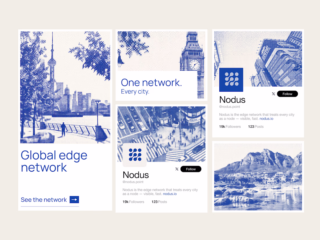
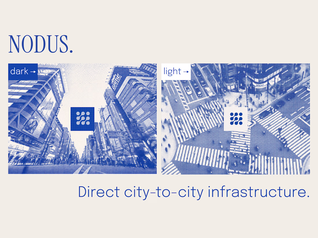
Nodus treats every city as a node. The core asset is generative: any city renders in the same halftone style — London, Tokyo, Cape Town, or any city added later. New market, new visual, zero drift.
Covers logo, color, type, the city-node visual language (static + motion), web direction, and social templates.
System first, so everything after it scales.
Obsesseddd
Trending
Claude
Claude has entered the design space. How are you using Claude Design?
Contra University
Learn from expert creatives how to earn more using next-gen AI tools.
creativeaiflow
Creative AI workflows are evolving. What tools do you use, and what are their strengths and weaknesses?
freelancerlife
Freelancer life is wins, pivots, and everything in between. What’s yours right now?