The network for creativity
Join 1.25M professional creatives like you
Connect with clients, get discovered, and run your business 100% commission-free
Creatives on Contra have earned over $150M and we are just getting started
Back to feedPost

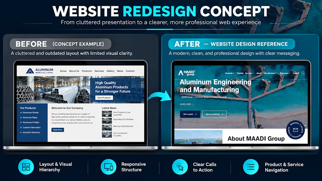
From a basic website layout to a more modern, professional online experience. 💻
For this MAADI Group website redesign concept, I focused on how better structure and visual hierarchy can help an industrial business present its services more clearly.
Here’s what I focused on achieving:
• Improved visual hierarchy: Made the main headline and key information easier to notice.
• Stronger first impression: Used a bold hero section and relevant imagery to create a more professional presentation.
• Clear calls to action: Highlighted the “Get a quote” and “See our products” buttons to guide visitors toward the next step.
• Simplified navigation: Organized the main website sections to make products and services easier to find.
• Responsive design direction: Considered how the layout could adapt across desktop, tablet, and mobile screens.
My goal was to create a design that communicates the business's value clearly while making it easier for potential customers to explore its offerings.
I design WordPress websites and landing pages using Elementor, helping businesses build a stronger online presence.
If your business website needs a redesign, feel free to send me a message.
What do you think makes the biggest difference in a website redesign: the layout, imagery, or user experience?


The network for creativity
Join 1.25M professional creatives like you
Connect with clients, get discovered, and run your business 100% commission-free
Creatives on Contra have earned over $150M and we are just getting started











Related posts

AI can build the UI in minutes.
Bringing it up to a good standard, still needs a designer. Agree or disagree?

I see some of your work and honestly your work is really premium 🎉🎉
Great job Alex🎉🎉🔥🔥


Gorgeous 😍


Your Hero Section Has One Job: Be Clear.
You don’t need huge headlines or long explanations. You need the right image + short headline + clear offer.
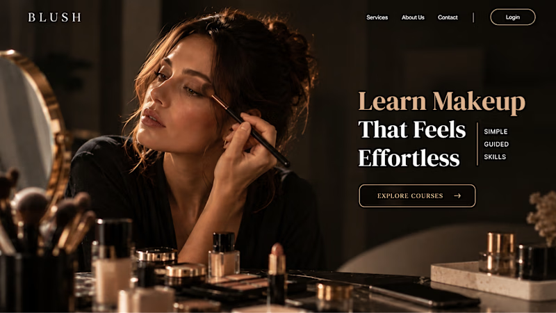
For the first version, we worked on the branding, the image and the copy together, so at first glance it’s clear: this is a makeup course, and here’s what you’ll get.
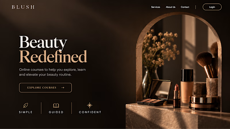
The second version is still beautiful and still feels like beauty. But what are you actually getting? A makeup course? Products? A store? That’s the problem with a Hero that looks good but isn’t thought through.
Your first screen doesn’t need to say everything. It just needs to say the right thing.

22 voted
61%
14 voted
39%
36 votes
Closed
