The network for creativity
Join 1.25M professional creatives like you
Connect with clients, get discovered, and run your business 100% commission-free
Creatives on Contra have earned over $150M and we are just getting started
Back to feedPost

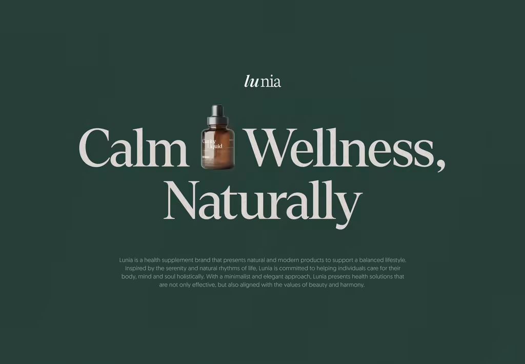
Lunia Case Study | Health Supplement Brand
Lunia addresses the challenge of standing out in a saturated wellness market where traditional health brands often rely on overly bright or inconsistent visuals. To connect with mindful, health-conscious women and digital-savvy audiences, the project establishes a cohesive visual branding system centered on calm, purity, and natural holistic values. The solution pairs a soft, neutral color palette with clean typography, minimalist layouts, and intentional breathing space across packaging, digital platforms, and marketing touchpoints. Moving away from cluttered wellness graphics, this flexible identity positions Lunia as an elegant and trustworthy companion that elevates the daily health experience.
Looking for the closer details? See the complete project here!
What do you think about this design? Let me know your thoughts in the comments!
The network for creativity
Join 1.25M professional creatives like you
Connect with clients, get discovered, and run your business 100% commission-free
Creatives on Contra have earned over $150M and we are just getting started





Related posts

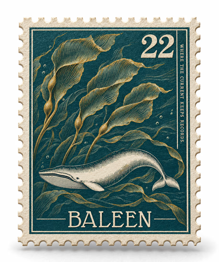
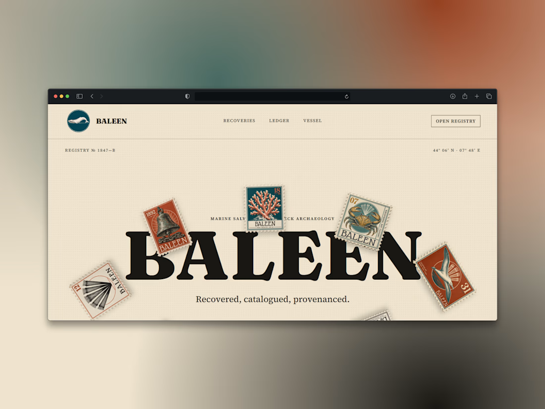
What if a salvage company's brand looked like it belonged in a stamp album, not a treasure map?
Introducing BALEEN — marine salvage & shipwreck archaeology, built on vintage natural-history stamp DNA. Every object recovered, catalogued, provenanced.
Website here


This project was an instant yes!
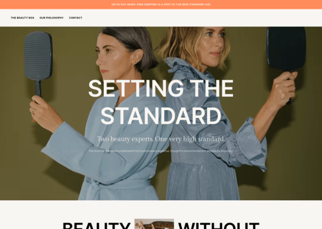
I got to work with the dreamiest new brand and photography to translate into a more editorial Shopify experience for a beauty subscription brand. Even better, the new site helped increase subscriptions and hit the brand's goal after launch. ✨ Check it out.


So cool!