The network for creativity
Join 1.25M professional creatives like you
Connect with clients, get discovered, and run your business 100% commission-free
Creatives on Contra have earned over $150M and we are just getting started
Back to feedPost
Taste Test

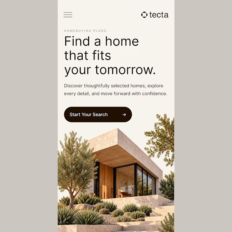
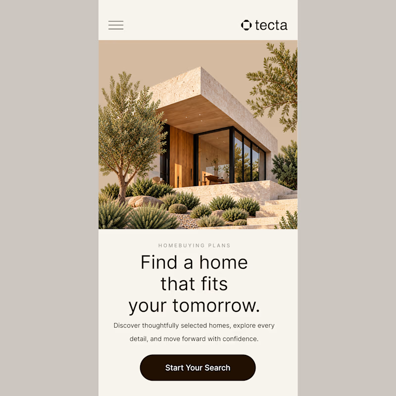
Exploring two responsive homepage directions for Tecta, a modern architecture and home discovery website.
Both approaches embrace minimal typography, warm neutral tones, and thoughtful spacing.
Which experience would you choose - A or B? 👀
Would love to hear your thoughts! ↓
2 voted
100%
0 voted
0%
2 votes
Closed

Option A is more premium Great job Kiran 🎉❤️
The network for creativity
Join 1.25M professional creatives like you
Connect with clients, get discovered, and run your business 100% commission-free
Creatives on Contra have earned over $150M and we are just getting started





Related posts

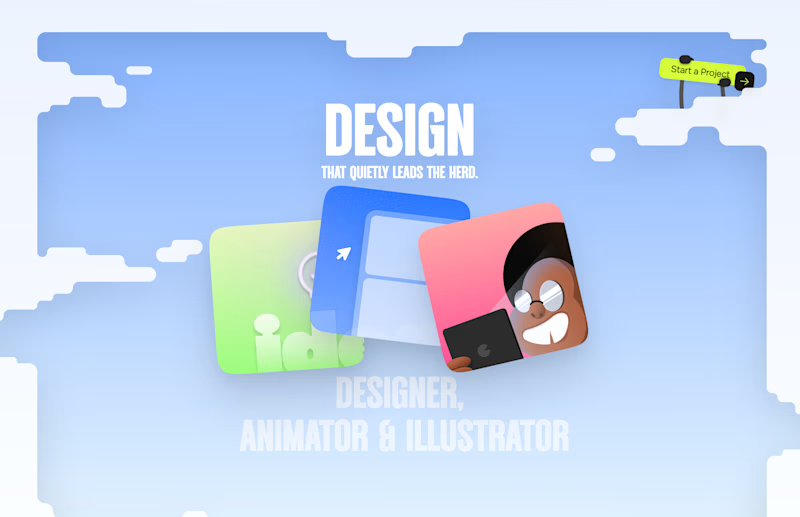
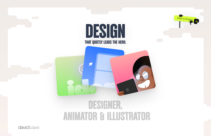
Should I go for left or right? Focusing on updating and finishing up my portfolio... and then I came across this crossroads. Another alternative is to make them switchable themes through a toggle, but I still need to decide which should be the default.

27 voted
75%
9 voted
25%
36 votes
Closed

Left is better because the text is readable, the overall blue background is not flashing to the eyes as compared to the right one.
For the top right button " Start a project ", you can add some animation so that it stands out and encourage users to click on it.


Built the StupidFish Design System from the ground up and covering everything from color, typography, spacing, and components to comprehensive documentation.
Designed and documented for both web and mobile, creating a consistent, scalable foundation that makes product design and development faster and more cohesive.
Check out the full case study here →


Really thorough system, nice job

NURV® 🟠
Phase 39/35. Readiness 94%. 4/28 laps.
A swim, nutrition and supplement app where every number is made of dots and the only color is the one that matters.


Dots as the only visual language with one orange accent is a bold, consistent call.