The network for creativity
Join 1.25M professional creatives like you
Connect with clients, get discovered, and run your business 100% commission-free
Creatives on Contra have earned over $150M and we are just getting started
Back to feedPost

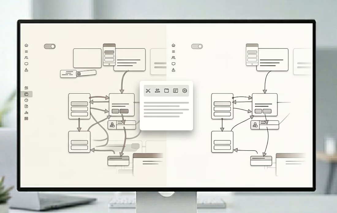
Clients don’t pay for “nice UI”.
They pay for clarity.
They pay for:
• Easier user journeys
• Faster task completion
• Better product usability
Good design isn’t decoration, it’s problem-solving.
That’s what I focus on in every project.
The network for creativity
Join 1.25M professional creatives like you
Connect with clients, get discovered, and run your business 100% commission-free
Creatives on Contra have earned over $150M and we are just getting started





Related posts

An old client project: a full redesign of a crypto app.
Created the video with Opus 5.5

Top-notch design.


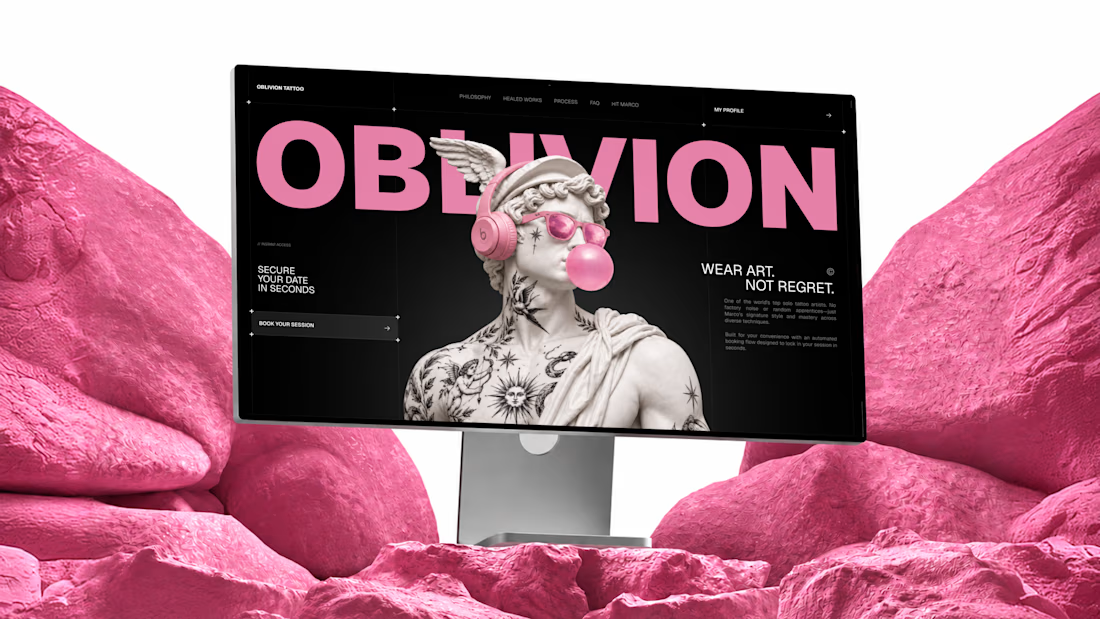
I built OBLIVION Tattoo service for the @Lovable #lovablechallenge
OBLIVION is a private tattoo studio in Kraków, Poland, run by one artist.
As a solo artist, Marco handles every inquiry, reference, estimate, booking, and schedule change himself.
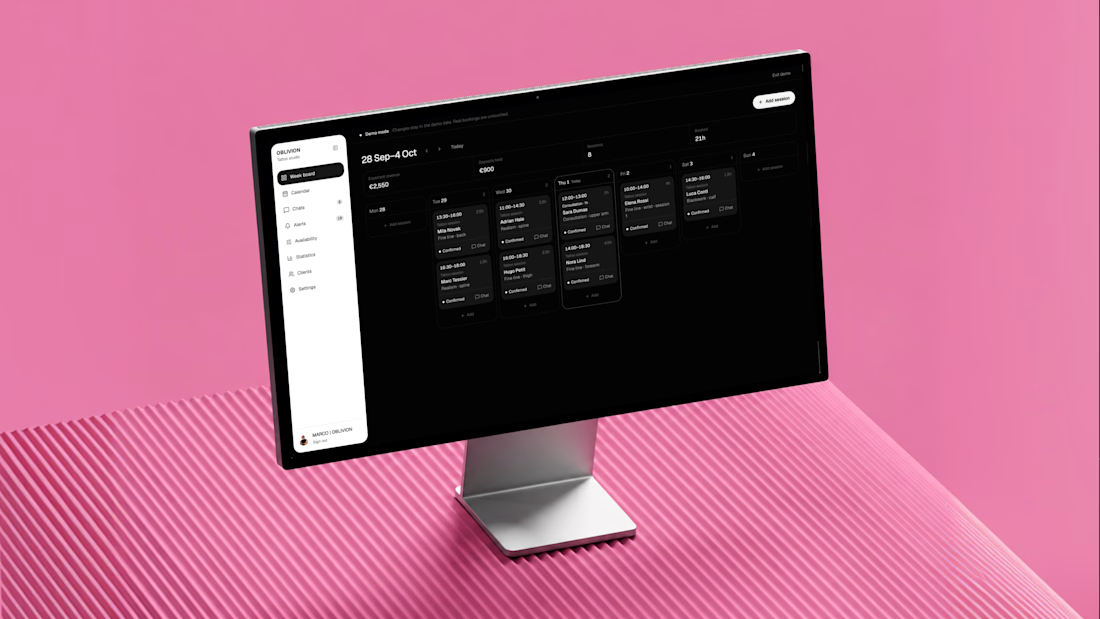
OBLIVION turns complex tattoo inquiries into confirmed appointments by collecting the full client brief, estimating the work, finding real availability, and keeping the entire booking in one connected artist workspace.
One system, three jobs:
1) Attract — custom animated landing page
https://oblivion-tattoo.lovable.app/
2) Book — guided tattoo booking flow
https://oblivion-tattoo.lovable.app/booking
3) Manage — demo artist admin panel
https://oblivion-tattoo.lovable.app/demo
*The public demo admin resets after refresh. The real admin is private, fully persistent, and connected to live bookings, clients, chats, availability, and studio data.
A smoother booking experience for the client, and far less manual work for the artist.



I spent the last few days on the @Lovable challenge, and I picked a business I think about every tax season: the one-person tax office.
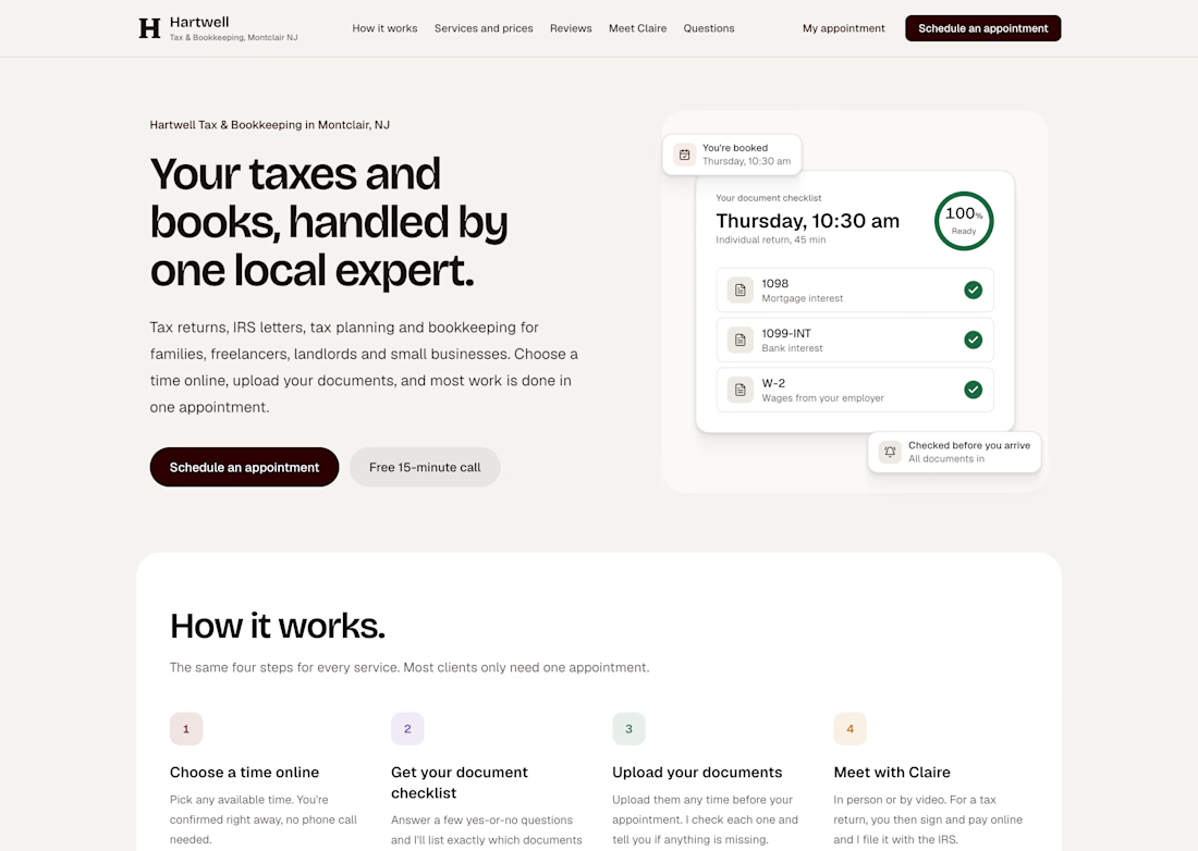
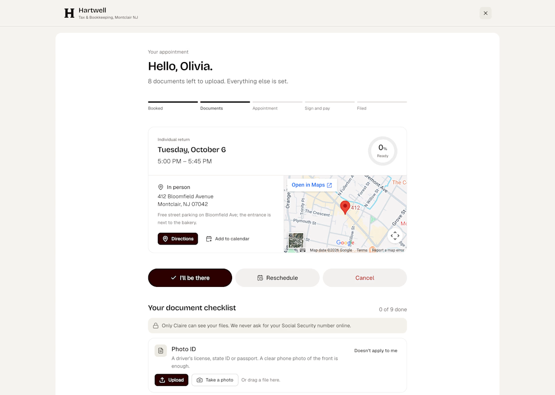
Mine is called Hartwell Tax & Bookkeeping, in Montclair, NJ. Claire Hartwell runs it alone. No front desk, no assistant, and two crazy rushes a year. Her real problem isn't the taxes. It's everything around them: phone tag just to set a time, clients who show up without half their documents, and no-shows that leave an hour she never gets back.
So I built her a system where a client can go from "can I book with you?" to "you're booked" in about two minutes, at 10 p.m., without calling anyone. They see real open times, pick in person or video, and answer a few quick questions that tell them exactly what to bring.
After that, Claire doesn't chase anyone. The confirmation, calendar invite and video link go out on their own. So do the reminders about missing documents, the offer to move to a later time if someone isn't ready, the message to the waitlist when a slot opens, and the nudge when someone starts booking and doesn't finish. She opens one screen in the morning and only sees what actually needs her.
You can also try it yourself. Test with your own email and the real emails will land in your inbox: https://hartwell-tax-bookkeeping.lovable.app
To see owner's side visit here.
There's a built-in demo mode that fills her week with sample clients in every stage, and a phone preview that shows every email exactly as the client gets it.
Built entirely in Lovable. #lovablechallenge


Amazing!!!