The network for creativity
Join 1.25M professional creatives like you
Connect with clients, get discovered, and run your business 100% commission-free
Creatives on Contra have earned over $150M and we are just getting started
Back to feedPost

Just published a new case study: Brand Identity & Logo Design for Twenty26 Endurance Cycling. 🚴♂️
A bold, motivational visual system for a team built on perseverance, speed, and a "no excuses" mentality. From concept to final brand guidelines — full process documented.
#BrandIdentity #LogoDesign #SportsDesign #EnduranceCycling #FreelanceDesigner #Contra


The network for creativity
Join 1.25M professional creatives like you
Connect with clients, get discovered, and run your business 100% commission-free
Creatives on Contra have earned over $150M and we are just getting started






Related posts

Had some fun with this one.
Exploring how typography, colour, and a few unexpected details can give a brand its own personality.
Meet Flankman. Full case study is live! ↓
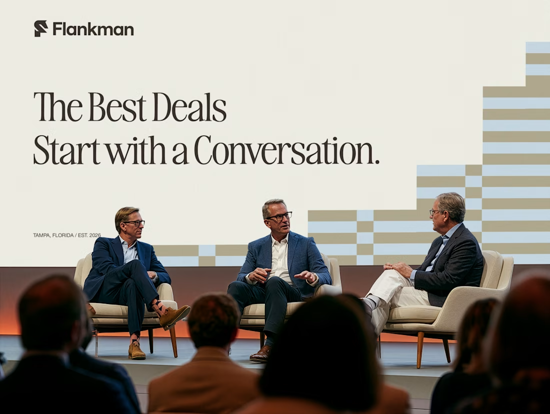


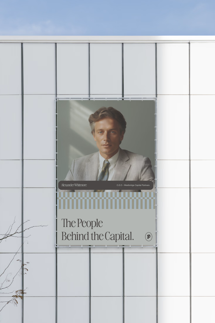


clean


How far can you take a logo beyond the first draft?
I started with Recraft's Logo Maker and a fictional idea: Bibu's Paws, a cosy little dog rescue and adoption shelter.
I wanted the identity to feel warm, homely and full of character, so I explored a few logo directions before settling on the little dog tucked inside a house.
From there, I took the idea further, building out the visual identity with an earthy colour palette, typography, illustrations and a few real-world applications: the shelter space, dog merchandise and an adoption welcome kit.
I enjoyed seeing how a small starting point could grow into a brand with its own personality and world.
Now I'm curious: if you were building a brand around this logo, what would you create next?






It turned out so cozy, you did great

Been exploring different ways to sell compression socks beyond the usual product shots and performance-focused ads.
For this Ad set, I played with different customer use cases long shifts, travel, recovery, sports, and everyday wear. I also leaned into the brand's vibrant visual style and experimented with a promotional motion ad.
Check it out here, Would love to know what you think!


splitting it by use case is smart, someone on a long shift and a runner care about totally different things


