The network for creativity
Join 1.25M professional creatives like you
Connect with clients, get discovered, and run your business 100% commission-free
Creatives on Contra have earned over $150M and we are just getting started


The network for creativity
Join 1.25M professional creatives like you
Connect with clients, get discovered, and run your business 100% commission-free
Creatives on Contra have earned over $150M and we are just getting started

Challenges
View all


Related posts

Explorations for a project agenda. Where the project is right now, and what ships before it moves on.

Treating the agenda as a calendar-first view instead of a list is such a smart reframe, it makes "where are we" a glance instead of a scroll. What almost didn't make the cut in this exploration, was there a version that leaned more list-based before you landed here?

RAVENSCAR RACING — Independent Motorsport Brand Concept
A visual identity exploration built around performance, precision, and a cleaner future.
The concept develops a complete visual world for a modern racing brand, from the race car and driver identity to team environment, digital presence, merchandise and supporting brand assets.
The goal was to create a distinctive, cohesive motorsport identity that combines racing energy with a contemporary, performance-driven visual language.
Concept by Elza Schwibinger Concepts
Mainz, Germany
I turn ideas into identities.


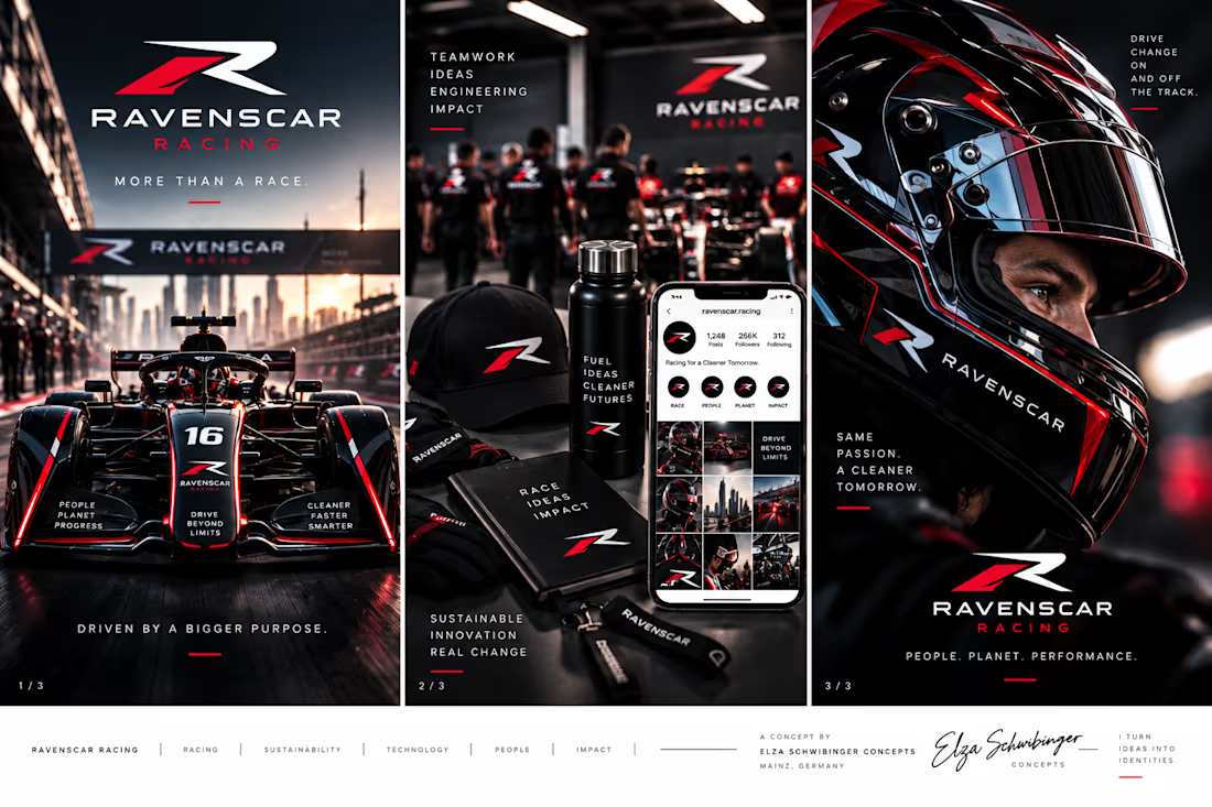
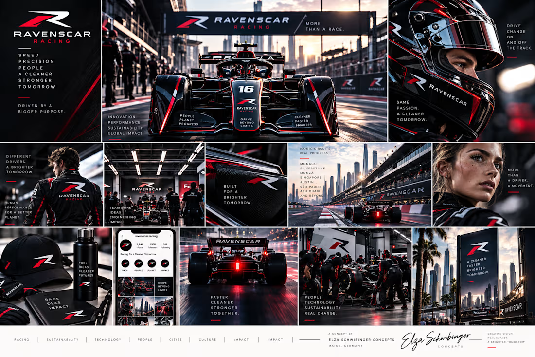

The system feels cohesive from the car graphics through the digital touchpoints—the red accents and tight black palette carry performance without becoming noisy. The supporting asset spread also makes the identity feel genuinely usable, not just a logo exercise.

A bold, cohesive fitness brand identity designed to bring energy, functionality, and modern aesthetics into one unified visual system.
The project spans branding, apparel, packaging, merchandise, and digital applications—creating a distinctive and scalable identity built for an active lifestyle.
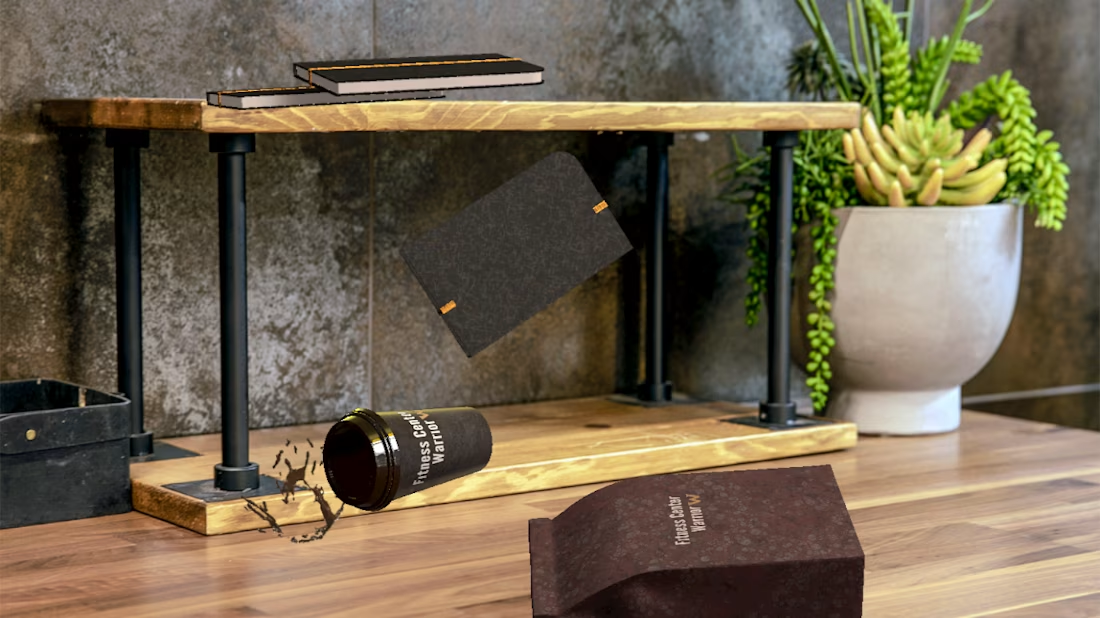
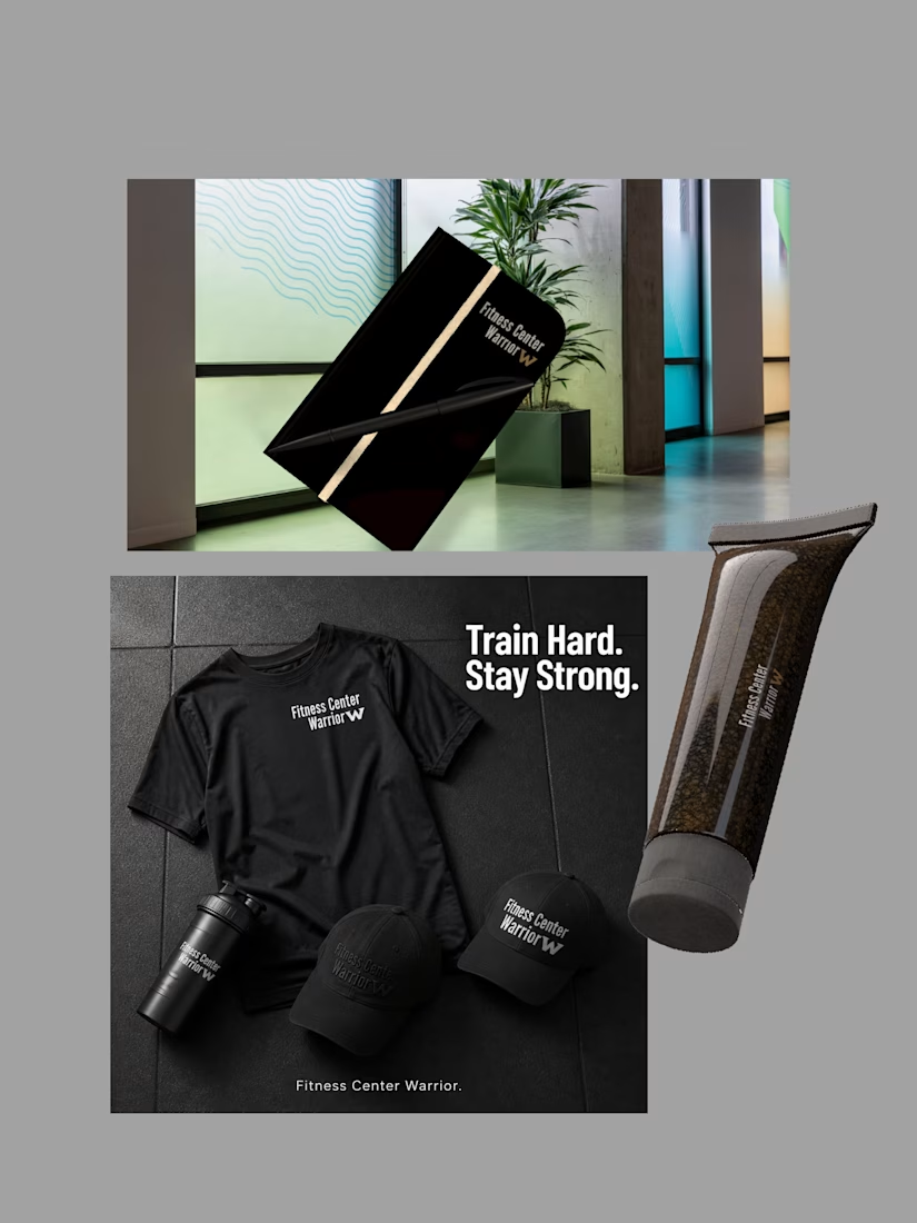
The restrained palette and tactile packaging make the fitness system feel premium without losing its energy. I especially like how the product photography carries the same confident rhythm as the identity.