The network for creativity
Join 1.25M professional creatives like you
Connect with clients, get discovered, and run your business 100% commission-free
Creatives on Contra have earned over $150M and we are just getting started
Back to feedPost

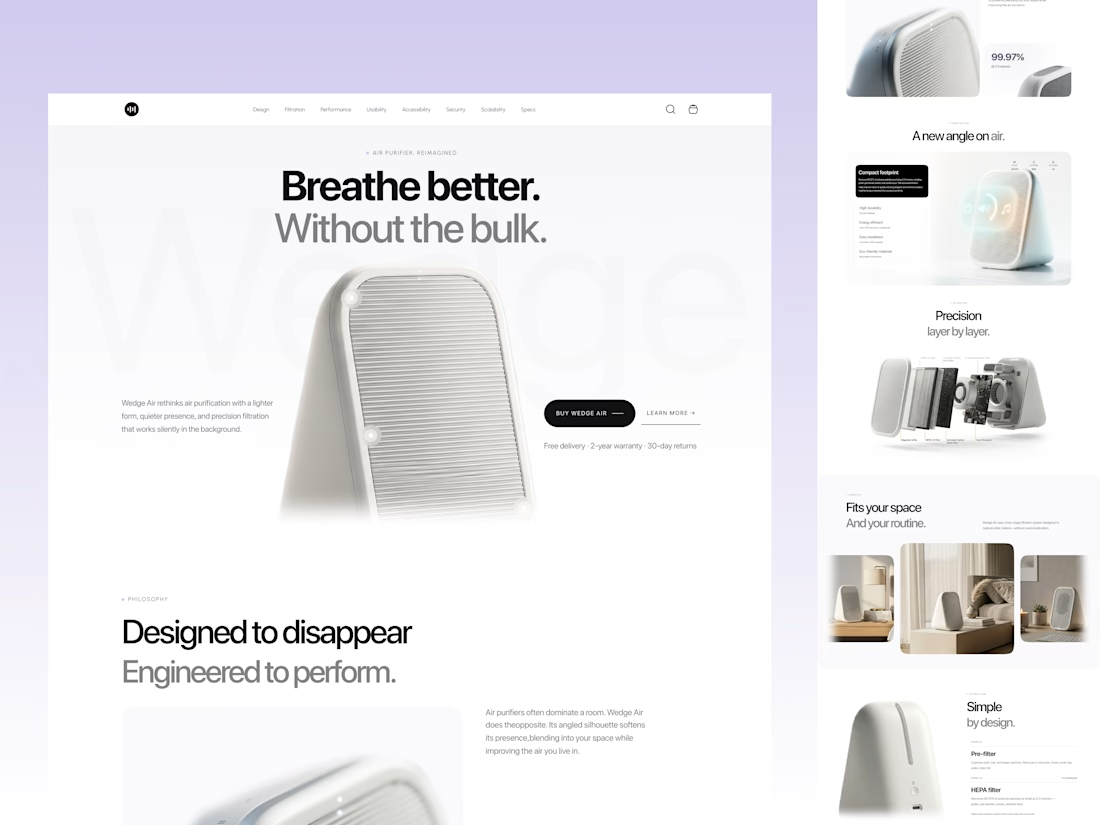
Minimal air purifier landing pageClean air products usually look technical, bulky, and forgettable.
So I explored a different direction — making an air purifier feel calm, premium, and beautifully minimal.
This concept focuses on:
• Soft visual storytelling
• Product-first presentation
• Clean typography & spacious layouts
• Lifestyle-driven product placement
• Exploded-view engineering showcase
• A seamless balance between function and aesthetics
The goal was simple:
Create a product experience that feels less like an appliance and more like a modern lifestyle object.
From the muted palette to the layered product visuals, every section was designed to communicate clarity, quietness, and precision.
Would love to hear your thoughts on the visual direction 👀

This is clean
The network for creativity
Join 1.25M professional creatives like you
Connect with clients, get discovered, and run your business 100% commission-free
Creatives on Contra have earned over $150M and we are just getting started

Challenges
View all


Related posts

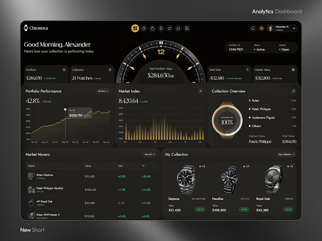
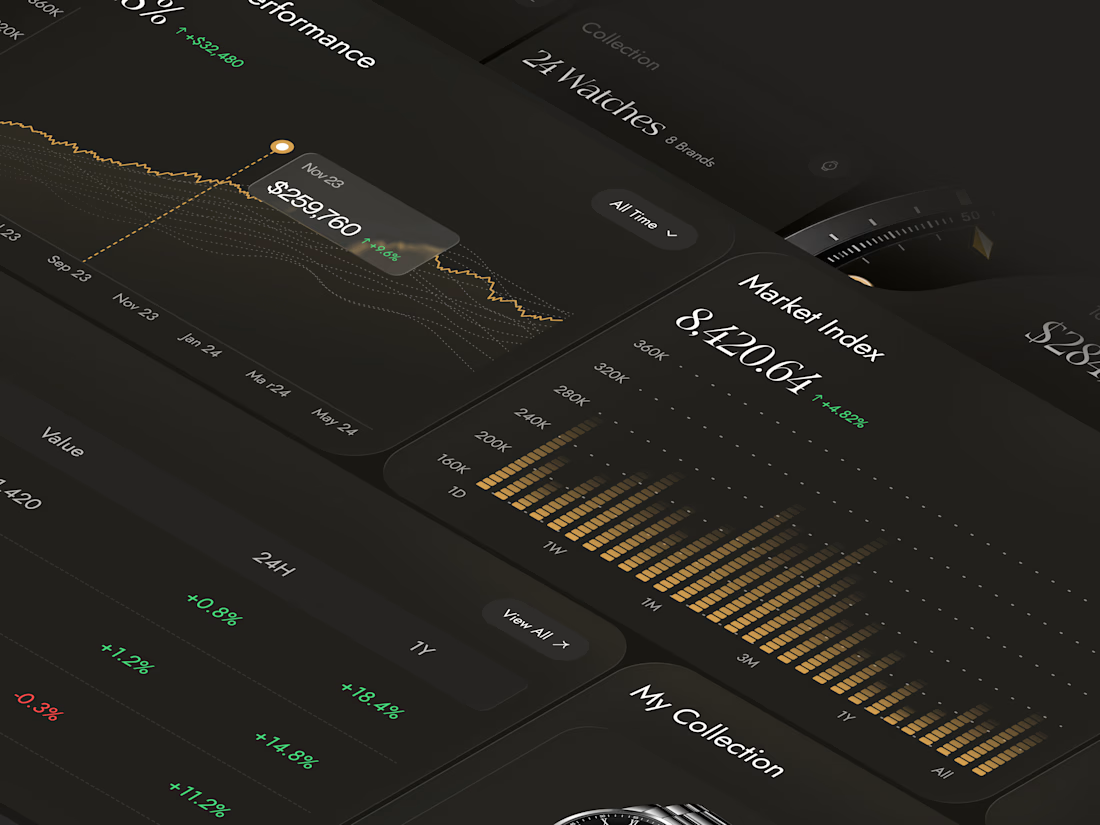
What if your watch collection had a dashboard this luxurious?
Meet Chronova. Built for collectors who care about every detail.
Would you use this?


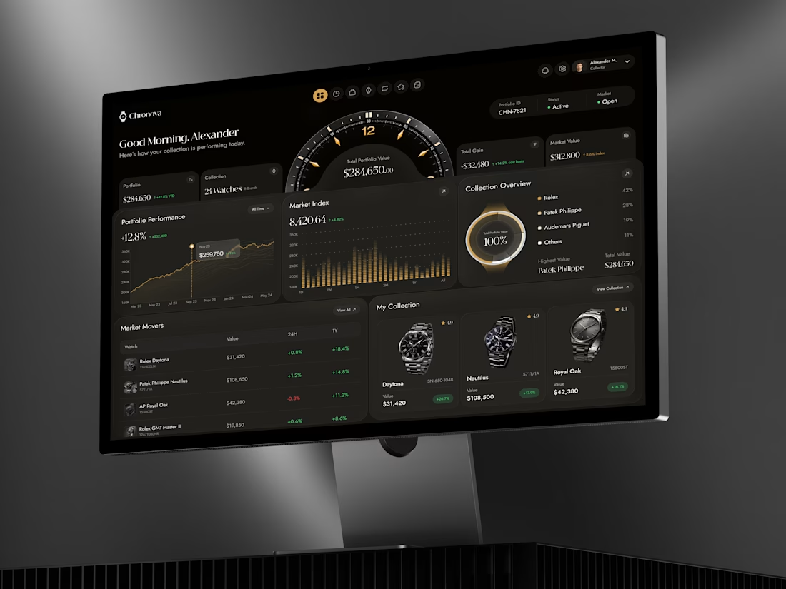

a dark dashboard makes sense here, the watches get to be the brightest thing on screen. how do you show a collection's value changing without it feeling like a trading app?

Product visuals created for S'IP Coffee Shop
Delicious designs engineered to turn scrollers into customers








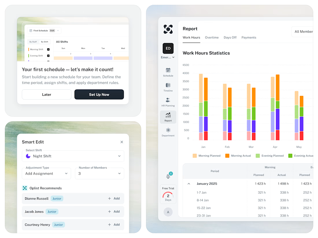
🚀 From Excel chaos to a clear SaaS workflow for staff scheduling.