The network for creativity
Join 1.25M professional creatives like you
Connect with clients, get discovered, and run your business 100% commission-free
Creatives on Contra have earned over $150M and we are just getting started
Back to feedPost

A big celebrity moment can drive initial interest but can it sustain a brand alone in 2026? Curious to hear your thoughts.
#celebritybrands #brandstrategy #creativedirection
The network for creativity
Join 1.25M professional creatives like you
Connect with clients, get discovered, and run your business 100% commission-free
Creatives on Contra have earned over $150M and we are just getting started











Related posts

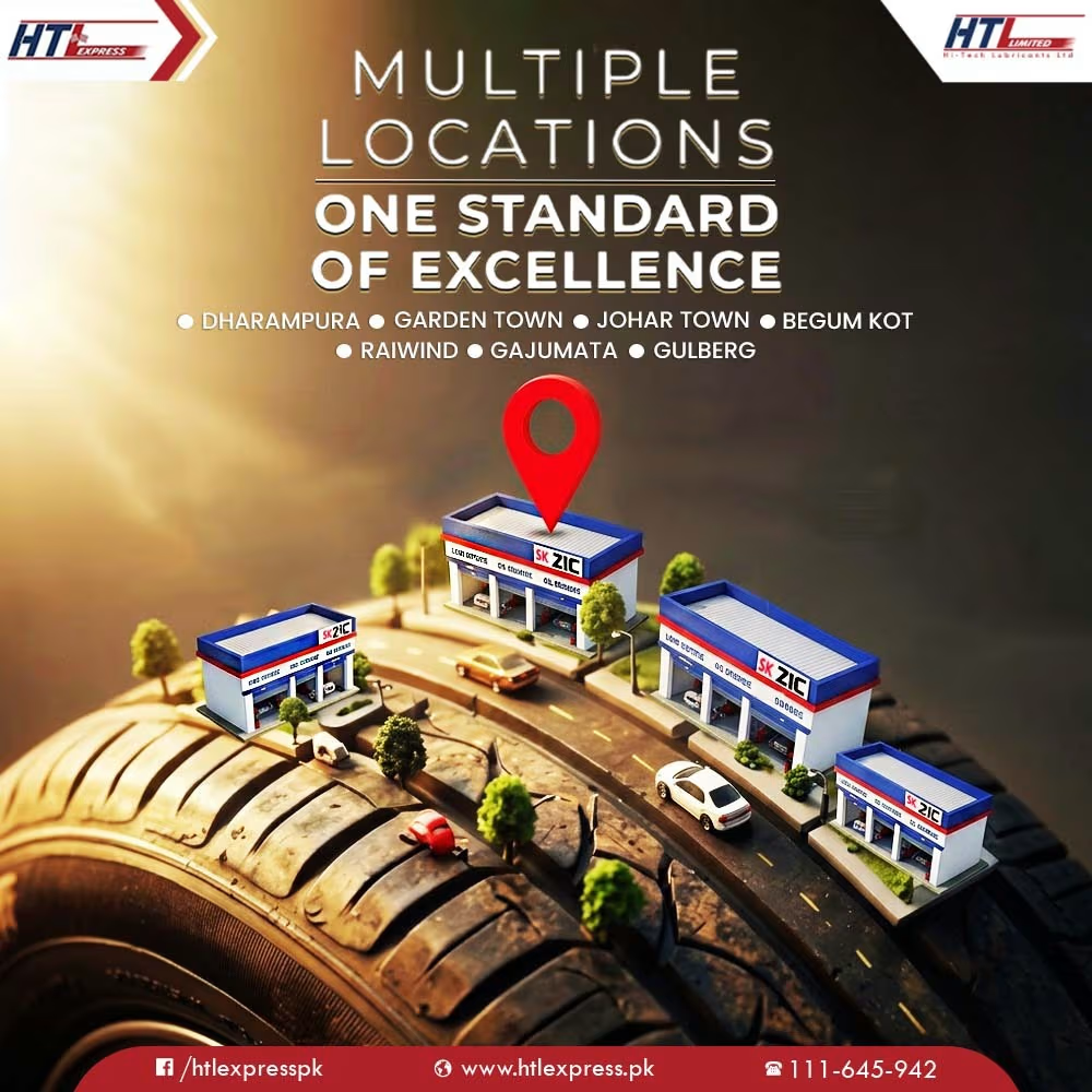
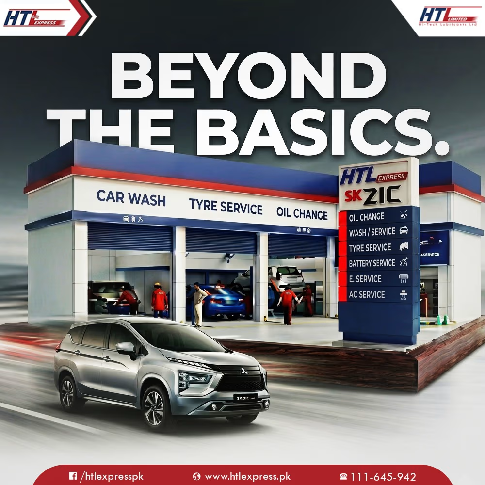
Social Media Design & Visual Branding for Automotive Brand







Awesome branding work

Branding work for WithNation
Love the motion, visual style and aesthetics on this one
The concept is to mix the power of creative prompting and allowing everyone to orchestrate their business from start to finish.
Build • Run • Market
The logo represents a shopping bag with the prompting input inside