The network for creativity
Join 1.25M professional creatives like you
Connect with clients, get discovered, and run your business 100% commission-free
Creatives on Contra have earned over $150M and we are just getting started
Back to feedPost

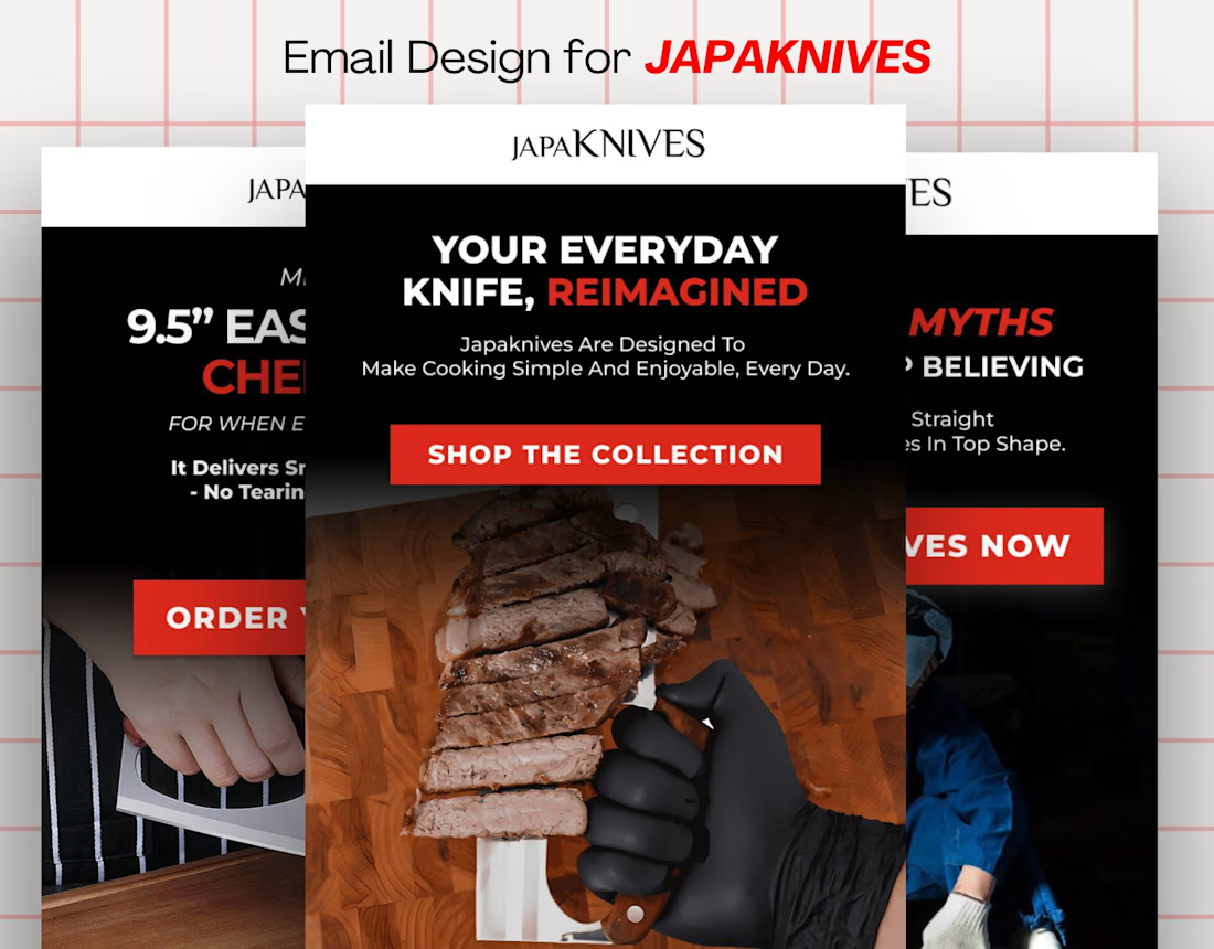
Email Marketing Design for Japaknives.
Designed in Figma and implemented in Klaviyo for Campaigns and Flow.


The network for creativity
Join 1.25M professional creatives like you
Connect with clients, get discovered, and run your business 100% commission-free
Creatives on Contra have earned over $150M and we are just getting started





Related posts

Hi everyone! I’m new to Contra and still learning how everything works here. I’d love to connect with other freelancers, especially designers, and hear about your experiences with Contra. If anyone is open to chatting or sharing some tips, I’d really appreciate it!


It's been some week, i tried some things increase score, so if u feel confused about any feature, I can help you out ❗


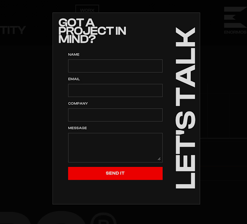
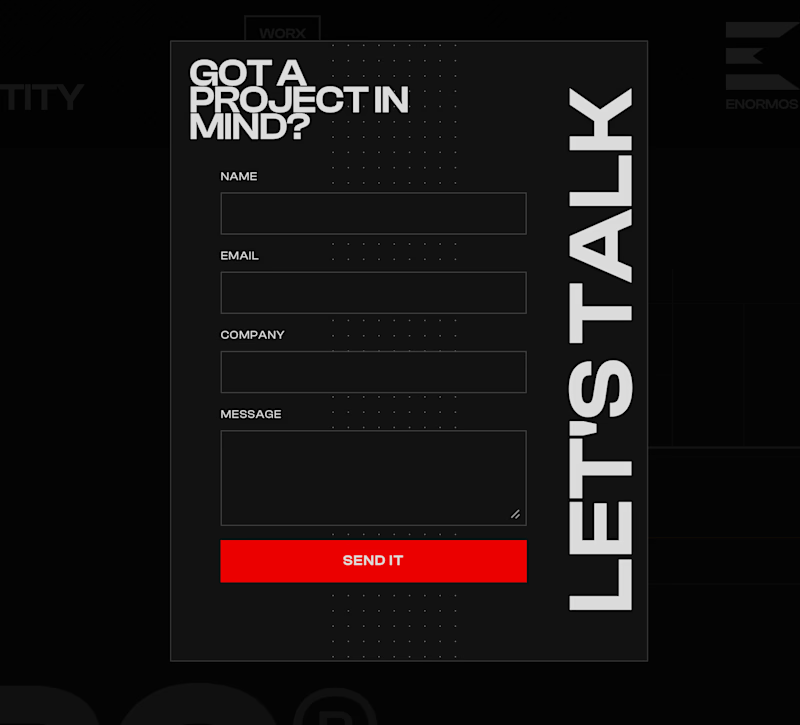
Working on this contact form for my own portfolio. Do you like it with or without the line of dots?
7 voted
44%
9 voted
56%
16 votes
Closed


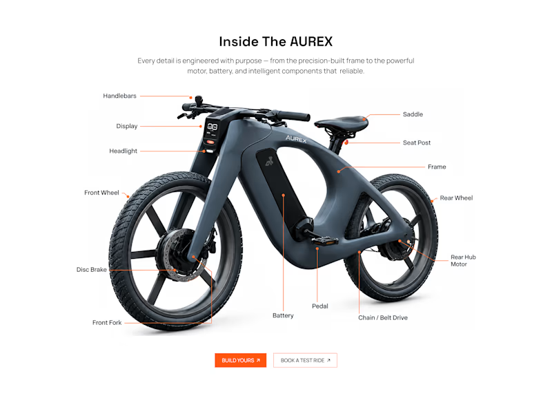
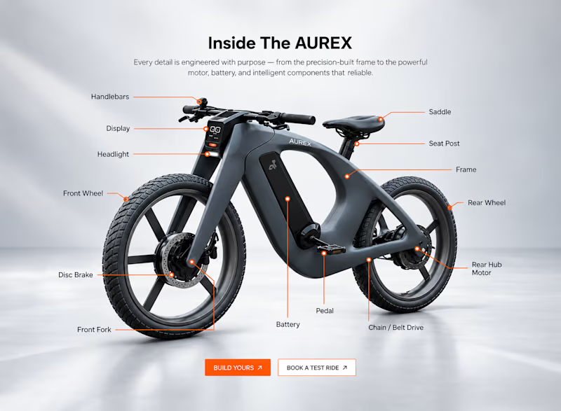
Light or refined - which E-Bike product breakdown section design would you choose?
Two concepts for the same AUREX e-bike. Same product, same components, two different presentation styles:
A - Soft Studio: subtle gray depth, larger product focus, and a more premium visual feel.
B - Clean Minimal: bright white background, tighter spacing, and a more technical editorial layout.
Which direction feels stronger for a premium e-bike brand and why?

5 voted
31%
11 voted
69%
16 votes
Closed

A feels more premium to me. The soft gray depth and bigger product focus make the bike feel like something special. B is great for specs, but A sells the feeling