The network for creativity
Join 1.25M professional creatives like you
Connect with clients, get discovered, and run your business 100% commission-free
Creatives on Contra have earned over $150M and we are just getting started
Back to feedPost

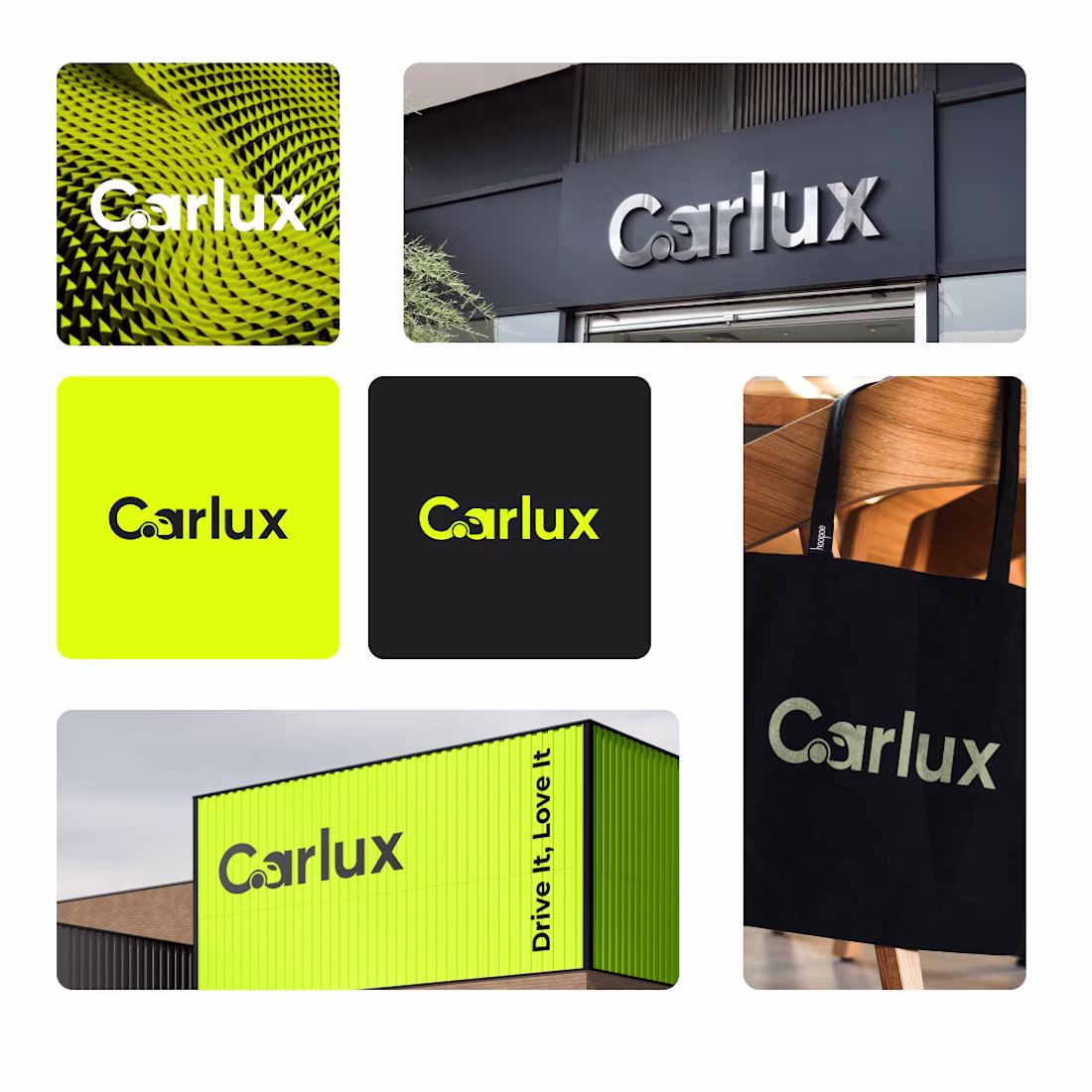
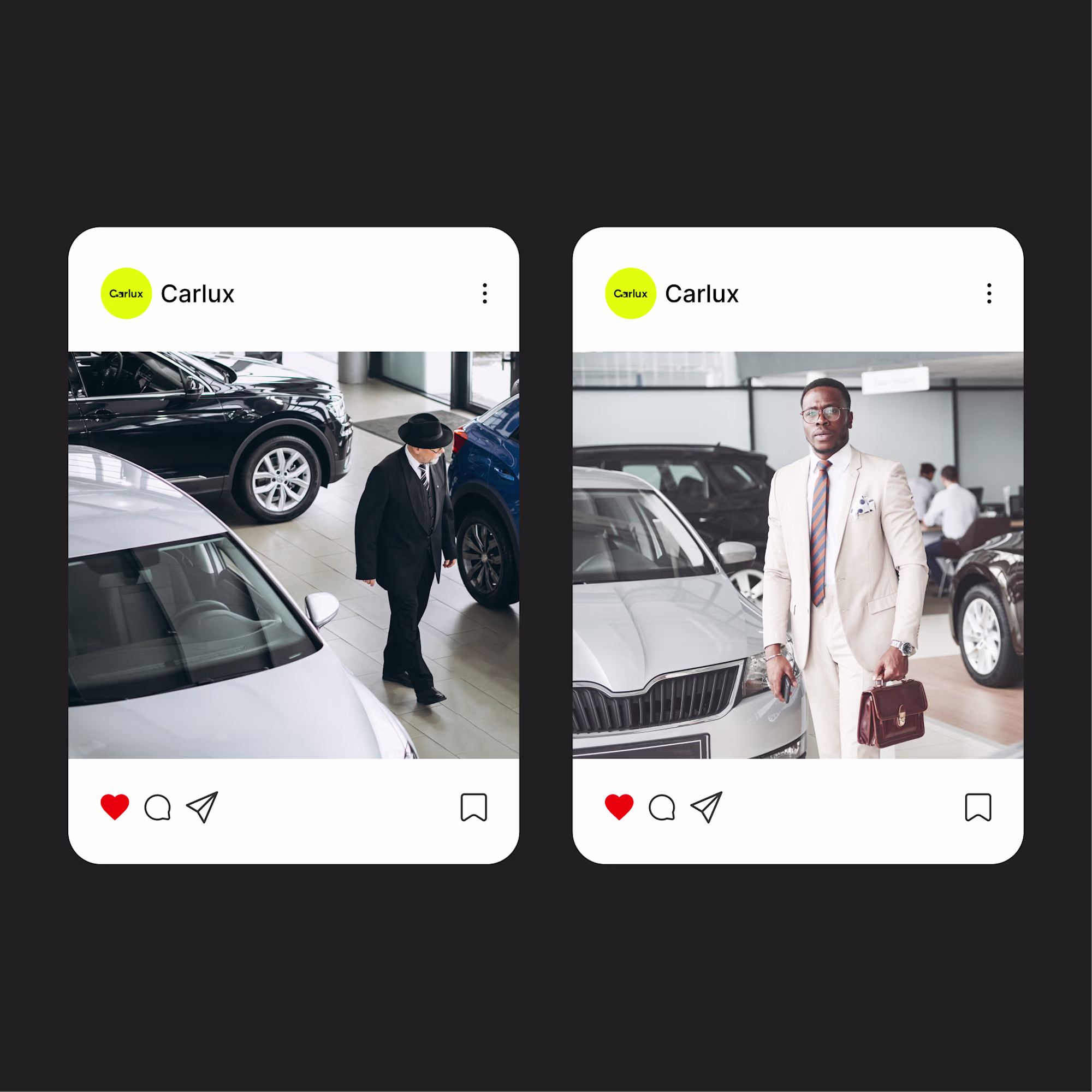
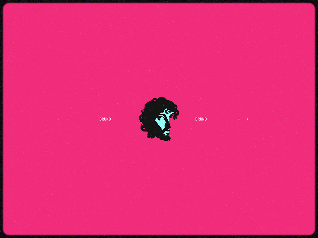
Here is a project I worked on 2 years ago and I'm proud of!
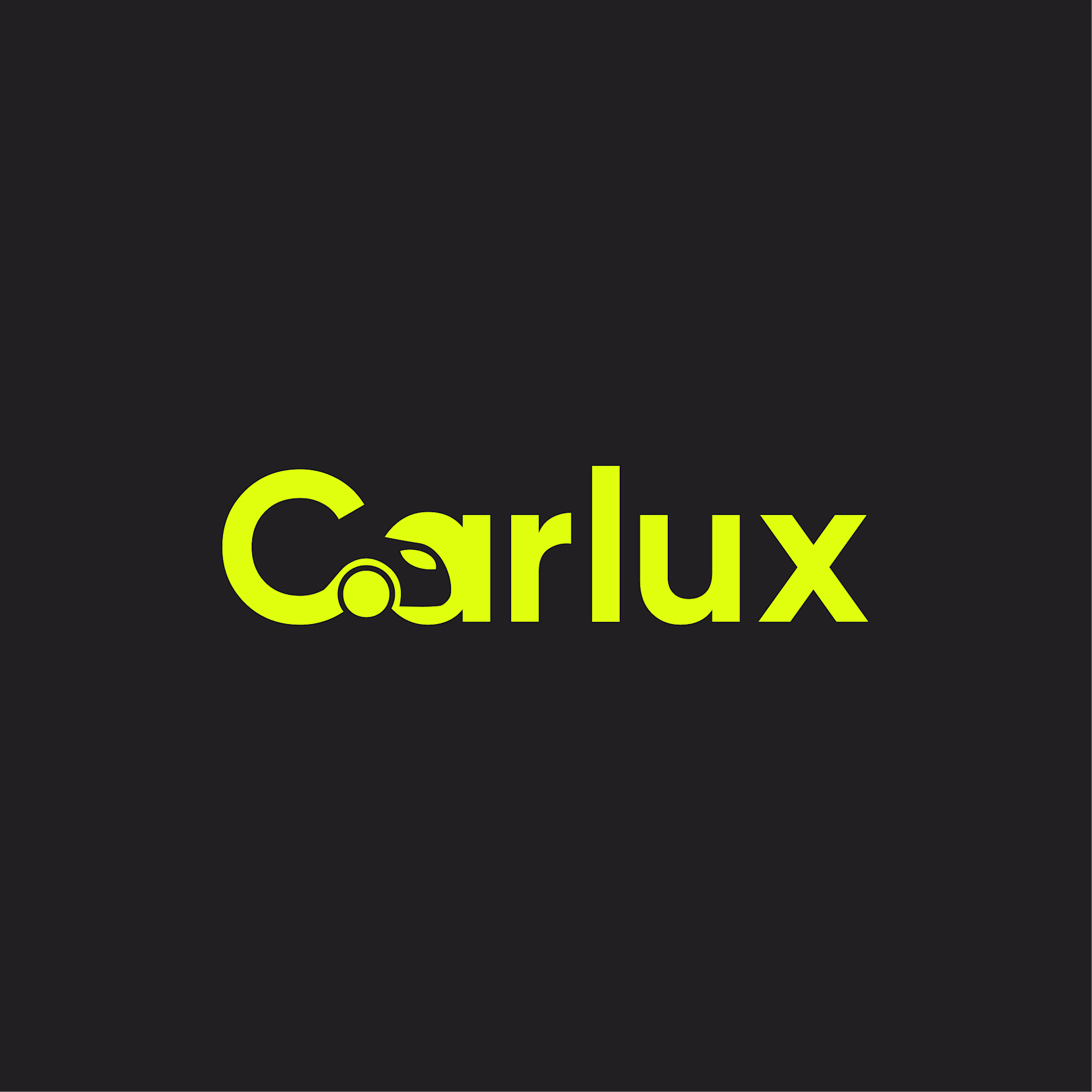
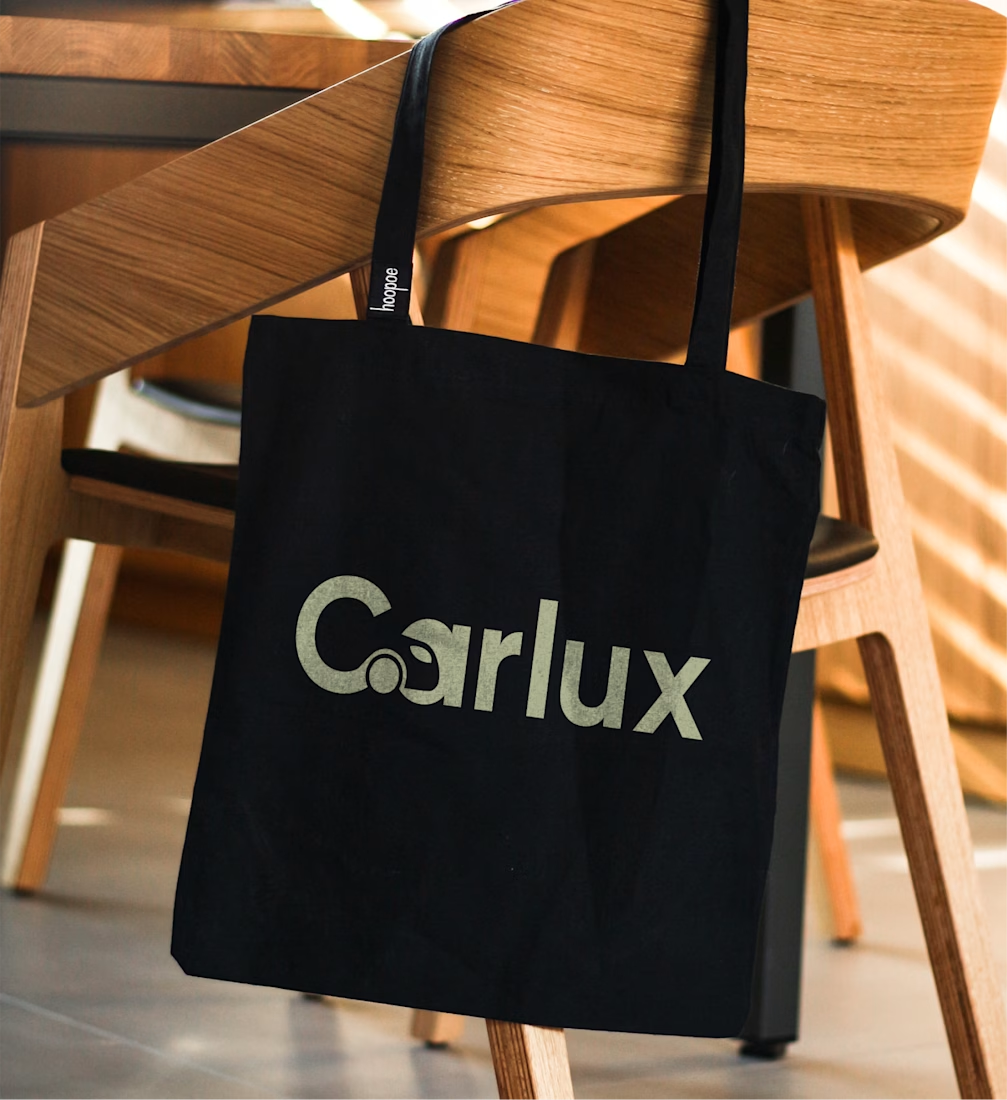
The goal was to create a minimal wordmark logo for the brand.
Carlux is a brand that deals in the sales of Luxury cars.
The logo had a car icon in a negative space, and I used a bold sans-serif font to depict the idea of the boldness and prestige people have when driving a luxury car.
Need a designer to bring your idea to life!
Send me a message today, let's collaborate to create greatness
#Branddesigner
Strong wordmark direction. The negative space integration is particularly interesting — subtle but memorable. Especially effective for a luxury-oriented brand where restraint tends to amplify perceived sophistication.
Thanks for your kind comment
Appreciate that — glad the intent came through. I was aiming for a restrained, minimal direction where the negative space carries part of the identity. Interesting how subtle details often create stronger recall than louder elements.
The network for creativity
Join 1.25M professional creatives like you
Connect with clients, get discovered, and run your business 100% commission-free
Creatives on Contra have earned over $150M and we are just getting started
Related posts
Nice design
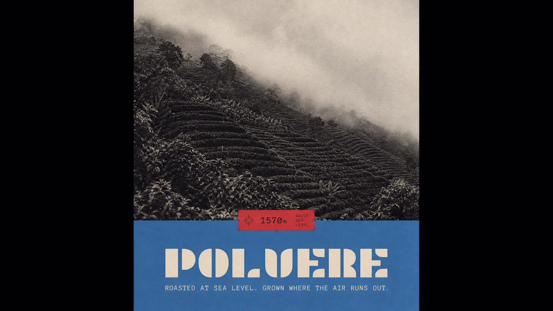
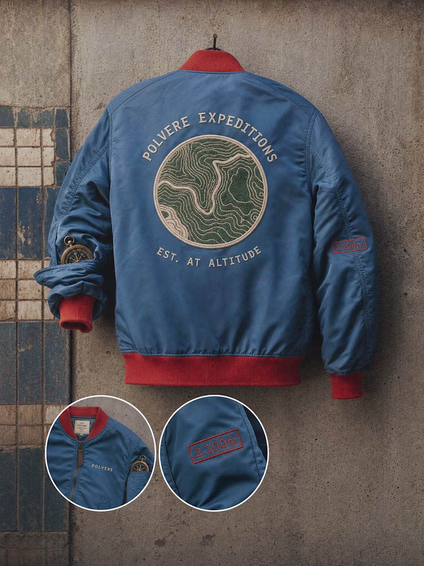
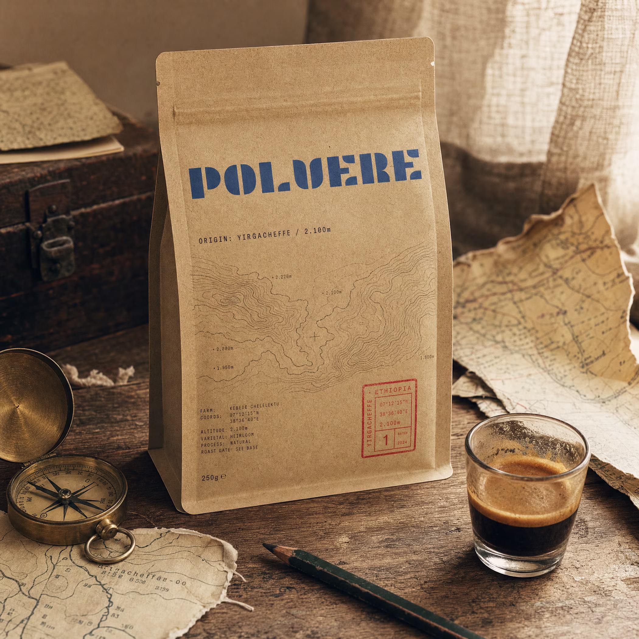
built a coffee brand where the bag is a postcard from 2,100m above sea level.
topographic maps. airmail borders. stamps that track altitude, not price.
full case study
Love this!
Trending
Claude
Claude has entered the design space. How are you using Claude Design?
Contra University
Learn from expert creatives how to earn more using next-gen AI tools.
creativeaiflow
Creative AI workflows are evolving. What tools do you use, and what are their strengths and weaknesses?
portfolioreview
The best portfolios tell a story, not just show a grid. Share yours for feedback.
freelancerlife
Freelancer life is wins, pivots, and everything in between. What’s yours right now?