The network for creativity
Join 1.25M professional creatives like you
Connect with clients, get discovered, and run your business 100% commission-free
Creatives on Contra have earned over $150M and we are just getting started
Back to feedPost


The network for creativity
Join 1.25M professional creatives like you
Connect with clients, get discovered, and run your business 100% commission-free
Creatives on Contra have earned over $150M and we are just getting started

Challenges
View all


Related posts

Generated these looks in Midjourney — but the layout is what really pulls it together.
Grid, crosshairs, typography, detail callouts: same images, but the presentation makes them read like an actual editorial spread instead of just pretty pictures.

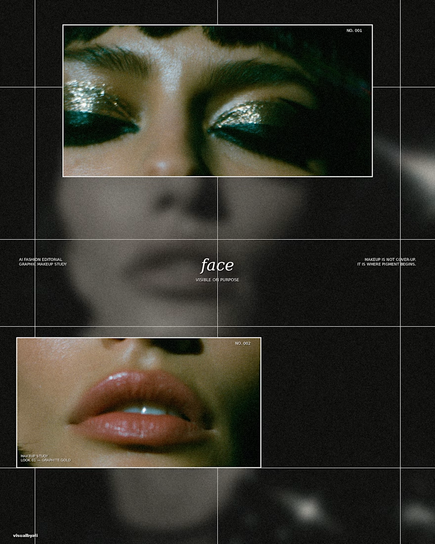
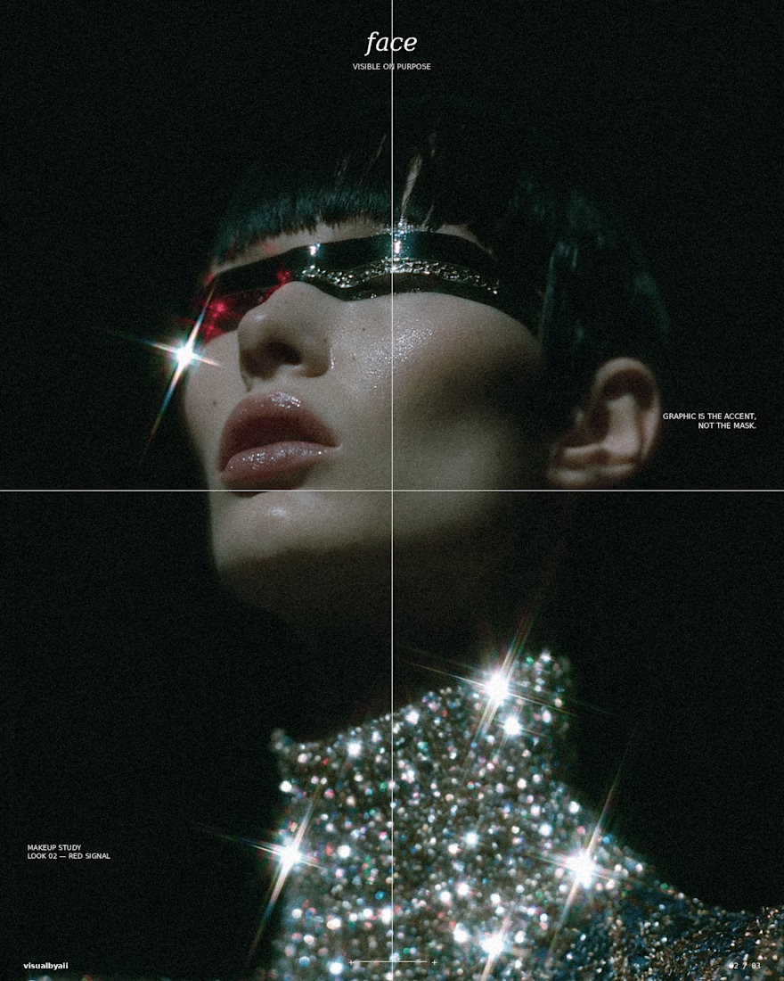
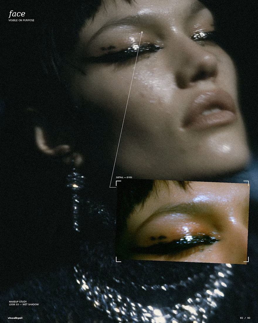

The grid, crosshairs, and detail callouts do more than decorate the Midjourney output—they turn it into an editorial system. Great example of how art direction can make a set feel like a coherent campaign.

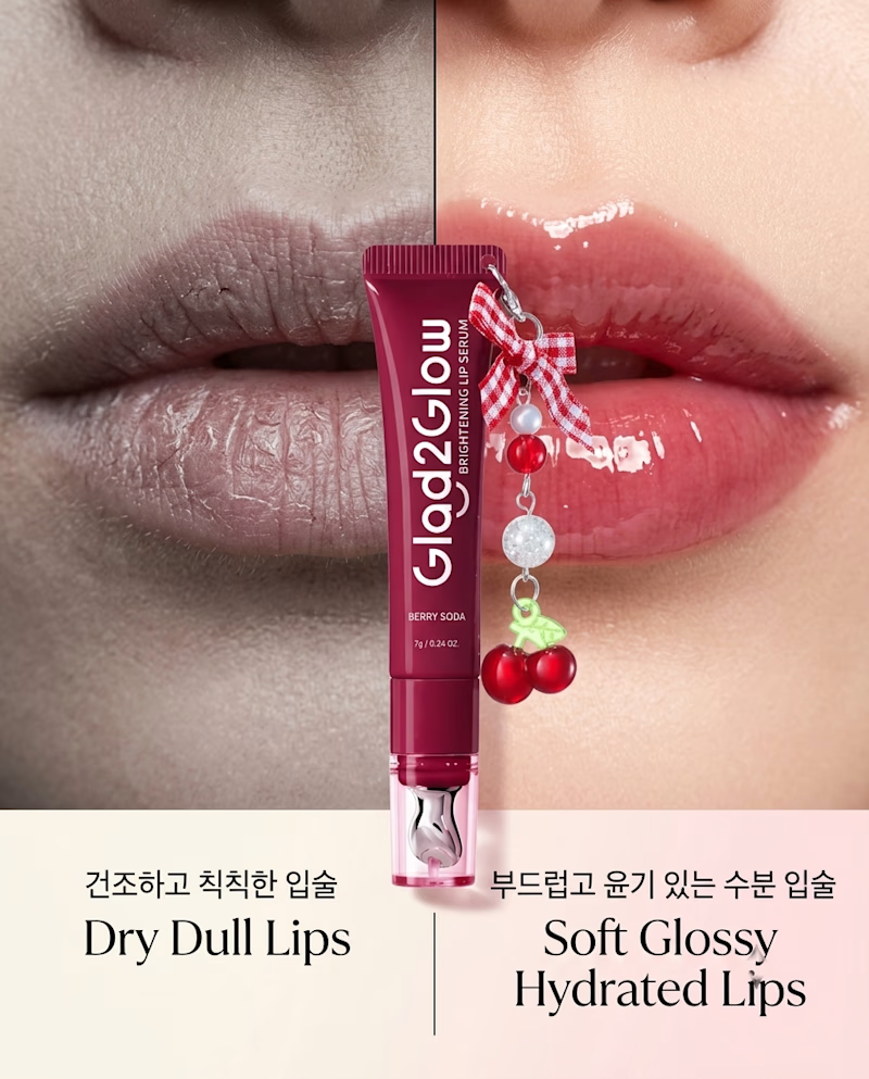
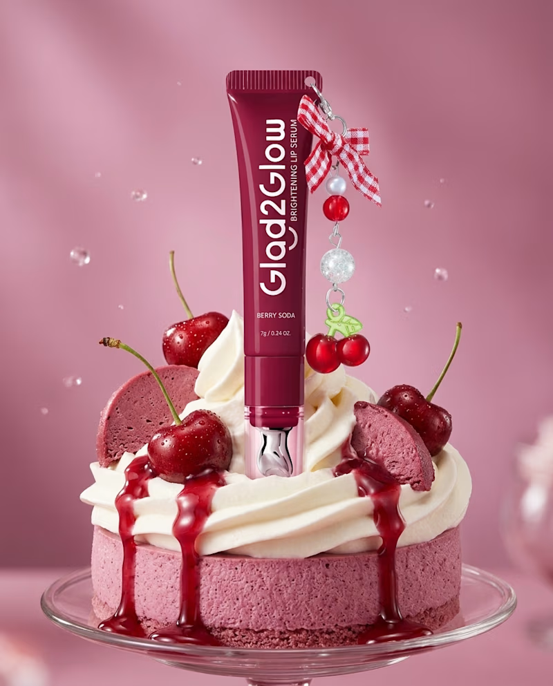
I Just Created GLOW2GLOW BERRY SODA 🍒✨
A beauty campaign concept for a Berry Soda Lip Serum, combining product styling, visual identity, and social media design into one cohesive visual experience.
I explored rich berry tones, glossy textures, cherries, and beauty-focused visuals to create a playful yet premium campaign that makes the product stand out.
🎨 Designed by me | Product & Social Media Design
What do you think of the creative direction? Drop your thoughts below! 🙌

1 voted
33%
2 voted
67%
3 votes
Closed


ATTENTION GRAPHIC DESIGNERS!
Let's be real. How do you feel about AI?

I feel it's a great tool use to improve speed and also help build on the creativity you already have.