The network for creativity
Join 1.25M professional creatives like you
Connect with clients, get discovered, and run your business 100% commission-free
Creatives on Contra have earned over $150M and we are just getting started
Back to feedPost
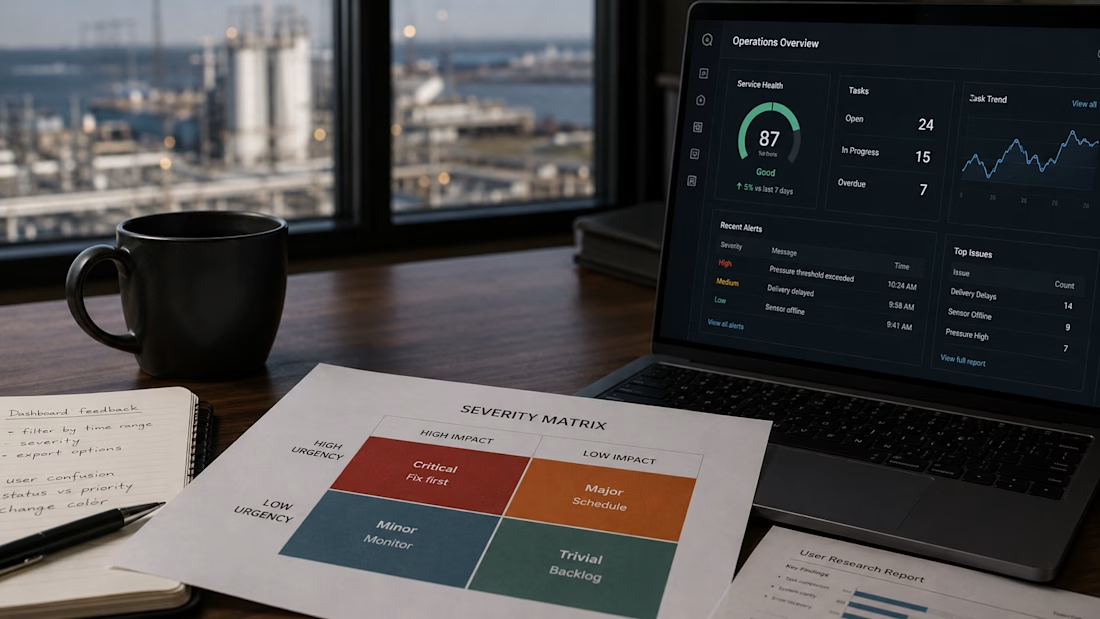
Just published on Medium: "Your Usability Score says 'good.' Your roadmap still isn't done."
After four years testing dashboards across energy, logistics, and operational systems, I keep seeing the same pattern: a passing usability score feels like permission to move on.
It isn't.
In this article, I explore why the severity matrix often tells a more important story than the overall score and how it changes conversations with stakeholders.
The biggest usability problems rarely affect everything. They hide in one or two critical tasks that consistently slow users down, create friction, or increase cognitive load.
That's exactly why aggregate metrics can be misleading.
If you work with operational systems, logistics, energy, or anywhere people depend on software to move real assets through real infrastructure, I'd like to hear your perspective.
What patterns are you seeing in your own usability research?
[Link to the Medium article in the comments below]
The network for creativity
Join 1.25M professional creatives like you
Connect with clients, get discovered, and run your business 100% commission-free
Creatives on Contra have earned over $150M and we are just getting started
Related posts
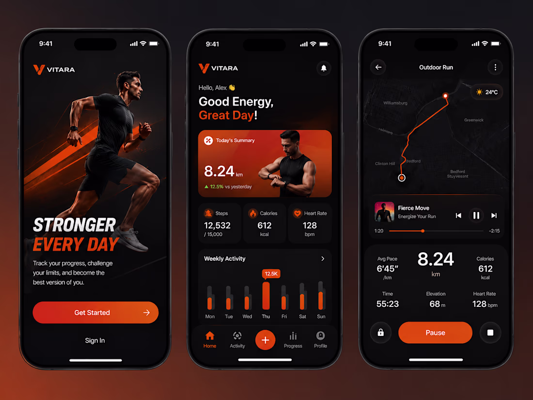
Every fitness app tracks your activity.
But the best ones make you want to come back tomorrow.
That was the idea behind this concept.
Instead of designing another dashboard filled with numbers, I focused on creating an experience that feels motivating from the moment you open the app.
A few things I paid extra attention to:
- A bold onboarding screen that creates energy from the first interaction.
- A dashboard that highlights progress without overwhelming users.
- Clear visual hierarchy so the most important metrics stand out instantly.
- A workout screen that keeps everything accessible while you're on the move.
- A consistent dark theme with vibrant orange accents to reinforce the brand's energy.
Good fitness apps don't just measure performance.
They motivate people to keep going.
What would you improve?
Excellent
3 signs your admin dashboard is hurting productivity:
Everything is important - No visual hierarchy. Eyes don’t know where to go
5 clicks to do 1 task - Approve, edit, save should be 1-2 clicks max
No mobile version - Managers check data on phone too
Fix these 3 and your team go save hours every week.
Agree or disagree? What’s #4?
#UXDesign #SaaS #Dashboard #Productivity #DesignTips
Time Zone Overview
Exploring how thoughtful motion can simplify global collaboration.
This Time Zone Overview concept combines real-time time zone tracking, a clean visual timeline, and intuitive interactions to help users compare locations and coordinate across different regions. Designed as a dashboard interaction study for productivity tools, SaaS platforms, and business applications.
Challenges
View allTrending
Claude
Claude has entered the design space. How are you using Claude Design?
Contra University
Learn from expert creatives how to earn more using next-gen AI tools.
fifaworldcup2026
The World Cup is here and the whole world's watching. How are you designing for the world stage?
creativeaiflow
Creative AI workflows are evolving. What tools do you use, and what are their strengths and weaknesses?
freelancerlife
Freelancer life is wins, pivots, and everything in between. What’s yours right now?