The network for creativity
Join 1.25M professional creatives like you
Connect with clients, get discovered, and run your business 100% commission-free
Creatives on Contra have earned over $150M and we are just getting started
Back to feedPost

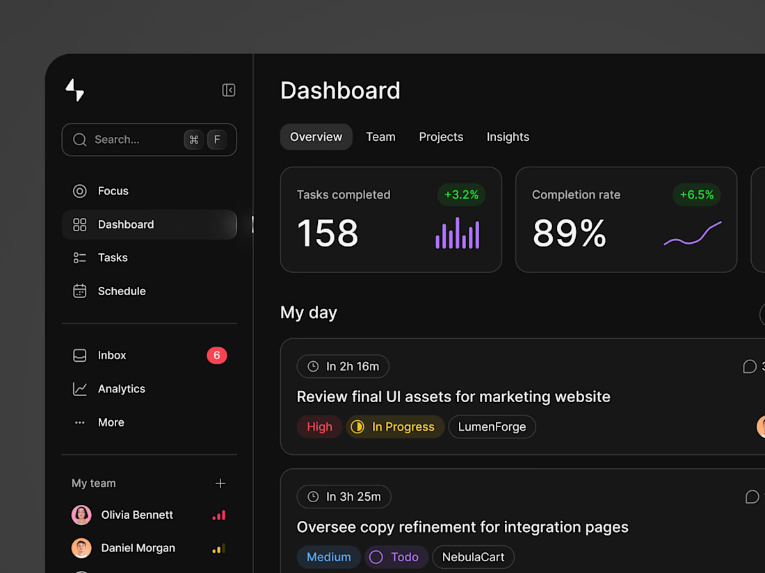
3 signs your admin dashboard is hurting productivity:
Everything is important - No visual hierarchy. Eyes don’t know where to go
5 clicks to do 1 task - Approve, edit, save should be 1-2 clicks max
No mobile version - Managers check data on phone too
Fix these 3 and your team go save hours every week.
Agree or disagree? What’s #4?
#UXDesign #SaaS #Dashboard #Productivity #DesignTips
The network for creativity
Join 1.25M professional creatives like you
Connect with clients, get discovered, and run your business 100% commission-free
Creatives on Contra have earned over $150M and we are just getting started
Trending

Claude
Claude has entered the design space. How are you using it?

Contra University
Learn from expert creatives how to earn more using next-gen AI tools.
Brand Design
The best brand designers are on Contra. Scroll to see what's trending in brand design. What are you building?
creativeaiflow
Creative AI workflows are evolving. What tools do you use, and what are their strengths and weaknesses?
freelancerlife
Freelancer life is wins, pivots, and everything in between. What’s yours right now?



Related posts


A company can be doing serious work and still look surprisingly small online.
Here are three signs your website might be creating that impression:
1) Everything is fighting for attention
Every service, feature and message feels equally important. When there’s no clear hierarchy, visitors don’t know where to look or what to remember.
2) Your best proof comes too late
Client names, results and real examples of your work are buried near the bottom of the page - long after most visitors have already formed an opinion.
3) Every page feels disconnected
The layouts change. The spacing changes. Even the way you explain your offer changes. Instead of showing versatility, the website starts to feel inconsistent.
The tricky part is that none of this necessarily looks “bad.” Your team may be experienced. Your work may be excellent. Your offer may genuinely stand out.
But new visitors can only judge the business through what the website communicates.
And when the website feels uncertain, the company often does too.


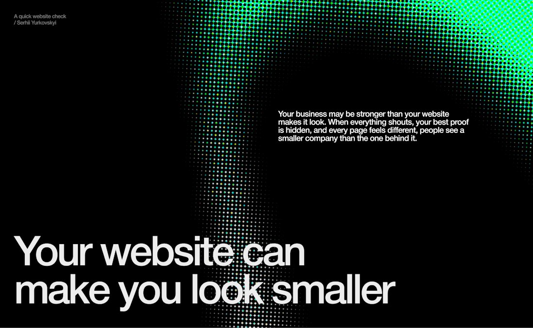

Well said. A website shapes perception within seconds. Clear visual hierarchy, early social proof, and a consistent user experience can make an established company feel as credible online as it is in the real world.

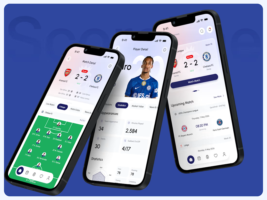
The final app experience. Built around scannable live match stats, dynamic pitch lineups, and deep player performance data.
(2/5)

Project & Team Management Dashboard. 🚀
A dark-mode productivity dashboard designed for team collaboration and task management. It features high-level key metrics (tasks completed, completion rate, and pending reviews), a prioritized daily task list, team capacity indicators, and a real-time activity feed with recent team mentions.