The network for creativity
Join 1.25M professional creatives like you
Connect with clients, get discovered, and run your business 100% commission-free
Creatives on Contra have earned over $150M and we are just getting started
Back to feedPost

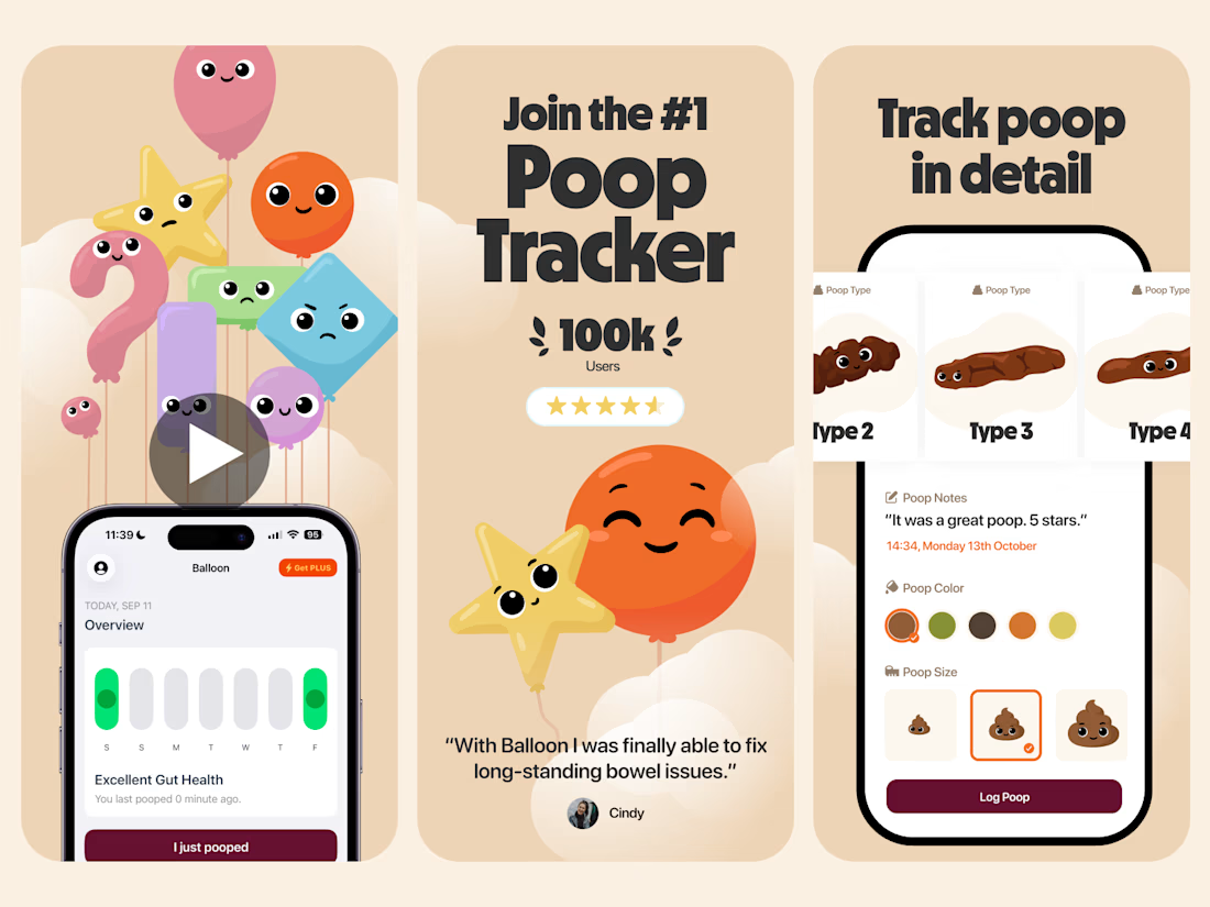
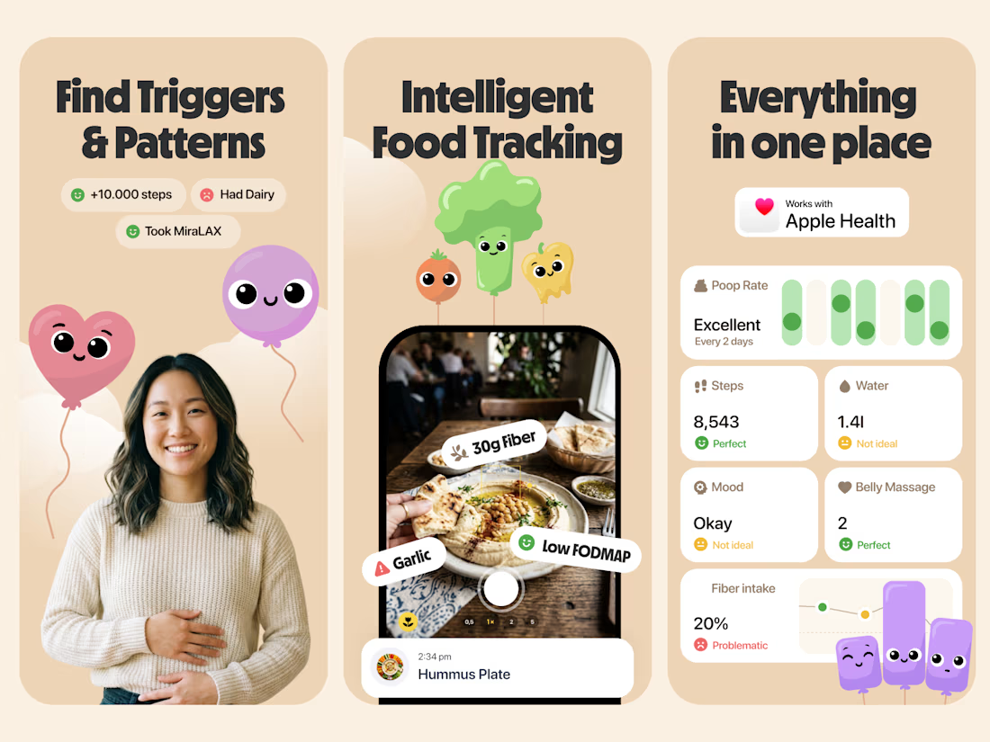
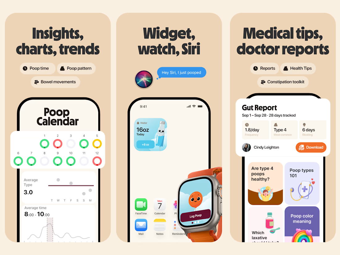
This mockup brings such a sense of lightness—exactly what we wanted to convey for the brand.
The network for creativity
Join 1.25M professional creatives like you
Connect with clients, get discovered, and run your business 100% commission-free
Creatives on Contra have earned over $150M and we are just getting started



Related posts


Every letter of the wordmark was uniquely drawn in Adobe Illustrator as a guilloche pattern tile. I then built everything into custom Figma plugins that generate the result, so tash.cards can form unique words for its own communication.

This is striking Nikas! 👏 The layered guilloche lines in pink and blue against the black background look so precise. I like that you build figma plugins so the wordmark can create new words, since it makes the brand flexible and unique. Great work on tash.cards!

One pixel grid. A whole brand.
For Appy, a London product studio for impact-driven startups, the wordmark, icons, 3D smile and Appy Pixel, its custom typeface, all come from the same grid.
Appy Pixel won Typography at the Online Design Awards.
Type first or symbol first: where do you start a rebrand?


thats so nice, i loveee

i love this lol, you deserve an upgoat from me hahah