The network for creativity
Join 1.25M professional creatives like you
Connect with clients, get discovered, and run your business 100% commission-free
Creatives on Contra have earned over $150M and we are just getting started
Back to feedPost

Built Atlas, an End-to-End Travel App Prototype.
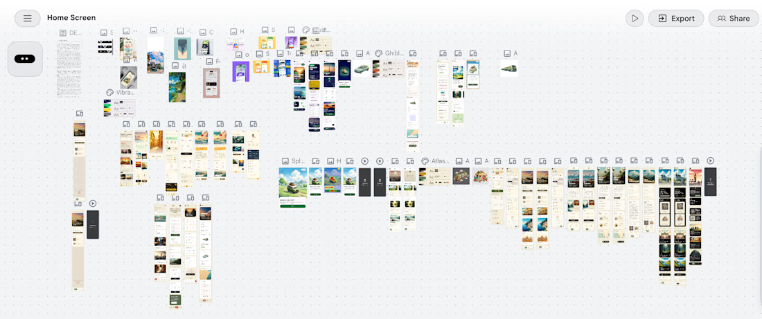
Atlas is an end-to-end travel planning prototype covering the full user journey from destination discovery through visa application, flight booking and activity planning. It was designed and prototyped using Claude as the design system engine and Google Stitch as the generation tool, with UI references curated from Pinterest and Mobbin.
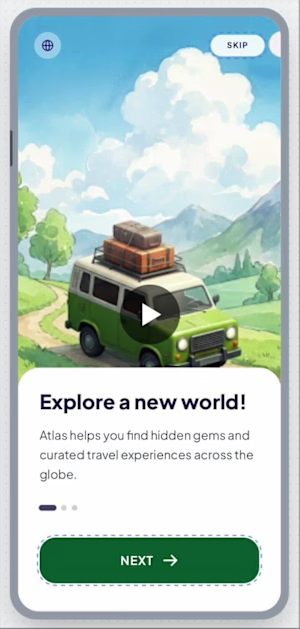
The central design decision: all destination imagery is rendered in Studio Ghibli painterly illustration style. No photography. Every country card, every hero screen, every activity scene is hand-painted cartoon art — warm brushstrokes, layered skies, thick vegetation, glowing light.
The Design Thinking
Touring pages and booking flows are serious product surfaces. They handle real decisions — money, travel documents, visa deadlines. I approached them the way a business landing page designer would: earn trust first, create desire second, remove friction at every step.
The Ghibli illustration style was a deliberate answer to a real problem. Photography in travel apps always belongs to someone else's trip. An illustration belongs to the user's imagination. It represents possibility rather than memory. That psychological shift — from "look where someone else went" to "imagine where you could go" — changes how the user emotionally engages with the product.
The background across the entire app is a warm parchment cream, not white and not black. This decision came from studying a lockscreen design featuring the Great Wall of China rendered in illustrated style. The cream background reduced visual intensity, made the illustrations breathe and gave the app warmth that pure white UIs cannot achieve.
The Cloth-Grab Interaction
One signature interaction was adapted from a food app UI reference: a linen cloth illustration at the top of the Offers section, with a cartoon hand gripping it. When the user swipes upward, the cloth peels back to reveal new destinations and offers beneath — like pulling a tablecloth to reveal what's underneath. This interaction is used in exactly one place, which gives it meaning and surprise value rather than becoming a repetitive pattern.
Animation Philosophy
Every animation in Atlas is triggered only by user interaction. Nothing loops. Nothing auto-plays. Nothing rotates or moves without the user initiating it. Buttons press down on tap and spring back. Cards lift slightly before navigating. Page transitions slide in from the right, back from the left. The cloth peels only when swiped. This restraint makes each interaction feel intentional and physical rather than performative.
Process
I collected UI references from Pinterest and Mobbin — spanning food delivery apps, fintech wallet designs, sports match apps, shopping flows and travel concepts. I identified patterns I wanted to carry into Atlas: the warm non-white backgrounds, the illustrated card tiles, the cloth-grab, the wax-seal status badges, the floating label inputs.
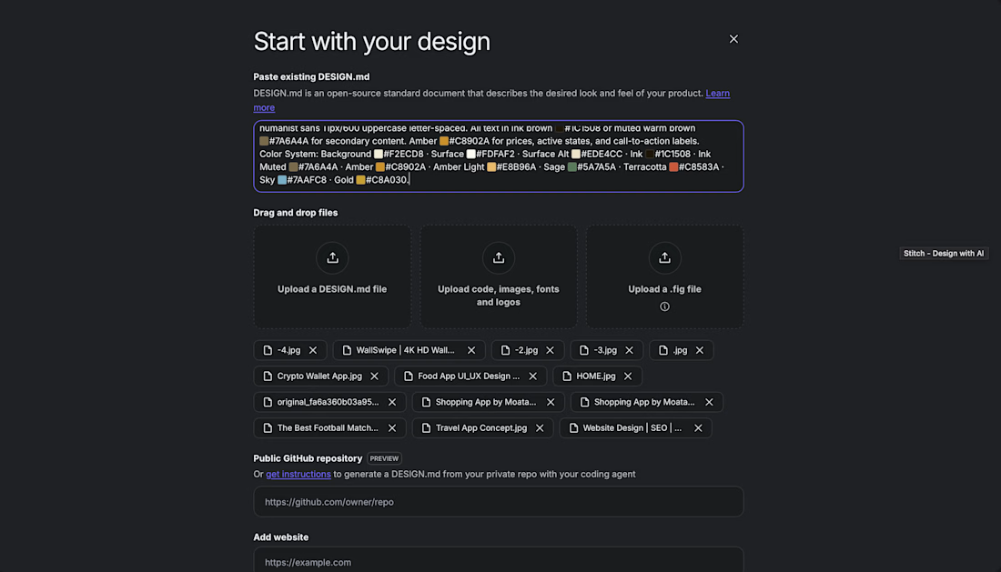
I fed these references and my design direction into Claude, which generated a comprehensive design system markdown file — color tokens, typography scale, component specifications, animation behavior rules, illustration briefs for every screen and detailed screen-by-screen prompts written in precise language.
That structured markdown was then fed into Google Stitch, which used the prompts to generate the visual prototype screens. Stitch handled the translation from written specification to visual output.
Tools
Claude — design system documentation, component specifications, screen prompts Google Stitch — prototype generation from prompts Pinterest and Mobbin — UI reference collection Studio Ghibli illustration style — visual language for all destination and scene art



This is a beautiful example of using illustration as a product decision, not just a visual style. The idea that illustrations represent possibility rather than someone else's memories is such a strong insight.
View my entry for this challenge:
https://on.contra.com/pnfJBQ
Would love to hear your thoughts!

on.contra.com
Introducing Voya: Revolutionize Your Travel Planning Experience
Connect with next-gen talent and tools to get work underway. Hire more independents. Start more projects. Get more creative.
The network for creativity
Join 1.25M professional creatives like you
Connect with clients, get discovered, and run your business 100% commission-free
Creatives on Contra have earned over $150M and we are just getting started





Related posts



Professional work

Take a vampire, a grim reaper and a bat for a midnight ride through a haunted town. Hold to boost over broken track, brake before the big hills, and grab candy to refill your boost. Push your luck too far and your passengers end up splattered across the screen.


Cute!!

AI Sales Agent SaaS Landing Page
A modern AI Sales Agent & Sales Intelligence SaaS website designed for startups and growing businesses looking to automate sales workflows, streamline lead management, and boost revenue through intelligent automation and real-time insights. The design combines a premium SaaS aesthetic with a conversion-focused user experience, featuring clear product messaging, interactive sections, and a scalable interface built to support modern sales teams.

Amazing design