
Raja Thejes
Product Manager and Owner. AI native Product Designer.
Profile in progress
Raja is building their profile!

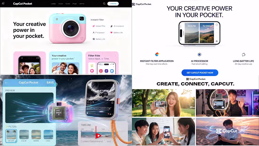
CapCut Pocket: The Voice-Activated Edge AI Camera by CapCut.
Direction A: Imagined Capcut as an Alternate Industry having a handy AI camera. Fusion of Instax, GoPro with the inbuild capcut in ultra AI processsor.
CapCut Pocket is a mobile-sized standalone computer and camera ecosystem that translates CapCut’s software philosophy removing friction from human creativity into a tangible, high-desire physical accessory. It merges the playful, collectible aesthetic of lifestyle cameras like the Fujifilm Instax with the high-performance capabilities of action cams (GoPro, Insta360) and mobile flagships, delivering an unmatched cinema-level output through automated voice workflows.
Key Product Features & UX Usability:
• Vocal Interface Editing: Eliminates the cognitive load of mobile timeline editing. Creators speak commands directly to the hardware (e.g., "Apply 35mm Fujifilm simulation tone" or "Match Sony FX3 color space") and the footage renders on the fly.
• Live Stream Pipeline: Features a seamless, instant broadcast link to external monitors and streaming devices, making it an essential hub for YouTube creators, live streamers and online educators.
• Next-Gen Form Factor: Designed as a beautiful, durable toy. It produces zero thermal throttling (no heat), boasts multi-day battery efficiency, features a shatter-resistant composite screen and fits effortlessly into a pocket.
Technical Architecture: The CapCut Kinetic-1 Chip At the heart of the device is the proprietary CapCut Kinetic-1 (K1) Neural Processor. Unlike generic off-the-shelf mobile processing units or power-hungry desktop architectures, the K1 features application-specific integrated circuits (ASICs) optimized purely for real-time generative video models and localized neural color grading. This enables desktop-class processing speeds at a fraction of the power consumption.
Design Pipeline & Tool Prototyping Workflow To prove complete project execution and active feature experimentation, this concept was developed using a multi-layered design matrix:
• Aesthetic Alignment: Mood boarding and user trend mapping sourced via Pinterest.
• Product Realization: High-fidelity hardware turnarounds and colorway iterations generated via Nano Banana.
• Marketing Animation: Dynamic 3D promotional movement and video assets generated natively inside the CapCut Design Studio canvas using the Dreamina Seedance 2.0 model.
0
72
Built Atlas, an End-to-End Travel App Prototype.
Atlas is an end-to-end travel planning prototype covering the full user journey from destination discovery through visa application, flight booking and activity planning. It was designed and prototyped using Claude as the design system engine and Google Stitch as the generation tool, with UI references curated from Pinterest and Mobbin.
The central design decision: all destination imagery is rendered in Studio Ghibli painterly illustration style. No photography. Every country card, every hero screen, every activity scene is hand-painted cartoon art — warm brushstrokes, layered skies, thick vegetation, glowing light.
The Design Thinking
Touring pages and booking flows are serious product surfaces. They handle real decisions — money, travel documents, visa deadlines. I approached them the way a business landing page designer would: earn trust first, create desire second, remove friction at every step.
The Ghibli illustration style was a deliberate answer to a real problem. Photography in travel apps always belongs to someone else's trip. An illustration belongs to the user's imagination. It represents possibility rather than memory. That psychological shift — from "look where someone else went" to "imagine where you could go" — changes how the user emotionally engages with the product.
The background across the entire app is a warm parchment cream, not white and not black. This decision came from studying a lockscreen design featuring the Great Wall of China rendered in illustrated style. The cream background reduced visual intensity, made the illustrations breathe and gave the app warmth that pure white UIs cannot achieve.
The Cloth-Grab Interaction
One signature interaction was adapted from a food app UI reference: a linen cloth illustration at the top of the Offers section, with a cartoon hand gripping it. When the user swipes upward, the cloth peels back to reveal new destinations and offers beneath — like pulling a tablecloth to reveal what's underneath. This interaction is used in exactly one place, which gives it meaning and surprise value rather than becoming a repetitive pattern.
Animation Philosophy
Every animation in Atlas is triggered only by user interaction. Nothing loops. Nothing auto-plays. Nothing rotates or moves without the user initiating it. Buttons press down on tap and spring back. Cards lift slightly before navigating. Page transitions slide in from the right, back from the left. The cloth peels only when swiped. This restraint makes each interaction feel intentional and physical rather than performative.
Process
I collected UI references from Pinterest and Mobbin — spanning food delivery apps, fintech wallet designs, sports match apps, shopping flows and travel concepts. I identified patterns I wanted to carry into Atlas: the warm non-white backgrounds, the illustrated card tiles, the cloth-grab, the wax-seal status badges, the floating label inputs.
I fed these references and my design direction into Claude, which generated a comprehensive design system markdown file — color tokens, typography scale, component specifications, animation behavior rules, illustration briefs for every screen and detailed screen-by-screen prompts written in precise language.
That structured markdown was then fed into Google Stitch, which used the prompts to generate the visual prototype screens. Stitch handled the translation from written specification to visual output.
Tools
Claude — design system documentation, component specifications, screen prompts Google Stitch — prototype generation from prompts Pinterest and Mobbin — UI reference collection Studio Ghibli illustration style — visual language for all destination and scene art
2
0
138
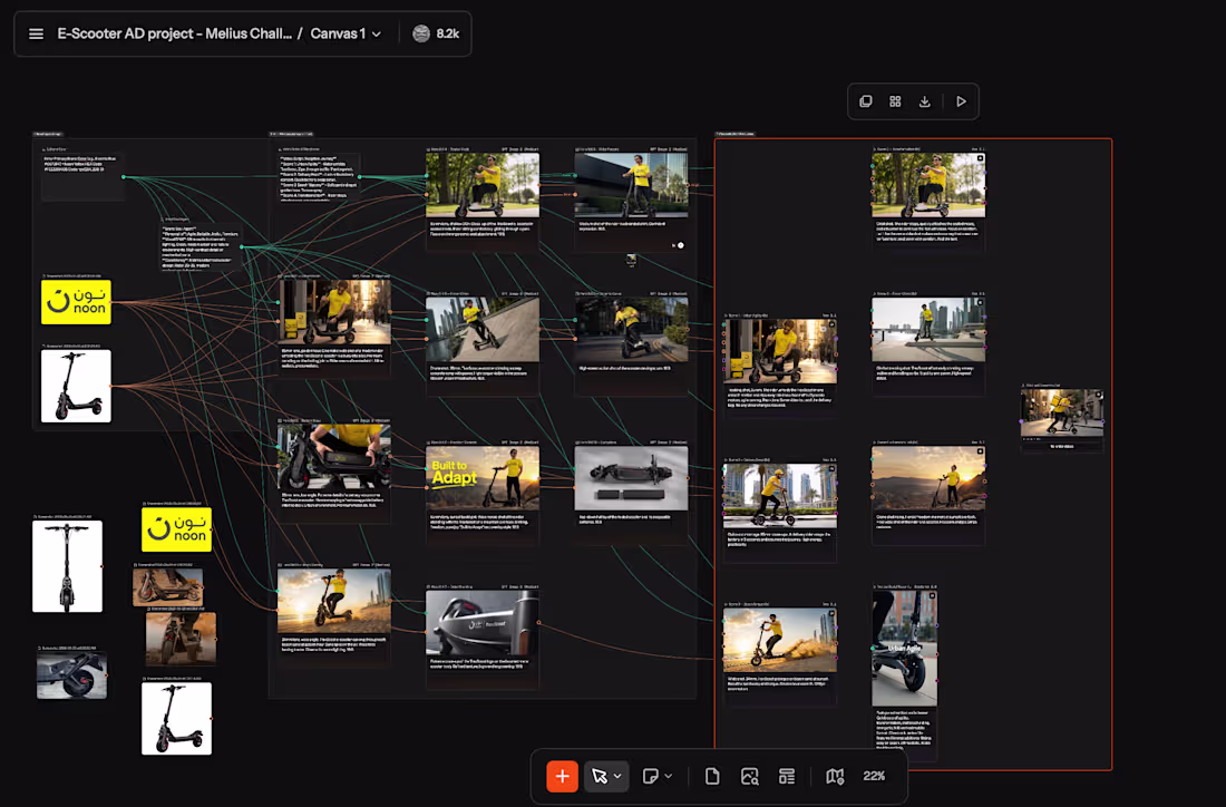
Adaptive E-Scooter Storyteller
In the recent of continuously rising petrol and fuel prices, e-scooter product is getting a high Demand and becoming a lifestyle product, a compact vehicle to carry on, easy ride option for quick deliveries.
Brands procure these products and white label these products, hence such AI videos for their product's promotion is a big value added for sure.
I built a smart, reusable creative workflow in Melius that helps brands showcase practical, cost-effective mobility solutions.
Product: TravScoot is an intelligent system that takes 3–5 real photos of an e-scooter + brand logo and generates a complete premium promotional package with perfect visual consistency.
Core Story & Benefits Showcased:
No more dependency on expensive petrol — charge fully at home for pennies
Compact, foldable design — easy to carry anywhere (offices, public transport, apartments)
Instant battery swap system for zero downtime
Transforms from agile standing mode to comfortable seated mode in seconds
Real-world reliability: navigates crowded city streets, beach sand, steep ramps & slopes, small hurdles, and light mountain trails with confidence
The rider wears the exact brand-colored shirt with the company logo prominently displayed, making every output fully on-brand.
Models used: Google Veo 3.1 and Seedance e 2.0
Outputs Generated:
One 60-second cinematic landscape promotional video
One 15–20 second vertical Instagram/TikTok optimized cut
8–10 high-quality hero still images
This workflow is exactly what I wish existed for mobility and consumer brands — a fast, consistent way to create emotionally compelling content that highlights real savings, practicality, and freedom in today’s high-fuel-price world.
Built entirely during the Melius Challenge window using Melius agents for consistency, storytelling, and multi-format generation.
Project link: https://app.melius.com/projects/76616e3e-996f-42c9-85e4-76752dad672e/canvas/660c2a37-bdd2-483d-8aa4-f150de886904
Excited to share this entry!
Check out the LinkedIN posts also: https://www.linkedin.com/posts/rajathejes_melius-meliuschallenge-escooter-activity-7462756038698704898-wuX7?utm_source=share&utm_medium=member_desktop&rcm=ACoAACGrLbcBUZX_-R6MEKSziPHHwQ3dEMtCWIc
2
149
The idea is simple but powerful: help people turn good intentions into lasting daily rituals.
Prototype: https://rajamobbinproject.lovable.app
You start by choosing how many days you want to commit like 7, 21, 30, 60, or 90 days. Then you pick a category like skincare, fitness, drinking more water, waking up at 6 AM, or anything custom. You can set how many times per day you want to do it and even add alarms.
Every ritual gets its own beautiful color that you choose, and you can track progress with either a big glowing circular ring or a clean progress bar — just like Apple Fitness. As you complete tasks, you earn XP, build streaks with fire icons, and get satisfying confetti celebrations.
I drew heavy inspiration from Mobbin studying Polestar’s elegant scheduling screens, Apple Fitness for the progress visuals, Duolingo’s addictive gamification, and Sweatcoin’s reward flow. Then I combined them into something fresh: a clean, dark, premium ritual tracker with smooth hero animations, container transforms, and delightful micro-interactions.
LinkedIN: https://www.linkedin.com/posts/rajathejes_mobbinchallenge-uxdesign-productdesign-activity-7443551084243099648-L7Ek?utm_source=share&utm_medium=member_desktop&rcm=ACoAACGrLbcBUZX_-R6MEKSziPHHwQ3dEMtCWIc
1
0
72