The network for creativity
Join 1.25M professional creatives like you
Connect with clients, get discovered, and run your business 100% commission-free
Creatives on Contra have earned over $150M and we are just getting started
Back to feedPost

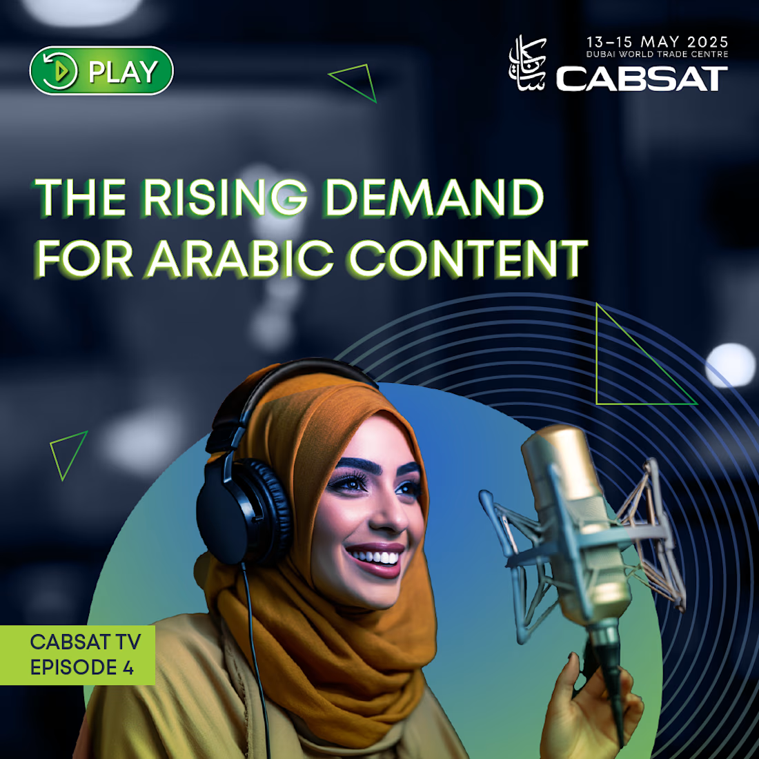
The 2025 campaign evolved the CABSAT identity with bold typography, high-impact photography and a flexible graphic system across industry insights, exhibitor campaigns, podcasts, testimonials and event content.


The network for creativity
Join 1.25M professional creatives like you
Connect with clients, get discovered, and run your business 100% commission-free
Creatives on Contra have earned over $150M and we are just getting started





Related posts

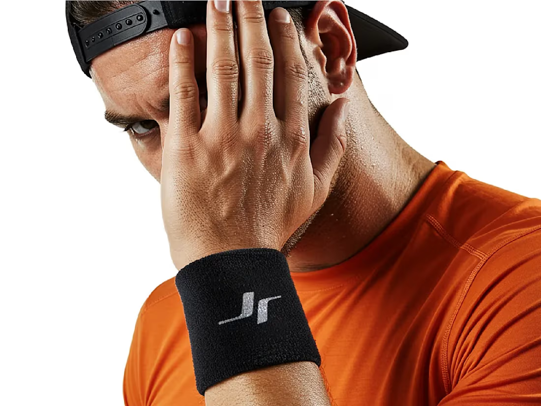
Jordan Reid - Sportswear Brand Identity





Like the logo direction


Turning complex AI workflows into a calm, monochrome experience, brought to life with motion. We'd love to hear your thoughts!


This reel for @afterluc was a chance to play a little more with the visual language we usually use for his content.
It’s a fun “get ready with me” piece that opens with a teleport effect and moves into a faster, more playful edit. Since Luc’s profile normally leans toward a cleaner and more minimalist aesthetic, I pushed the typography further here, using bolder text treatments and more expressive motion without losing the visual identity we’ve built around his content.
The goal was to make the edit feel energetic and entertaining while still polished, using pacing, text, sound and small visual moments to support his personality rather than overwhelm it.
I really enjoy projects like this because they show how a consistent visual identity doesn’t have to mean doing the same thing every time. Sometimes the right choice is knowing exactly where you can break the rules a little.
Role: Video Editing, Motion Design, Text Animation, Sound Design, Color & Visual Storytelling

The jump cut into the teleport with the bold yellow OUTFIT type feels snappy. Good fit for a get ready with me reel.


