The network for creativity
Join 1.25M professional creatives like you
Connect with clients, get discovered, and run your business 100% commission-free
Creatives on Contra have earned over $150M and we are just getting started
Back to feedPost

[STATRYS] Motion Graphics - Promotional Video


Financial product promos have an interesting clarity challenge. How did you decide which Statrys details needed animation and which could stay in the copy?
The network for creativity
Join 1.25M professional creatives like you
Connect with clients, get discovered, and run your business 100% commission-free
Creatives on Contra have earned over $150M and we are just getting started

Challenges
View all


Related posts


Engaging website for a New York–based architecture and construction studio, balancing bold typography, immersive imagery and a minimal editorial layout.


Wonder -- Visual Expressions


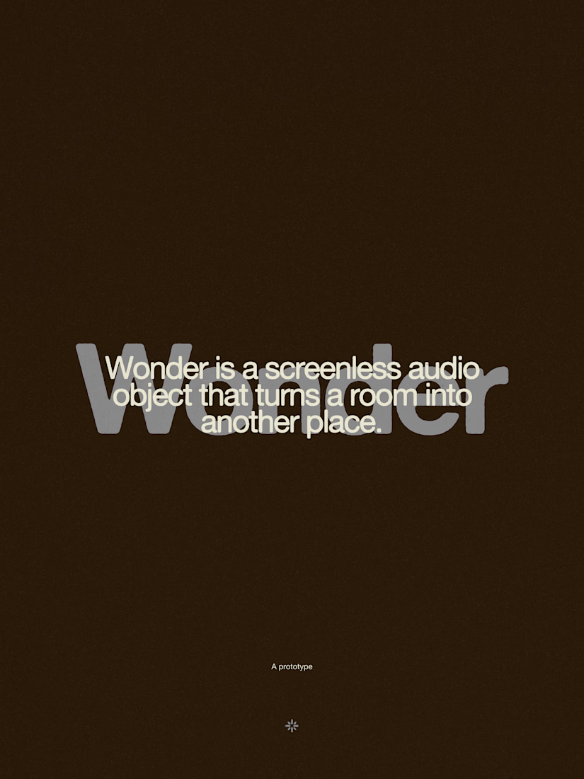



The restraint in the warm palette really lets the sound-object concept breathe—especially that shift from readable type to atmosphere.

Custom liquid interaction built in Framer.
Turning a static hero into a responsive visual surface through cursor-driven distortion.


How do you adapt the cursor-driven effect for touch screens?


