The network for creativity
Join 1.25M professional creatives like you
Connect with clients, get discovered, and run your business 100% commission-free
Creatives on Contra have earned over $150M and we are just getting started
Back to feedPost


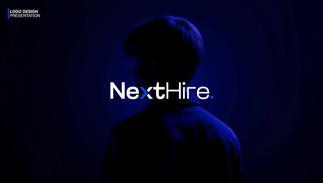
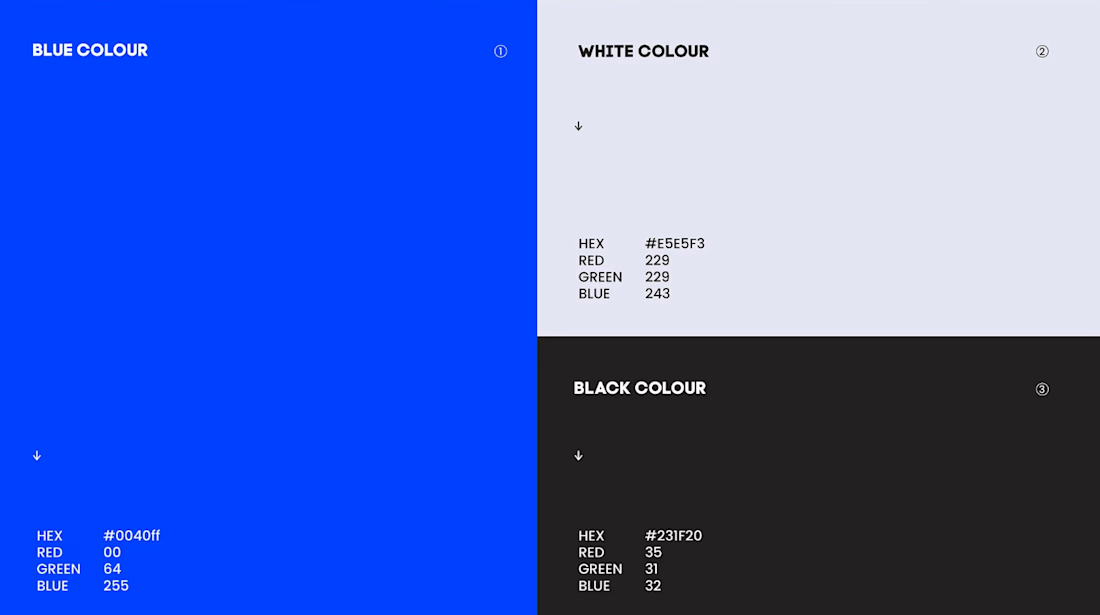
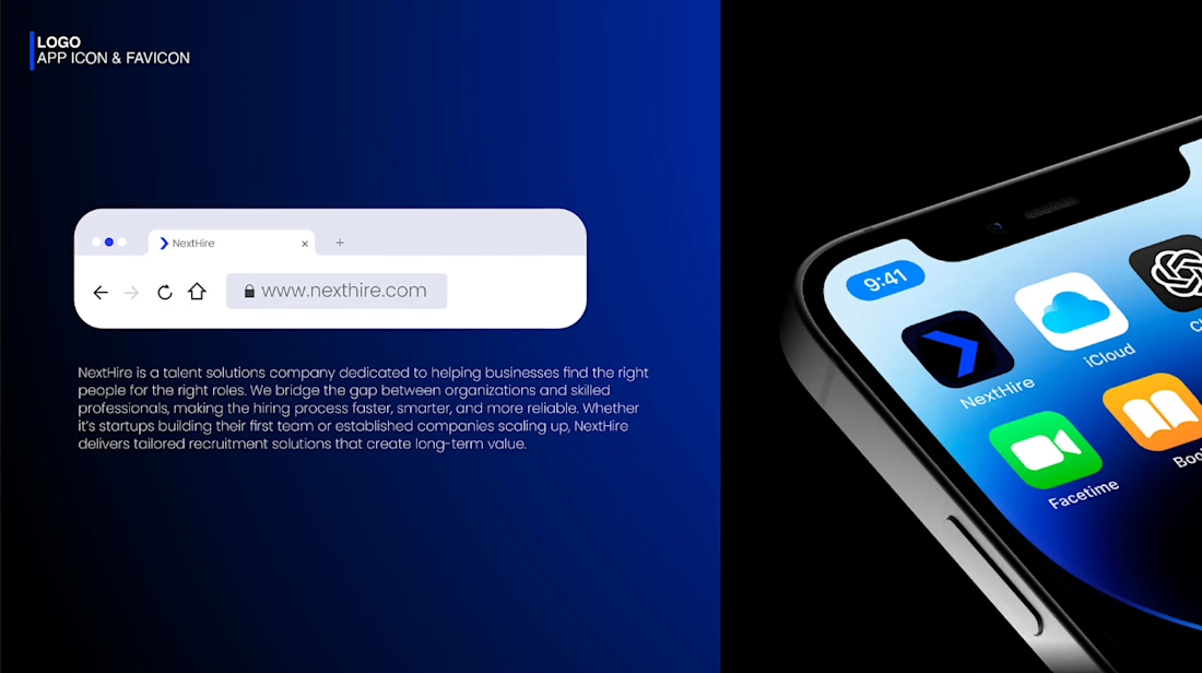
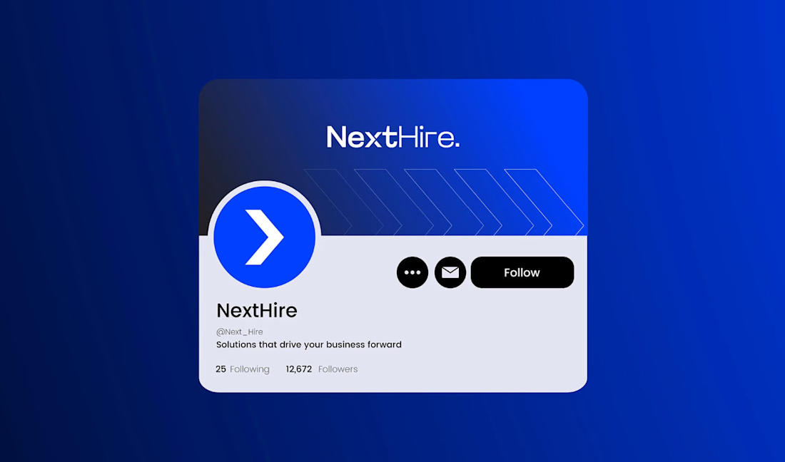
A look at the identity I created for NextHire, centered on one simple idea: moving forward.
NextHire helps businesses find the right people and professionals find their next opportunity. I wanted the brand to feel confident but approachable, with a clear sense of direction.
The blue arrow appears in the wordmark, then works on its own in smaller applications. It’s a small detail, but it gives the rest of the identity a clear foundation.
The network for creativity
Join 1.25M professional creatives like you
Connect with clients, get discovered, and run your business 100% commission-free
Creatives on Contra have earned over $150M and we are just getting started





Related posts

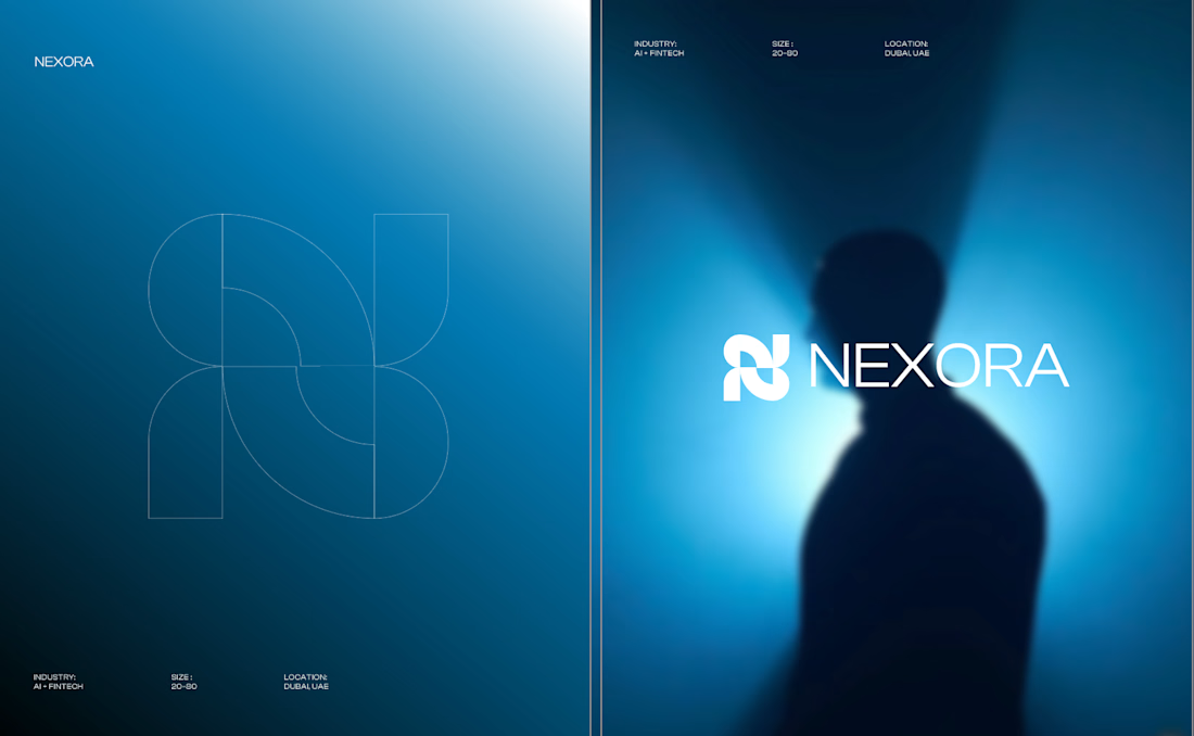
Currently building a new identity for an AI + fintech company in Dubai.
Still early, but this is one of the directions we’ve been exploring for the brand.
The idea was to avoid the usual “AI company” visual language and build something that feels more established, precise, and quietly futuristic.
We’ve been playing with geometry, light, and a much more restrained visual system around the mark.
Still developing this one, so I’m curious:
Would you push this direction further, or keep it this restrained?


Honestly the logo presentation is impressive


Brand guidelines fail when someone tries to use them. The PDF is complete. But when a developer needs something the system didn't anticipate, there's no logic to extend from. A style guide documents what exists. A system tells you what to do next.

Mind blowing job

I've got one open spot. 👀
Starting October, I have room for one new brand. Two ways we can work together:
🎨 Brand identity
Logo, colors, type, the whole feel. For brands that are done blending in.
📱 Social media on retainer
Monthly posts that look and sound like you, so you can stop stressing about what to post.
My sweet spot? Brands that are a little weird, a little bold, and don't want to look like everyone else in their feed.
If that's you send me a quick message
Only one spot, so first come, first served.