The network for creativity
Join 1.25M professional creatives like you
Connect with clients, get discovered, and run your business 100% commission-free
Creatives on Contra have earned over $150M and we are just getting started
Back to feedPost

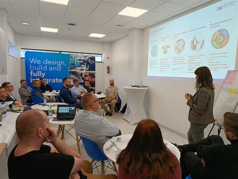
Great to look back on these workshops a few months ago! 🚀
It was a truly inspiring experience - full of collaboration, energy, and real Kaizen in practice. I’m glad I had the opportunity to conduct this workshop in Viscon Group and work together on continuous improvement.




amazing to see
The network for creativity
Join 1.25M professional creatives like you
Connect with clients, get discovered, and run your business 100% commission-free
Creatives on Contra have earned over $150M and we are just getting started








Related posts

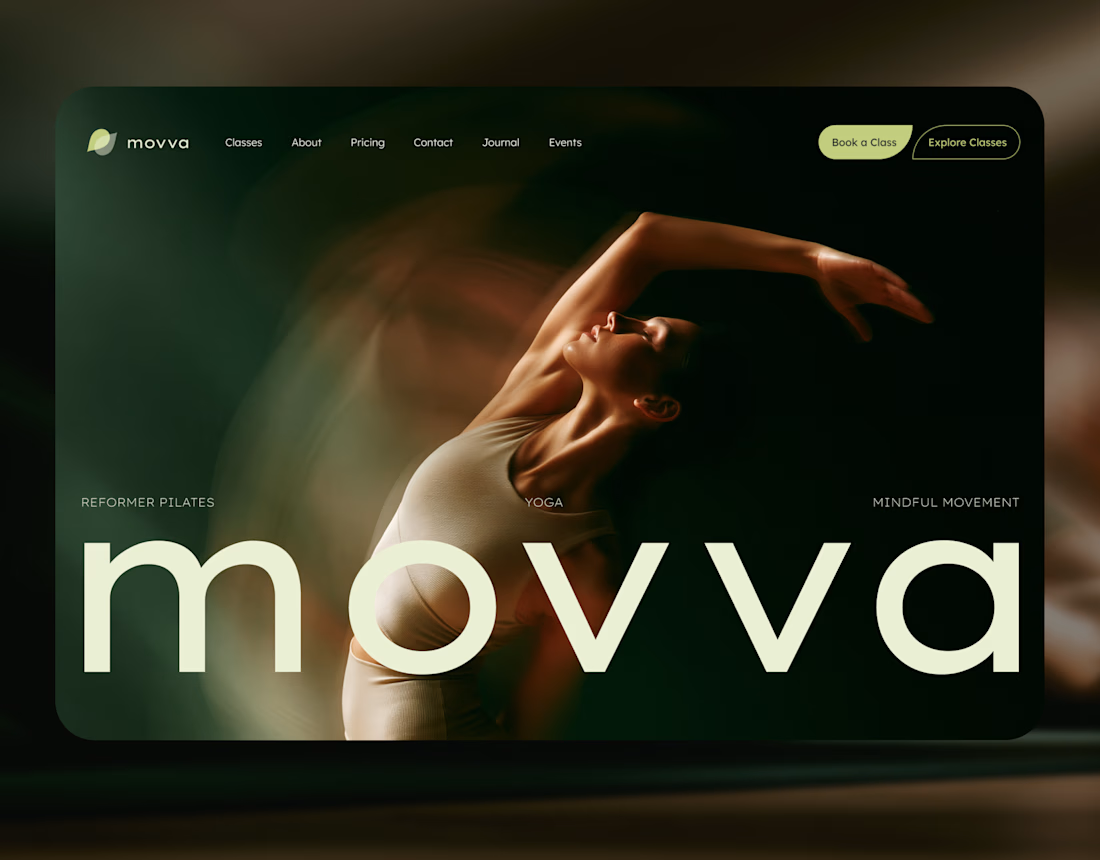
MOVVA is now featured on Contra 🤍
I’m especially happy about this because working on this template was a creative outlet for me.
I wanted to build something useful for a business: a website that covers what a studio needs when it opens, from an easy-to-use schedule to clearly structured class information, with a solid foundation for SEO.
At the same time, I wanted it to feel beautiful. To bring a sense of movement, lightness, and the joy of taking a class into the design. To capture that friendly atmosphere that makes you want to walk into a studio and give it a try.
Thank you, Contra team!


Huge congrats on getting featured! 🤍 MOVVA looks stunning - love the mindful movement vibe and that hero image. Super useful concept for studios. Well deserved feature!

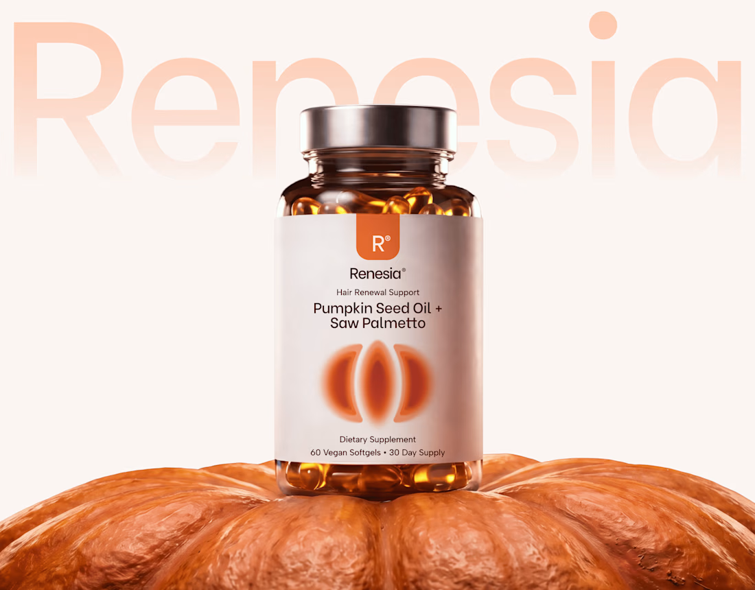
Here we go, check the full case study, I think you will love it! 🎃


Love this! 🎃 The pumpkin concept for Renesia is super creative - perfectly matches the Pumpkin Seed Oil story. Clean work in Illustrator & Figma!

Sometimes, all it takes is being in the right space, surrounded by the right energy, to remind you of what’s possible.
I joined Contra just a few weeks ago, and honestly, I didn’t expect to feel this inspired so quickly. There’s something about this community, the creativity, the people, and the opportunities that makes me feel like things are finally moving. 🌱
Ideas are turning into action. Connections are happening. New possibilities are opening up. And most importantly, I’m feeling more excited about what I’m building and where I’m going.
It’s still the beginning, but I can already feel the shift. And that’s what makes it so special. 🤍


Love this energy!!