The network for creativity
Join 1.25M professional creatives like you
Connect with clients, get discovered, and run your business 100% commission-free
Creatives on Contra have earned over $150M and we are just getting started
Back to feedPost

Just published a new story on Medium:
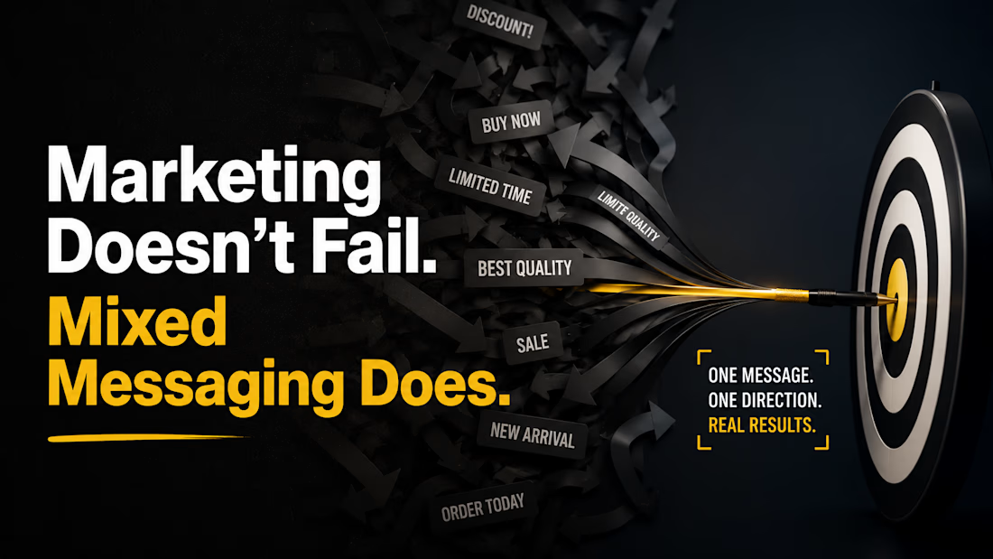
"Marketing Doesn't Fail. Mixed Messaging Does."
One thing I've noticed across brands is that marketing often gets blamed for poor results, when the real issue is inconsistent messaging.
If your website says one thing, your ads promise another, and your social media communicates something different, your audience doesn't know what to trust.
In this story, I explore why clear, consistent messaging is one of the strongest competitive advantages a brand can have—and how it impacts branding, advertising, and conversions.
I'd love to hear your thoughts and discuss your perspective.
#BrandStrategy #Marketing #ContentWriting #Storytelling #CreativeStrategy #BrandMessaging #Medium #Contra

The network for creativity
Join 1.25M professional creatives like you
Connect with clients, get discovered, and run your business 100% commission-free
Creatives on Contra have earned over $150M and we are just getting started





Related posts

Always get so excited about a Contra feature. 🚀
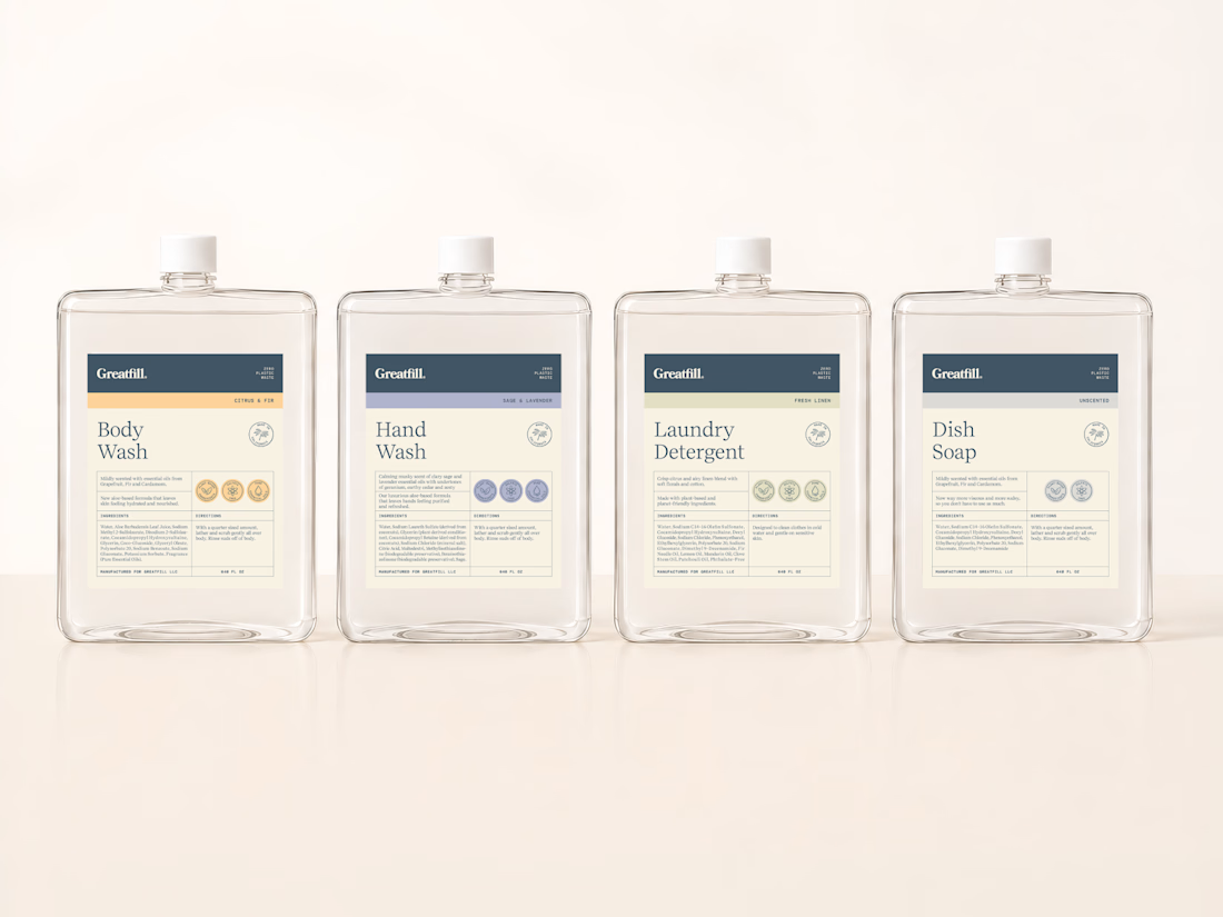
This one was about more than a visual refresh. This brand needed their labels to feel more aligned with who they are as a brand, and at the same time have a system that could grow with them without losing consistency.
Thank you Contra.

Color coding each variant with the dot rows is a clean way to scale the system. Quiet and easy to shop.


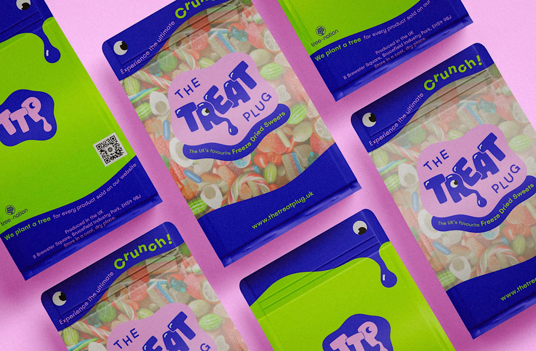
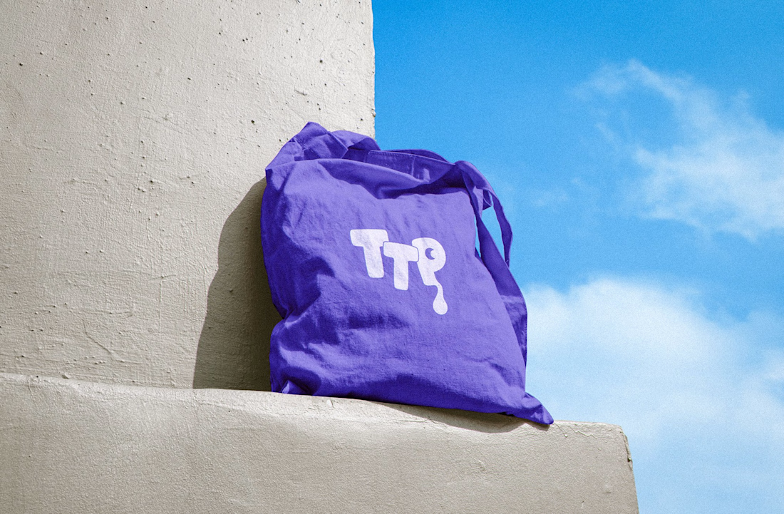

The Treat Plug Brand Identity | The UK's Favourite Freeze-Dried Sweets by FLM Studio
The Treat Plug was born on TikTok back in 2020 with a product people were obsessed with, and a brand that hadn't been built yet. They came with a name, FLM Studio built the rest.
Bold colour. Playful energy. A nostalgic hit with a modern edge. The identity was designed to stop the scroll and own a noisy market.
A full and comprehensive brand identity, custom illustrations, and pouch packaging from the ground up.
#branding #branddesign #brandidentity #packaging #packagingdesign



Impresive work